

Rittman Mead Consulting

Sql2Odi - best practices for auto-generating your ETL content
I blogged a while ago about our Sql2Odi tool that converts SELECT (and WITH as well) statements into Oracle ODI Mappings. (Blog posts 1, 2 and 3.)
Now that the tool has been around for close to 2 years, let us reflect on lessons learnt and best practices adopted.
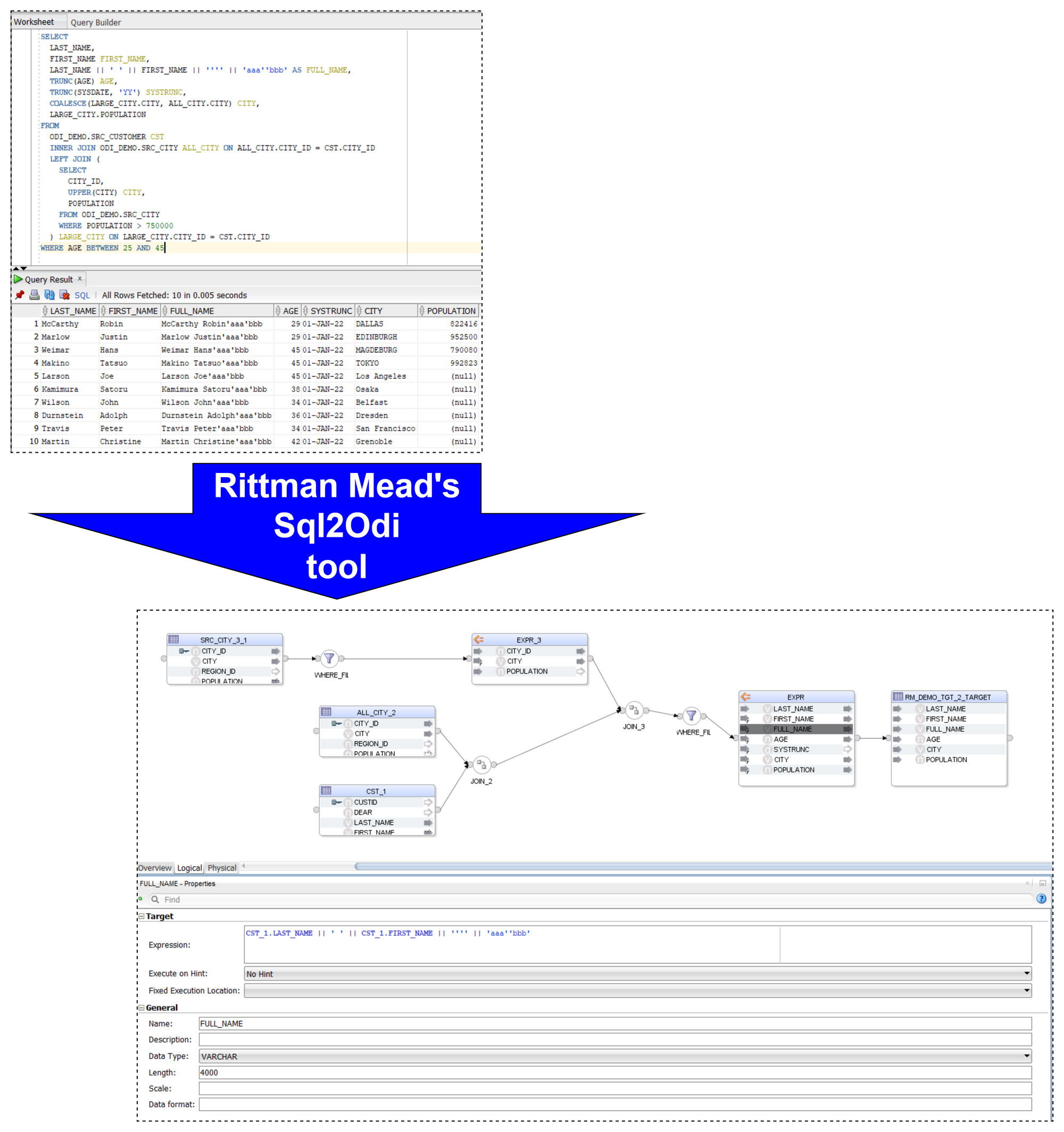
Let me start with a quick reminder of how the Sql2Odi tool works:
- You start by defining the feed-in metadata: the SELECT statement that the new Mapping will be based upon, name of the target table, names of Knowledge Modules and their attributes, flags like Validate Mapping and Generate Mapping Scenario flag, etc.
- Then run the Sql2Odi Parser that parses SELECT and WITH statements in your metadata table.
- Then run the Sql2Odi Mapping Generator that creates ODI Mappings based on the successfully parsed statements.
- Assess the outcome by reviewing the newly generated Mappings in ODI Studio.
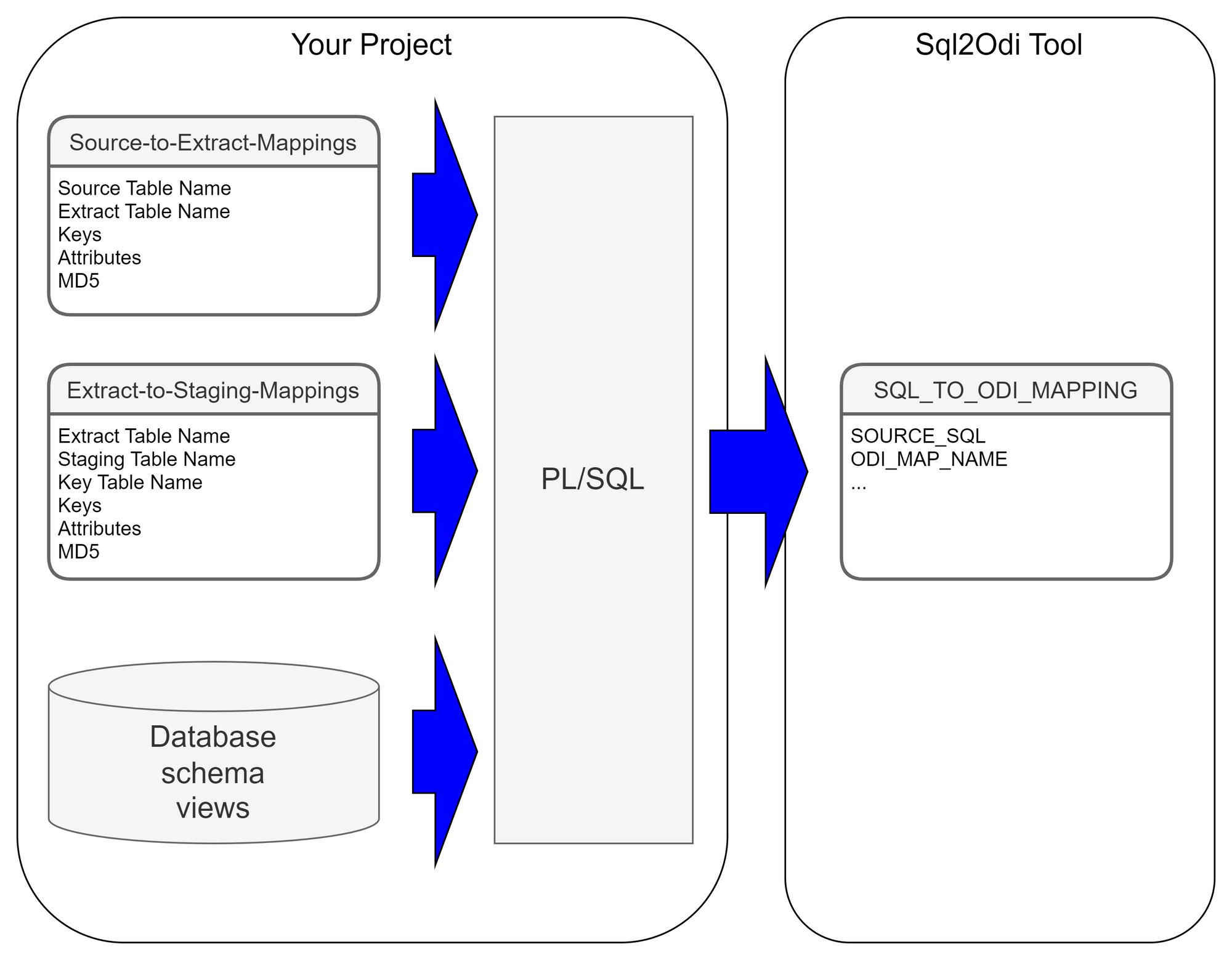
Each SELECT statement that we want to turn into an ODI Mapping needs its own line in the SQL_TO_ODI_MAPPING metadata table. (It currently has 35 columns and is likely to grow in the near future as the tool's capabilities are expanded.) It takes time to fill in all metadata required for Mapping generation. If there are many Mappings to be generated and they can be split into groups according to purpose and design pattern, for each group you should create its own custom metadata table with its unique distinguishing features. Once all the custom metadata tables are filled in, based on them you can generate records in the SQL_TO_ODI_MAPPING table.
 Executing Parser
Sql2Odi Parser parses SELECT and WITH statements and in case of a successful parse converts it into metadata that in turn is used by the ODI Content Generator to generate Mappings in ODI.
Any reserved word that is part of the SELECT statement, needs to be defined in the Parser so that it can understand it - that is something that can only be done by us. (The Parser does not have visibility of the database schema, does not validate a SELECT statement against actual schema content.) Any custom-built PL/SQL functions will hence not be understood. Standard Oracle RDBMS functions are supported but occasionally we are still finding some obscure ones that we have missed. Our Parser still has a range of limitations:
- All reserved words, including Oracle function names, must be given in UPPERCASE. (This is usually not a problem, because SQL Developer allows to convert any SELECT statement to uppercase.)
- No support for nested queries (where a SELECT substatement is used instead of a column reference or expression).
- No support for the
EXISTS()expression. - No support for hierarchical queries, i.e.
CONNECT BYqueries. - No support for
PIVOTqueries. - No support for the old Oracle
(+)notation. (You can still join tables in theWHEREclause if you so choose butOUTER JOINshould be used where in the old days we used(+). - Does not parse comments unless those are query hints.
Like most parsers, ours is not good at telling you what and where exactly the problem is. For example, if in your SELECT statement you are referencing a custom-built function, the Parser will most likely interpret it as a column name and will become upset when you try to pass values to it.
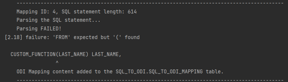
It will say it expects something else instead of the opening bracket ( whereas the problem is actually the function itself. Therefore it is a good idea to test and review all SELECT statements before passing them to the Sql2Odi tool.
ODI Content Generator is a Python script that you run from ODI Studio. It will generate new Mappings in the dev repository that you are currently connected to.
As was noted above, the Parser does not know anything about the database schema you are referencing. So if you have not tested your SELECT statement in SQL Developer, there might be typos in your table or column names - all those typos will be parsed successfully and those issues will come to light when you try to generate Mappings in ODI: if a schema name is incorrect in the SELECT, the ODI Model will not be found, if a table name is incorrect, the ODI Datastore will not be found, if a column name is wrong, attribute mappings will fail to be created.
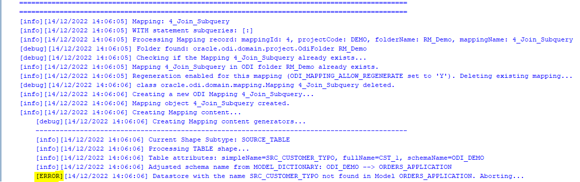
However, the good news is that the ODI Content Generator is much, much better at telling you what, where and why went wrong - it generates a rich log output and shows descriptive error messages.
Because semantic errors can only be spotted upon trying to generate Mappings, many cycles of edit SELECTS -> parse -> generate ODI content may be necessary.
When Mapping generation is done, always check the output log for errors and warnings!
Using Sql2Odi in a ProjectThe ODI Content Generator by default will delete and recreate Mappings, thus allowing for many generation cycles. However, this can be overridden at the level of individual Mapping - there is a flag in the SQL_TO_ODI_MAPPING metadata table: ODI_MAP_ALLOW_REGENERATE_FLAG. If set to N, Mappings that are already in the Repository, will not be touched.
In a project where the Sql2Odi tool or any other auto-content generator is used, there should be a well understood milestone for generated content, beyond which it passes into the domain of developers for further manual adjustment and can no longer be re-generated. When that milestone is passed, will depend on how far the Mapping can be developed by automated means. Typically it will take many cycles of auto-generation to get Mappings in the desired shape. How many cycles we will run, will depend on the review feedback after each generation but also on the performance of the auto-generator tool.
PerformanceOne of the benefits of using auto-generators is - making a small adjustment to all objects of same type is easy, for example, adjust MD5 calculation to include Source system ID for all Extract Mappings, of which there could be thousands. But will it take 5 minutes or 5 hours to regenerate the lot? A five minute job can be done almost any time whereas a 5 hour one looks like a nightly job. To discuss the performance of the Sql2Odi tool, we need to look at the Parser and the ODI Content Generator separately.
The Parser is a pure Java application with few outside dependencies. On my test system, it takes tens of milliseconds to parse a single SELECT statement. That suggests that parsing a thousand SELECT statements should be done within a minute. Also, parsing does not interfere with anything or anyone.
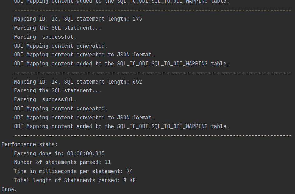
Parser performance stats:
Parsing done in: 00:00:01.675
Number of statements parsed: 42
Time in milliseconds per statement: 39
Total length of Statements parsed: 61 KB
The ODI Content Generator however is a different story. ODI content generation based on the parsing result written in the metadata table is done by a bunch of Groovy scripts, which query and update the ODI Repository repeatedly in the course of creating a single ODI Mapping, and they are subject to object locks in ODI Repository. Content generation is much slower than Parsing and its performance will depend heavily on the speed of your dev environment, how complex the Mappings are, do you set up Physical Design, validate and create Scenarios as part of creation, etc. On my test system it takes a couple of seconds for a Mapping to be fully generated, validated, Scenario generated.
[info][12/12/2022 19:10:26] -= Performance Stats =-
[info][12/12/2022 19:10:26] Of 38 enabled and successfully parsed Mappings in the Metadata table, 18 Mappings were successfully generated.
[info][12/12/2022 19:10:26] Total duration is 45.5 seconds, which is 2.527 seconds per successfully generated Mapping.Let us sum it up. The way your accelerated, automated development process will work will depend on the constraints like the complexity of your SELECT statements, the amount of manual intervention needed after your Mappings are generated and the performance of the automation system. You have designed your data analysis system and concluded that large parts of your data warehouse schema and the ETL (or ELT) can be built automatically. The Sql2Odi tool enables you to do that.
Why Data Governance Is More About Enabling Good Than Stopping Bad

It seems like every day businesses are bombarded with reminders of the value of data. Data, we are told, leads us to make smarter decisions that deliver better outcomes. No arguments there.
But we are constantly reminded of the dangers of data too; of the consequences of losing it, accidentally or through malicious actors. Attacks on Stuxnet, Equifax and the NHS are just some of the cautionary tales we share around. The cost of each attack is an eye-watering $4.5m, estimates IBM in its Cost of Data Breaches Report 2022. Add in the fallout from reputational damage, and the level of cybersecurity investment needed to protect against increasingly sophisticated threats, and a cost-benefit analysis of using data may conclude that it’s just not worth it.
It is common practice for businesses to address this risk with a data governance framework. As such, data governance is often presented as preventive; the art of stopping bad things happening. That positioning continues to be its downfall. When a business frames data governance in terms of risk mitigation and regulatory obligations, it becomes an ancillary function. It can quickly be superseded by activities that have a more immediate impact on the bottom line, be it revenue generating or cost cutting measures. When trading conditions are tough, this inclination to deprioritise data governance in favour of perceived core business endeavours is even stronger.
Instead, data governance should be seen as enabling good; that with the right controls and processes, you improve the quality of data you have; get it to the people who can gain most value from it; and so drive better outcomes with it.
This thesis supports the trend for self-service data discovery and BI. Businesses increasingly understand that data by itself is fairly useless. Data needs context, and so it becomes more powerful when in the hands of those making business decisions. This decentralised approach requires a level of organisation around who can access and share different data. That should be a fundamental aspect of a data governance framework—not because it’s important to stop data getting into the wrong hands, but to make sure the right hands get the data they need. Equally, a data catalogue and data management tools should be built with the end-user in mind, making it easy for them to find, understand and interrogate the data they need. In contrast, many businesses organise their data to demonstrate regulatory compliance.
Data also needs to be credible. In other words, do users believe the information and insights they are being given? So data governance must provide assurances on data provenance and establish control processes and tests to ensure data validity. Again, the emphasis here is on a framework that enables rather than restricts. When an executive trusts their data, they can make clearer, bolder decisions with it.
Culture is also key to an effective data governance framework. In the self-service, decentralised world of BI, data is no longer the sole remit of one team. Data and analytical literacy must be embedded into everyone’s role and every workflow. So data governance should not be seen simply as a framework for information security. It is also a set of behaviours and processes that are designed to foster collaboration at all levels and instil confidence in users as much as to keep them and the company safe. Data governance should describe how this culture permeates the entire business, from leadership through to individual lines of business, and right down to how every employee handles and uses data and information.
Transparency should be elevated to a core value. Mass data participation won’t be achieved if users are worried that they’ll do something wrong. But when vulnerabilities are valued and mistakes seen as a learning moment, users have no need to be paralysed with worry. Data becomes a playground of discovery. A data governance framework must bake this culture in from the start.
The traditional view of data governance is as a block to information and innovation. Executives want to be set free, to explore data and the secrets it surfaces. But a data governance framework that priorities regulation and security puts in place policies and protocols designed to restrict independence. Rather, effective data governance should be the reason you can say “yes” to data requests.
Often the problem is that data governance is considered too late. Insert data governance over existing priorities, policies and processes, and it is seen as being intrusive. But start with a data governance framework, and design everything else around that, and it becomes ambient, quietly enabling, never compromising.
3 elements of an effective data governanceLead from the top
Executives responsible for data governance must set the right tone. Excite employees about what an effective data governance can do for them, not what it will stop them doing.
Governance by design
A governance framework that truly liberates data must permeate the entire business, including systems, processes and culture. Architect governance with this scope in mind from the start.
Opportunity-based approach
A data governance framework should define the outcomes it wants to achieve. Resist the temptation to take a risk-based approach. Instead, describe the opportunities that effective data management can deliver.
Oracle APEX - Debugging Tip #1
If I would need this feature I would probably invest a lot of time trying to find out an answer. But funny enough I found out by mistake and as it might be useful to someone else I have just decide to publish this short blog post.
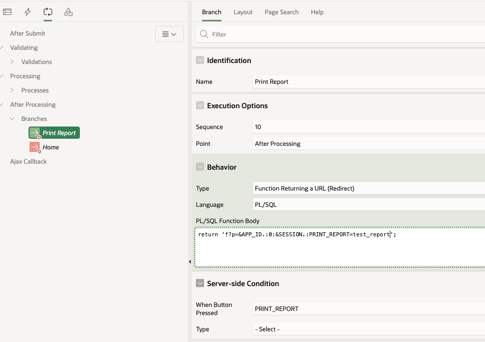
Application Process on Global PageWhen working with Report queries Oracle APEX creates an URL that you can use in your buttons or branches to call the report itself. That URL uses the global page 0 with an special REQUEST syntax as showed below.
I used that URL in a branch that fires when the "PRINT_REPORT" button is pressed:
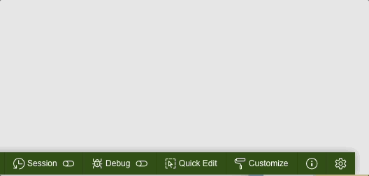
While trying to debug this process you might run into the following problem. If you enable debugging from the Developer toolbar like this:
 Enable debug from developer tool bar
or from the URL:
 Enable debug from URL
the page 0 process won't be debug. The output of the debug trace from the "View debug" option will be limited to the call of the button on page 1.
 View Debug from Developer tool bar when debug level is enabled from the Developer Toolbar or using URL parameter
Same goes for the Session Activity view:
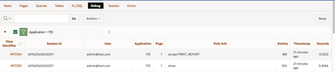
 Session Details from Monitor Activity when debug level is enabled from the Developer Toolbar or using URL parameter
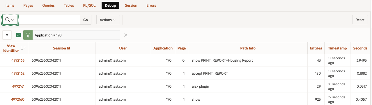
On then contrary, if you enable debug from Monitor Activity > Active Sessions > Session Details
 Enable debug from Monitor Activity
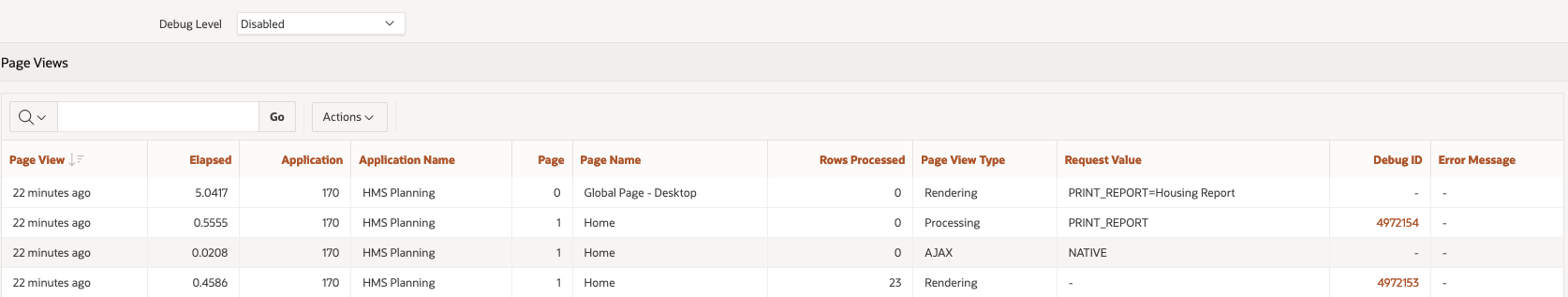
Debugging happens as well in page 0 processes. The "View debug" show the debug line:
 View Debug from Developer tool bar when debug level is enabled from Active Sessions in Activity monitor
Same information is displayed in the Session details:
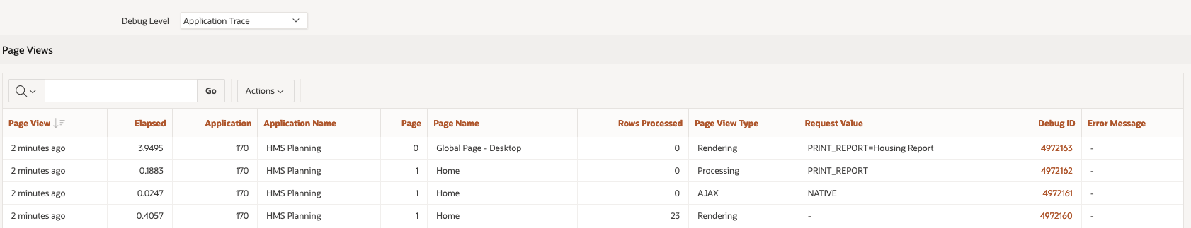 Session Details from Monitor Activity when debug level is enabled from Active Sessions in Activity monitorOracle APEX bug or feature?
Not sure if that is a bug or a feature and don't think is relevant at this stage. The important bit here (and applies for every aspect of the development cycle) is that we get to know different ways of reaching the same end, different methods to try, to keep us going forward :)
We've added Search!
Well, to be precise, our blog is hosted on Ghost, and we have just upgraded to version 5.0 which includes search, see here.
What does this mean? Well, now you don't have to use external search engines to find pages on the Rittman Mead blog, you can use our internal search engine.
Oracle APEX - Social Login
I looked into Social Sign-in as an option for Oracle APEX a few years ago. This was pre APEX 18.1 and, at this time, it was not simple to configure (in fact it would have taken a considerable amount of code to implement)
Fortunately, since 18.1 APEX offers natively functionality to integrate with Single (Social) Sign on providers and makes the whole process much easier.
This blog will describe the process of getting it up and running and why this might make life easier for both the developer and as an end-user.
Using a 3rd party to manage and authenticate the users that will be accessing your APEX application offers several potential advantages.
Firstly, delegating such a crucial task as security to an expert in the field in authentication is an inherently sensible idea. It eliminates the need to support (and possibly code for) a password management system inside the APEX application itself. This relieves an APEX developer of time spent managing users and worrying about the innate security risks that go hand in hand with storing this type of data. Not to mention trying to implement Two-Factor-Authentication (2FA)!
Secondly, from a user's perspective it should provide a better experience, especially if the IdP is chosen carefully based on the application's use. For example, if the application is to reside within an enterprise environment where users are already using Microsoft Azure to authenticate into various services (such as email) then, using the Azure IdP APIs, users could login into APEX with the same username / password. If the APEX application is deployed in a more publicly accessible space on the web, then using a generic IdP like google / facebook will allow you to capture user details more simply, without exposing users to the tedious experience of having to type in (and remember) their details for yet another website to enable them register or pay for something.
Allowing users to login to many systems using a single 3rd party system is sometimes know as federated authentication or single sign on (SSO) and the choice now includes many providers
- Microsoft
- Oracle IDCS, Ping, Okta etc
 Contributors to Wikimedia projects
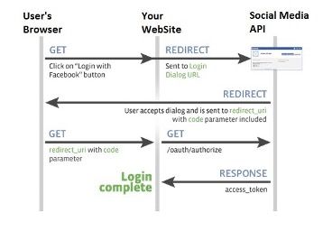
The protocols IdPs use to authenticate users into client applications (such as APEX) have their roots in Oauth2, which is a standard developed by the web community in 2012 to help websites share users' resources securely. A typical example of a requested resource is when a website (the client) you are registering on wants to access the list of contacts you have in your gmail account (the resource holder) so it can email your friends, in an attempt to get them to register too. Oauth2 allows an authorisation flow where the website can redirect you to a google server (the gmail provider) which will subsequently ask you to authorise this request and, with your consent, then provide an access token back to the original client website, which would be then used to query your contact data securely.
With Oauth2 websites could start sharing all sorts of data with each other, including, commonly, simple user profile data itself (eg name, email address, phone numbers). However, it is important to recognise that Oauth2 is an authorisation rather than an authentication protocol. In 2014 the Oauth2 specification was extended to include OpenId, which specifically deals with the authentication of a user. It is these standards that IdPs use to federate users.
The flow in more detailThe following diagram / points explain the data flow in more detail. In this example we will use a hypothetical set up a client app using Facebook as its IdP. Note that before this can occur the client app will have needed to register itself with Facebook and obtain a client id and client secret which it will need in some of the authentication steps
- User attempts to log onto the client. The authentication scheme redirects the user to Facebook authentication end point (with its client id)
- User Authenticates onto Facebook (if not logged in already). User prompted to confirm that he trusts the client app (this step is removed the next time the user logs in)
- Facebook redirects back to the application with an authorisation code
- The client application uses the authorisation code (with its client id and secret) to get and identity token about the user (with various meta data) and that is accepted by the client as a valid authentication
 Setting up an example in APEX!
OK, so let’s get an example up and running. For simplicity, I shall run through doing this on the Universal Theme application. We will change access from Public to Social Sign in (OAuth 2.0), create a couple of tables to hold who and when they logged into the application, and then add a report page to the application to detail user access.
This assumes you have the following:
- An Oracle APEX Cloud account and have a workspace and the Universal Theme application installed (the latest UT application can be downloaded from here).
- You have created a Google Account which will require a credit card. You may have already used this to create your Free Tier ATP Instance where you have APEX installed and like this scenario, we will need it for Google. Unless you launch your app to a very large community and start using other Google API features it will be free too. Google will send you alerts if and when you approach the end of the free quota, which resets each month. As an example, Google Maps Matrix API allows 28k calls a month for free.
- You have some familiarity with APEX and are not a complete beginner. If you are just starting, I would recommend you use one of the many resources now available online to get started.
Oracle have a lot of information and here is a good starting point.
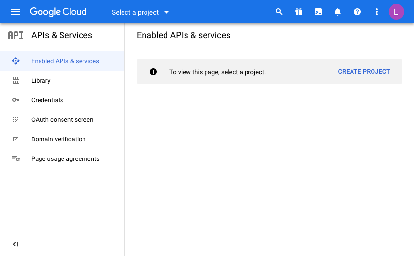
- Open a developer account with Google & setup the Developer Account
- Register an application into this google account and generate a client id and secret
- Register the client id and secret in an APEX workspace
- Create an APEX app and set up a Goole based social sign in Authentication scheme
- Create an APEX Authorisation scheme with a number of steps following your demo with done additional explanations on the way were helpful. Maybe just install UT and change that to require Google Auth
- Extract the user’s name [maybe add gender, locale and picture] from the Google OAuth 2.0 call and store in app items. (Having the image where the APP_USER is located would be really cool)
- Build a few simple tables that hold the user details such as their internal ID, when they last logged in etc
- Discuss roles in the app to secure functions for different user types. Create an Admin page and some reporting on the access from the users. Implement this initially with an Authorisation Scheme such as SQL statement of 1=1
- Introduce IDCS and roles and demonstrate setting this up with the Administration role
(do we need a standard role too for a user who comes in with the Google creds but is not an Admin?) - Moving back to the UT application, we will modify the authentication and authorisation to provide this function
Finally! Here is the hands-on fun bit!
Open a developer account with Google & setup the Developer AccountOnce you have a Google account (you already may have one if you use Gmail) you will need to navigate to the Google developer console.
If you have not done this already enter your details such as your address and mobile phone number. Use a mobile number as it makes life easier with confirmation text messages.
You will need to agree to Google’s terms and conditions and select whether or not to receive email updates. In terms of billing, it is probably a good idea to receive email updates but, in any case, you can opt out of this later if you want to.
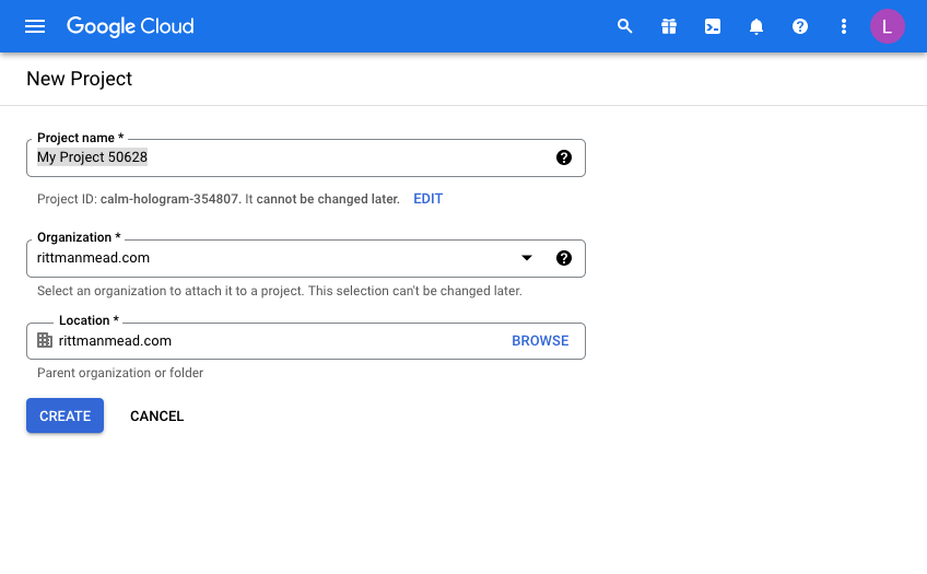
You should now get to the following screen:
Every Google API call you want to make will be defined from a “Developer Project”. In doing this, Google makes it nice and easy to control and report on where your API useage is, which is important when have more than one project on the go.
This is useful for demos or switching off access to a system independently of others if you need to so that you have the ability to switch off some usage while leaving others unaffected.
Click “Create Project” and give your project a name. This will be pre-filled and you will need to either be creative or just use the ID as a suffix for example to make it unique.
I’m afraid that now means you can’t use “My Project 50628” as I have below!
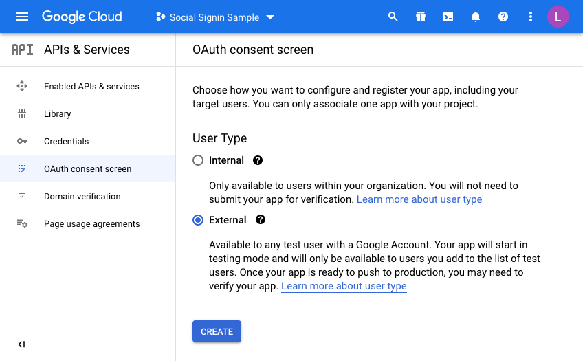
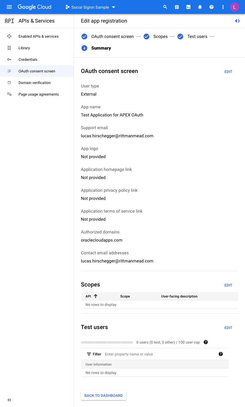
Once you have a project, you will have to configure the consent screen.
We’re going to make this available to all users with a Google account so select “External”
Enter details to match your setup:
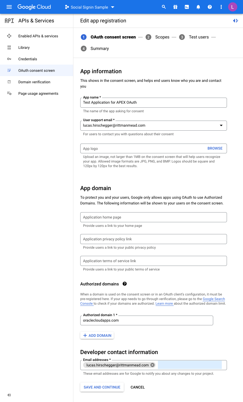
I have just entered the mandatory fields here. For the domain, just enter the base domain for the site so that my ATP Always Free Tier APEX home page is as follows and the base is bold:
https://xxxxxxxx.oraclecloudapps.com/ords/r/development/ut/home
The domain is oraclecloudapps.com in this example.
A Scopes configuration page is then loaded:
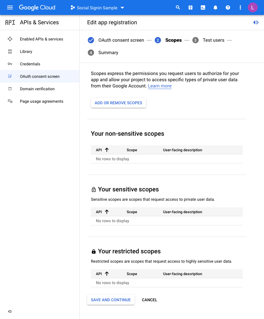
For this example, we are not going to set any scopes here so click
SAVE AND CONTINUE once again.
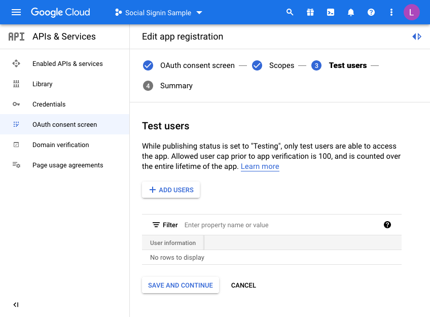
Finally, we are taken to a “Test users” page. Here you may choose to initially set your access to be limited to yourself & and limited set of users.
Unless you want to do this, click the SAVE AND CONTINUE button again. This project is only for the UT application so we do not mind sharing this without any test users defined as access is normally unrestricted (Public access in the APEX authentication scheme).
The last step is just the summary of the OAuth consent screen where you can double check the entries you have configured so far:
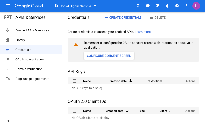
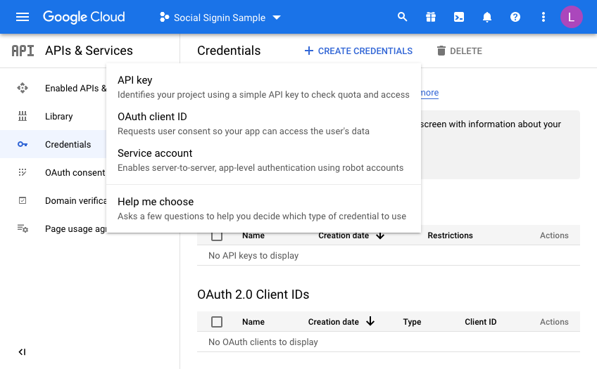
So now we are almost there on the Google side of things. We just need to generate credentials. Click on Credentials and then click CREATE CREDENTIALS, choosing OAuth Client ID in the dropdown menu:
On the next screen we choose a “Web Application” and then fill in the name you wish to assign this set of credentials:
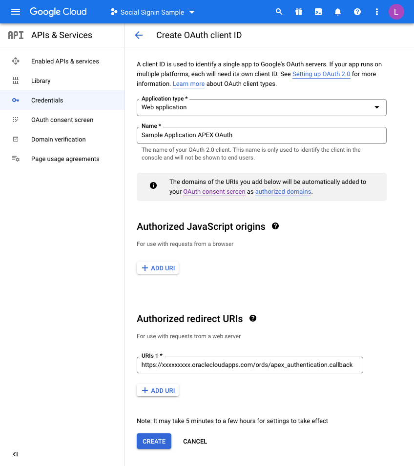
Before you click CREATE, add a redirect URL by pressing the ADD URI button.
All APEX redirects use the same redirect function which is just the part of the URL of your application and then an additional suffix.Take the URL of any page in your UT Application (you can just run this if you are unsure) and then copy the URL up to the ords section and then add the extra string of:
apex_uthentication.callback
Specifically, in my example this is:
https://xxxxxxxx.oraclecloudapps.com/ords/apex_authentication.callback
Once this is defined, press CREATE and that competes the Google Integration setup.
A dialog will be presented with the following information. This is what we will now set up in APEX for the Universal Theme Application:
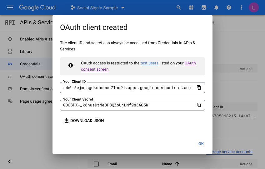
Make a note of the client ID and the Client Secret. We will need these when creating the APEX web credentials in the next section. Press OK a final time and you may now review what you have set up on the Google side of things.
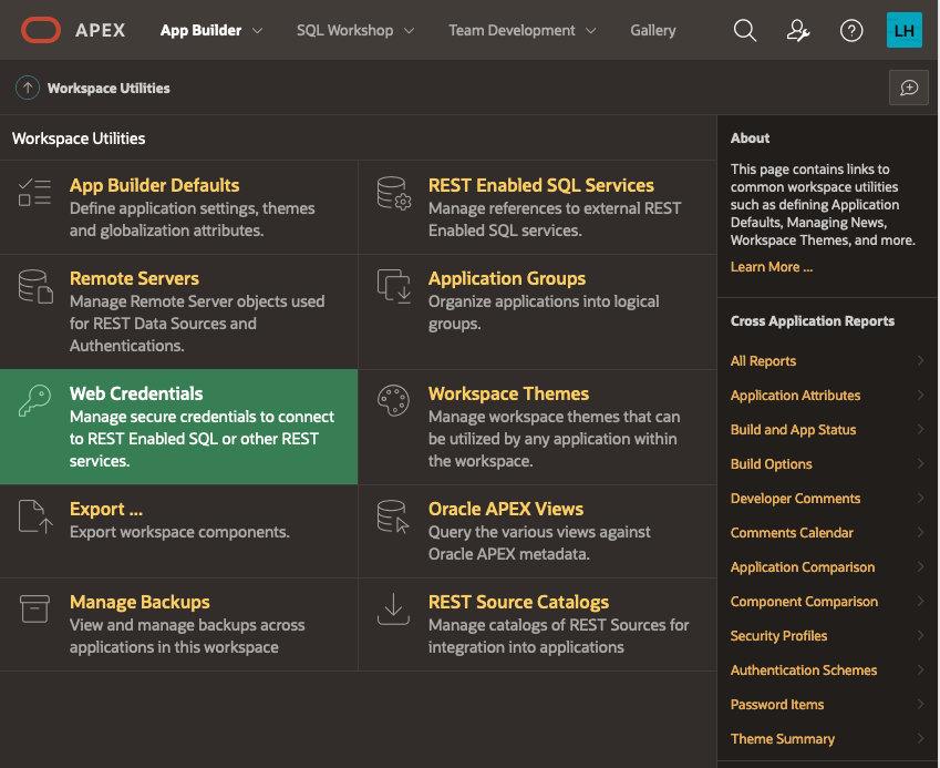
Setting up the APEX environment - Web CredentialsThe first step here is to define your web credentials in the APEX Workspace itself. Click on the "App Builder>Workspace Utilities > All Workspace Utilities" menu option:
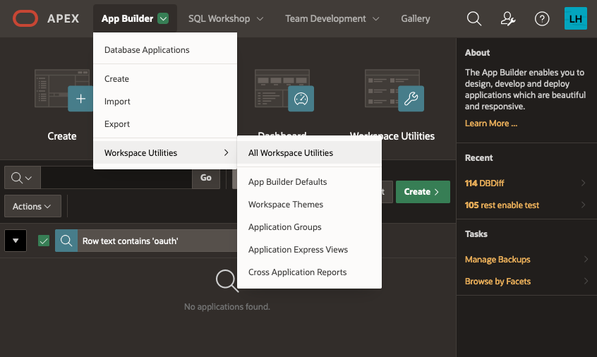
Next, choose “Web Credentials”:
The list of credentials is shown, click on CREATE
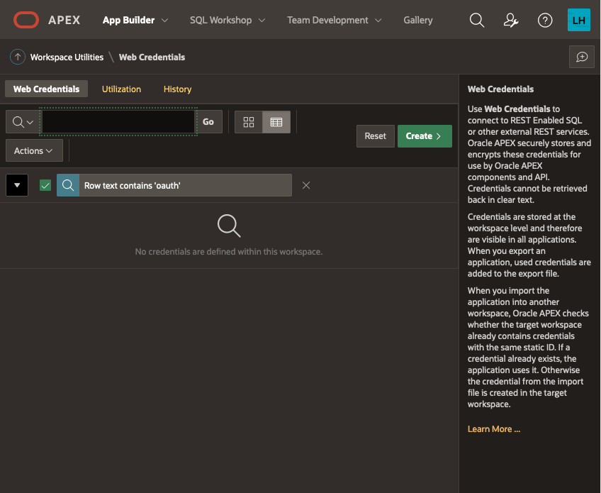
Give your Web Credentials a name and enter the Client ID and Client Secret from above repeating the secret in the verify field before saving these details:

This is now available to any application within your APEX workspace. Now we shall use this for our UT application. I am assuming you have installed the UT application or maybe you are setting this up for an application you have developed but you will need an APEX application at this point. If you already have the UT application and use it for reference, you may want to copy it so that you keep one version that does not require authentication via Google OAuth2.
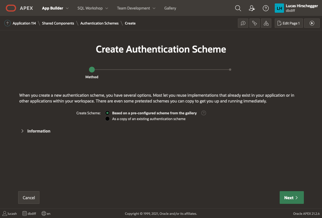
Go to application builder and navigate to the UT application you have installed.
Open it in application builder and then select
Shared Components>Authentication Schemes and then click CREATE.
Select “Based on a pre-configured scheme from the gallery” from the radio group and press NEXT
Now provide a name of your choice and select “Social Sign-in”:
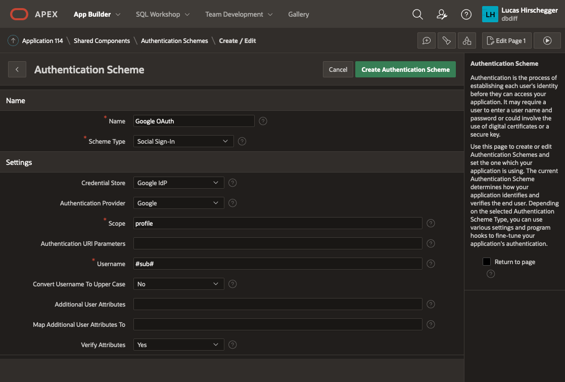
The above page will allow you to specify the following attributes of your Authentication:
- Name – a meaningful name for your scheme
- Scheme Type – select Social Sign-in
- Credential Store – select the one you have just created which is specified at the Workspace level
- Authentication Provider - here select Google. Note that APEX can integrate with any 3rd party IdP as long as they follow the OpenID protocol. Generic Oauth2 providers may be used as well as long as they support OpenId as an inputted scope. In these scenarios you will have to get information on the API end points for authentication / access token and userinfo.
- Scope – we could just use email but enter profile here and I will cover how to extract additional attributes from the JSON that is returned with successful login as an extra feature later on
- Username – here we assign the username to the email address of the Google account user
- Convert Username to upper case. I select yes here so that I lose case sensitivity for usernames but this is just down to what you intend to do with the user name
The discovery URL is not needed here (as it is pre defined by APEX when you select "Google" as then authentication provider, but is worth mentioning. This URL will provide us with JSON that describes this service in detail. You can examine the response by entering it in a browser:
https://accounts.google.com/.well-known/openid-configuration
Of interest to us in particular in the resulting JSON is the section listing claims_supported:
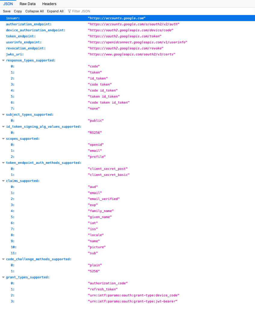
We shall just use email here for the identifier for the username and shall choose the option of making it uppercase in the application.
Click Create and that will complete the creation and switch the default authentication to your Google Authentication.
If you run your application now, you will see no difference. This is because all the pages are currently public and require no authentication or authorizations. We will change page 100 (the Home Page) now to demonstrate how access can be limited to those users you want to authenticate.
Oracle Analytics Cloud November 2022 Update: the New Features, Ranked
The November 2022 Update for Oracle Analytics Cloud came out few days ago and in this blog post I'm going to have a look at all the new features it includes. If you are also interested in a comprehensive list of the defects fixed by the update, please refer to Doc ID 2832903.1.
10. Non-SSL, Kerberos Connections to HiveNon-SSL connections to a Hive database using Kerberos network authentication protocol are now supported.
9. Enhanced Data ProfilingThe random sampling depth and methodology that drives augmented features such as quality insights and semantic recommendations have been improved.
8. Toggle Sample Data Previews in Metadata ViewThis feature allows users to switch off sample data previews in Metadata view to stop generating the sample values displayed in the Sample Values column and improve their user experience when previews are not required. The toggle switch is displayed at the bottom right of the Metadata view (Figure 1).
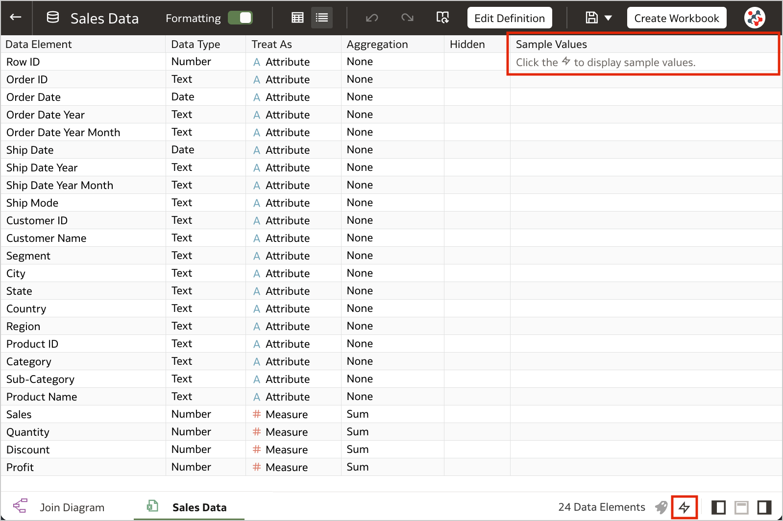 Figure 1. The toggle to switch off sample data previews.7. Blurred Thumbnails
Workbook thumbnails displayed on the home page are now blurred to protected sensitive data from being exposed to users that don't have the same access as data authors (Figure 2).
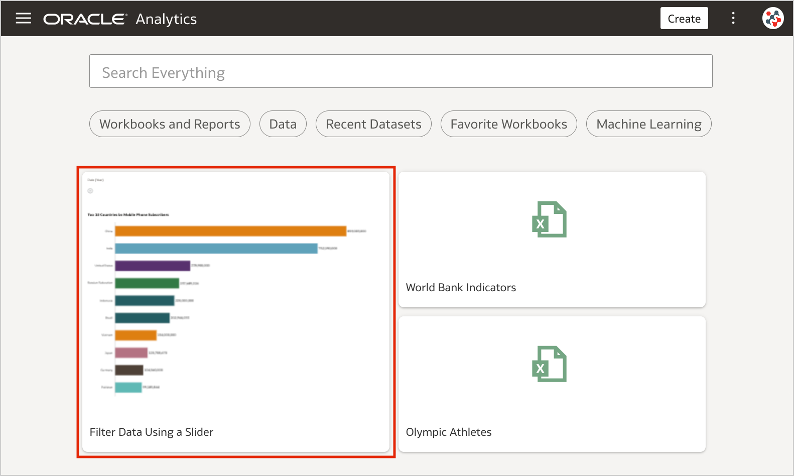 Figure 2. Blurred workbook thumbnails.
Unfortunately, the blur effect is not sufficient to make performance tile content completely indistinguishable. For additional security, administrators can disable workbook thumbnails altogether by switching off the Save Workbook Thumbnail option in the System Settings section of Data Visualization Console (Figure 3).
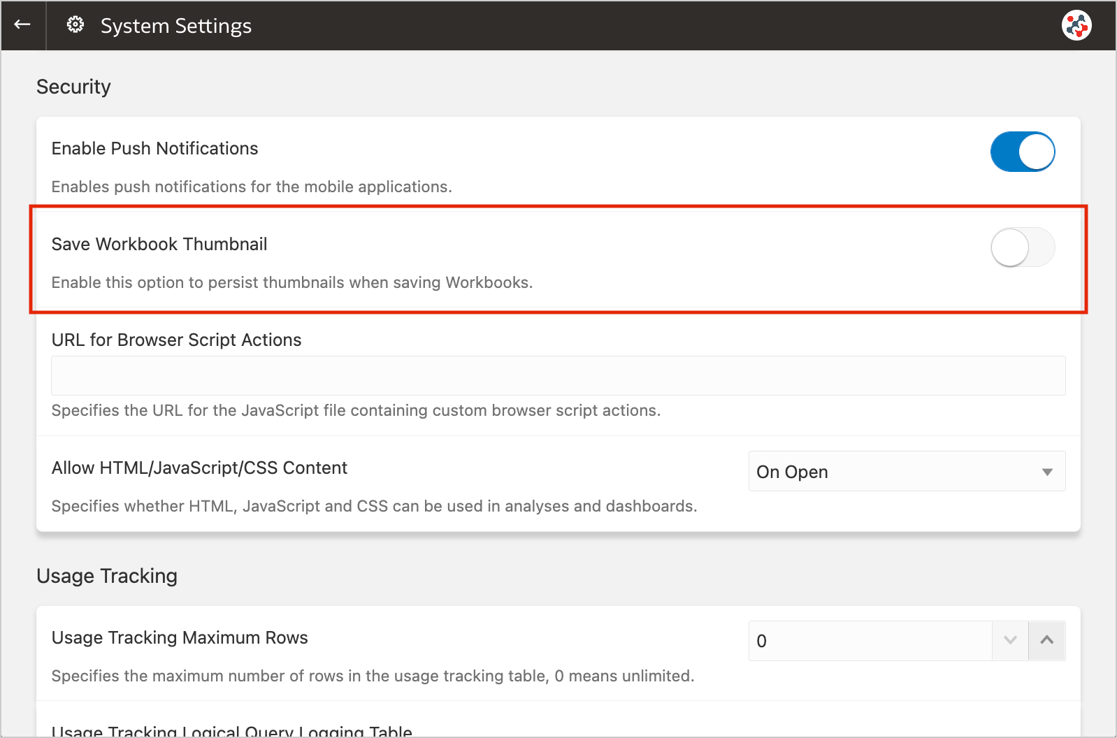 Figure 3. The new option to disable workbook thumbnails altogether.
When thumbnails are globally allowed, content authors can show or hide the thumbnail for an individual workbook as required. Click Menu on the workbook toolbar, select Workbook Properties and set Save thumbnails to On or Off (Figure 4).
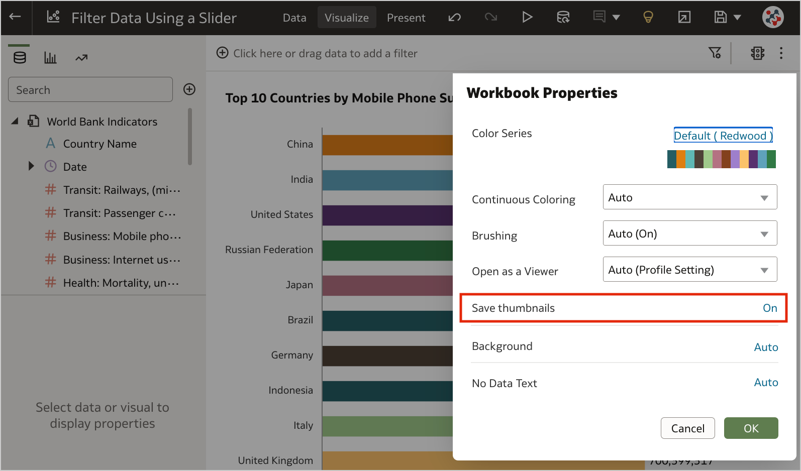 Figure 4. Showing or hiding the thumbnail for an individual workbook.6. Transform Data to Dates More Easily
Unrecognized dates can be transformed more easily using single-click Convert to Date recommendations.
5. Control Filter Interactions from the Filters BarWhen your workbook contains many filters, the Limit Values By icon in the filters bar can be used to toggle between limited filter selection values and unlimited filter selection values (Figure 5).
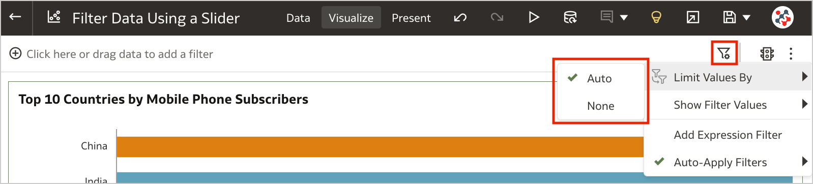 Figure 5. Control workbook filter interactions from the filter bar.4. Customize the Workbook Header Bar
Authors can show or hide the header bar, and customize it. To customize the header bar color, text, font, and image, go to the Properties panel in the Present page of the workbook and select the Presentation tab (Figure 6). End users can then view the header bar as configured by the author.
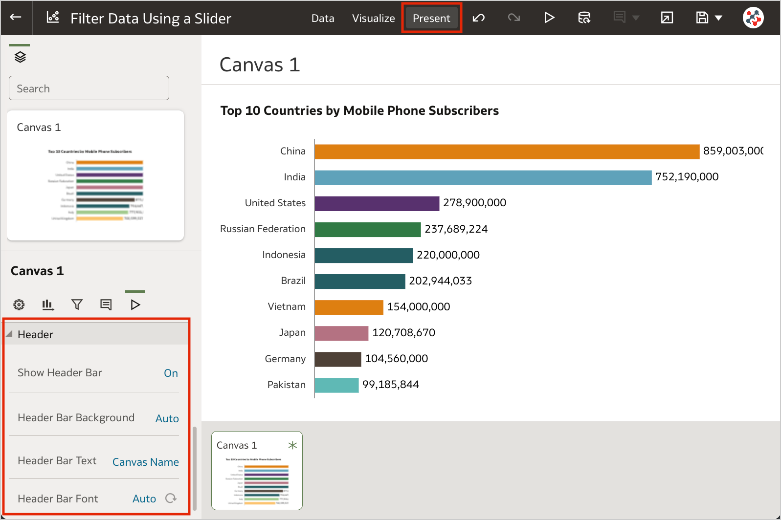 Figure 6. The options to customize the workbook header bar.3. Filter Data Using a Slider
Slider dashboard filter can be added to a canvas to animate visualizations and show dynamically how your data changes over a given dimension such as time (Clip 1).
The feature is similar to a section displayed as slider in Analytics, but more powerful: it generates more efficient queries, with a single object you can interact with multiple visualizations at the same time, and it supports tables and pivot tables as well. To make the most of it, I recommend to set up a custom End for Values Axis of your visualizations.
2. Select Columns for Auto InsightsBy default, Oracle Analytics profiles all columns in a dataset when it generates insights. Data columns to use for Auto Insights can now be selected by content authors to fine-tuning the insights that Oracle Analytics generates for you and focus only on the most useful ones (Figure 7).
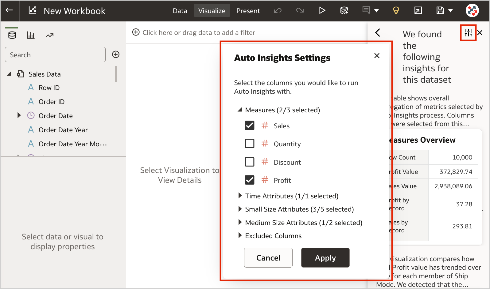 Figure 7. Selecting columns for Auto Insights.1. Export Table Visualizations to Microsoft Excel
Formatted data from table and pivot table visualizations (up to 25,000 rows) can now be exported to the Microsoft Excel (XLSX) format (Figure 8).
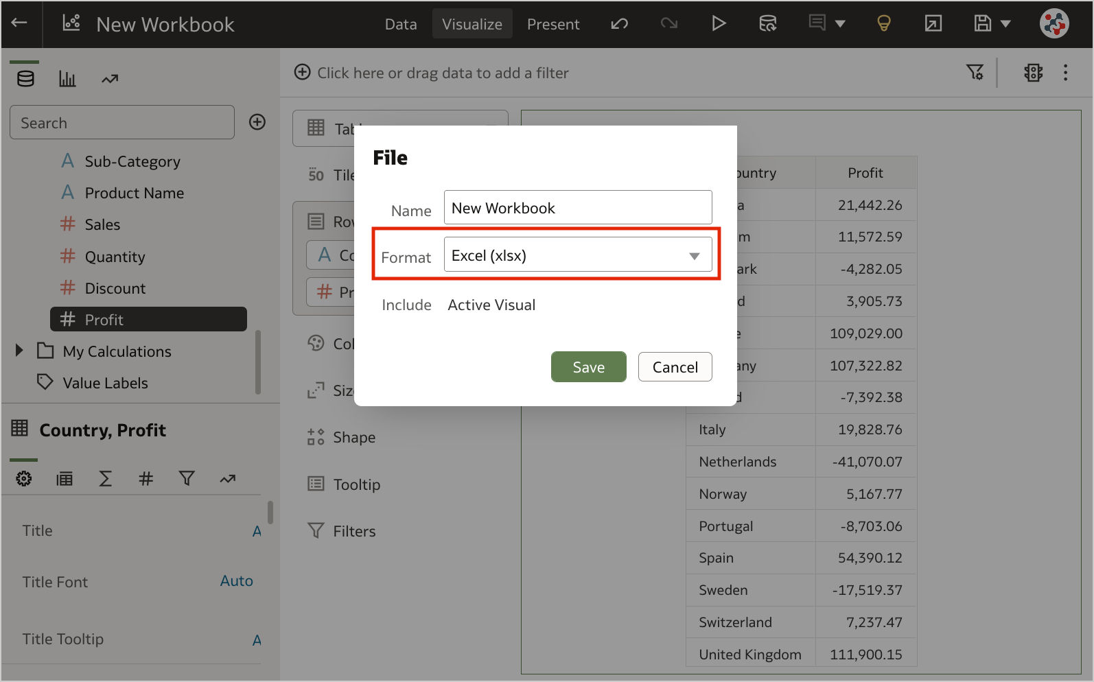 Figure 8. Exporting table visualizations to Microsoft Excel.
This feature is currently available for preview. Administrators can enable it by switching on the Preview Excel Export option in the System Settings section of Data Visualization Console (Figure 9).
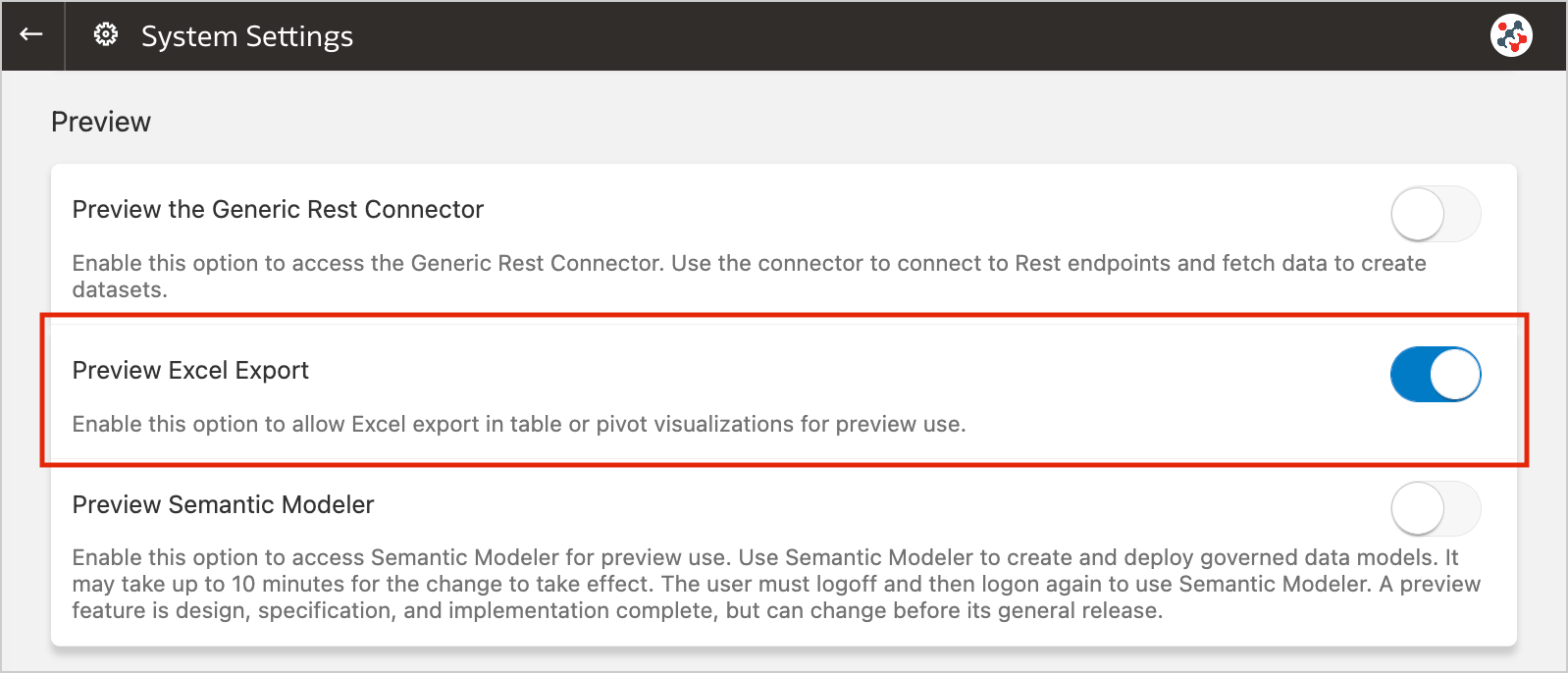 Figure 9. The new preview option to enable Excel export.Conclusion
The November 2022 Update includes several new features (and fixes) for Oracle Analytics Cloud that significantly improve Data Visualization and make it more user friendly.
If you are looking into Oracle Analytics Cloud and want to find out more, please do get in touch or DM us on Twitter @rittmanmead. Rittman Mead can help you with a product demo, training and assist within the migration process.
Leveraging Custom Python Scripts in Oracle Analytics Server
Oracle Analytics Server has enabled users to invoke custom Python/R scripts since the end of 2017. Unfortunately, this feature is not yet widely adopted, probably because the official documentation shows only how to upload a custom script, while the details about enabling the feature and embedding the script in XML format are not provided.
In this post, I'm going to illustrate how to leverage custom Python scripts in Oracle Analytics Server to give you greater control and flexibility over specific data processing needs.
Enabling Custom ScriptsThe feature to invoke custom scripts is disabled by default and Doc ID 2675894.1 on My Oracle Support explains how to enable it.
Copy the attached updateCustomScriptsProperty.py script to $ORACLE_HOME/bi/modules/oracle.bi.publicscripts/internal/wlst.
Then execute the script using the WebLogic Scripting Tool:
Linux:

$ORACLE_HOME/oracle_common/common/bin/wlst.sh $ORACLE_HOME/bi/modules/oracle.bi.publicscripts/internal/wlst/updateCustomScriptsProperty.py true $DOMAIN_HOME $ORACLE_HOME


Windows:

%ORACLE_HOME%\oracle_common\common\bin\wlst.cmd %ORACLE_HOME%\bi\modules\oracle.bi.publicscripts\internal\wlst\updateCustomScriptsProperty.py true %DOMAIN_HOME% %ORACLE_HOME%
Restart Oracle Analytics Server to enable the feature.
Installing Additional Python PackagesOracle Analytics Server 6.4 relies on Python 3.5.2 (sigh) which is included out-of-the-box with several packages. You can find them all under $ORACLE_HOME/bi/modules/oracle.bi.dvml/lib/python3.5/site-packages.
Call me paranoid or over-cautious, but to me it makes sense not to play around with the out-of-the-box version put in place by the installation. To avoid this, if any additional packages are required, I choose to firstly install another copy of the same Python version (3.5.2) in another location on the server - this way, I know I can add to or make changes without possibly affecting any other standard functionality that uses the out-of-the-box version.
Installing Python 3.5.2 on Linux in 2022 could be a bit tricky since the Python official website does not host the installers for older versions, but only the source code.
First of all download the source code for Python 3.5.2.
$ wget https://www.python.org/ftp/python/3.5.2/Python-3.5.2.tgz
Now extract the downloaded package.
$ sudo tar xzf Python-3.5.2.tgz
Compile the source code on your system using altinstall.
$ cd Python-3.5.2
$ sudo ./configure
$ sudo make altinstall
Then install all required packages using pip. My example needs langdetect and in order to make it work correctly with Python 3.5.2 I decided to install an older version of it (1.0.7). You should always verify which versions of packages used in your code are compatible with Python 3.5.2 and install them explicitly, otherwise pip will automatically pick the latest ones (which may not be compatible).
$ sudo pip3.5 install langdetect==1.0.7
Edit the obis.properties file located under $DOMAIN_HOME/config/fmwconfig/bienv/OBIS, set the PYTHONPATH variable to ensure the packages can be found by Oracle Analytics Server, and restart the services.
PYTHONPATH=$ORACLE_HOME/bi/bifoundation/advanced_analytics/python_scripts:/usr/local/lib/python3.5/site-packages
export PYTHONPATH
To be able to use a custom Python script with Oracle Analytics Server, we need to embed it in a simple pre-defined XML format.
The XML must contain one root element <script> that is the parent of all other elements:
<?xml version="1.0" encoding="UTF-8"?>
<script>
    ...
</script>
The <scriptname> element indicates the name of your script:
<scriptname>py.DetectLanguage</scriptname>
According to the documentation, <scriptlabel> should indicate the name of the script as visible for end users, but it seems to be ignored once the script has been uploaded to Oracle Analytics Server. However, if you don't include this element in the XML you will get an error notification while uploading the script.
<scriptlabel>Detect Language (py)</scriptlabel>
<target> refers to the type of script that you are embedding in the XML:
<target>python</target>
In order to use the script in data flows, it's mandatory to include the <type> element and set it to execute_script:
<type>execute_script</type>
<scriptdescription> is straightforward to understand and provides a description of the script as explained by its developer. You can also specify the version of the script in the <version> element.
<scriptdescription>
<![CDATA[
    Determine the language of a piece of text.
]]>
</scriptdescription>
<version>v1</version>
The <outputs> element lists the outputs returned by the script. In the example, the script returns one column called language. <displayName> and <datatype> elements refer to the name displayed in the user interface and the data type of the outputs.
<outputs>
    <column>
        <name>language</name>
        <displayName>language</displayName>
        <datatype>varchar(100)</datatype>
    </column>
</outputs>
The <options> element indicates the input parameters to the script. There is also a special parameter includeInputColumns which lets users choose whether to append output columns to the input dataset and return, or just return the output columns. In the example, the script requires one column input (text) and always append the output column (language) to the input dataset.
<options>
    <option>
        <name>text</name>
        <displayName>Text</displayName>
        <type>column</type>
        <required>true</required>
        <description>The input column for detecting the language</description>
        <domain></domain>
        <ui-config></ui-config>
    </option>
    <option>
        <name>includeInputColumns</name>
        <displayName>Include Input Columns</displayName>
        <value>true</value>
        <required>false</required>
        <type>boolean</type>
        <hidden>true</hidden>
        <ui-config></ui-config>
    </option>
</options>
And lastly, the <scriptcontent> element must contain the Python code. You have to import all required packages and implement your data transformation logic in the obi_execute_script function:
- The data parameter provides access to the input dataset in a Pandas DataFrame structure.
- The args parameter provides access to the input parameters as defined in the <options> XML element.
- The function must return a Pandas DataFrame structure.
- Oracle Analytics Server will automatically execute this function when you invoke the custom script.
<scriptcontent><![CDATA[
import pandas as pd
from langdetect import detect, DetectorFactory

def obi_execute_script(data, columnMetadata, args):
    language_array = []
    DetectorFactory.seed = 0
    for value in data[args['Text']]:
        language_array.append(detect(value))
    data.insert(loc=0, column='language', value=language_array)
    return data

]]></scriptcontent>
In the example above, the values in the input column are analyzed to detect their language using the langdetect package, the results are then collected into an array and returned alongside the input dataset. The source code is attached below, feel free to use it, but remember to install all required packages first!
Custom Python Scripts in ActionOnce wrapped into XML, administrators can upload custom scripts into Oracle Analytics Server. Once uploaded they can be shared and executed by other users.
In the Home page, click on the Create button and select the Script option.
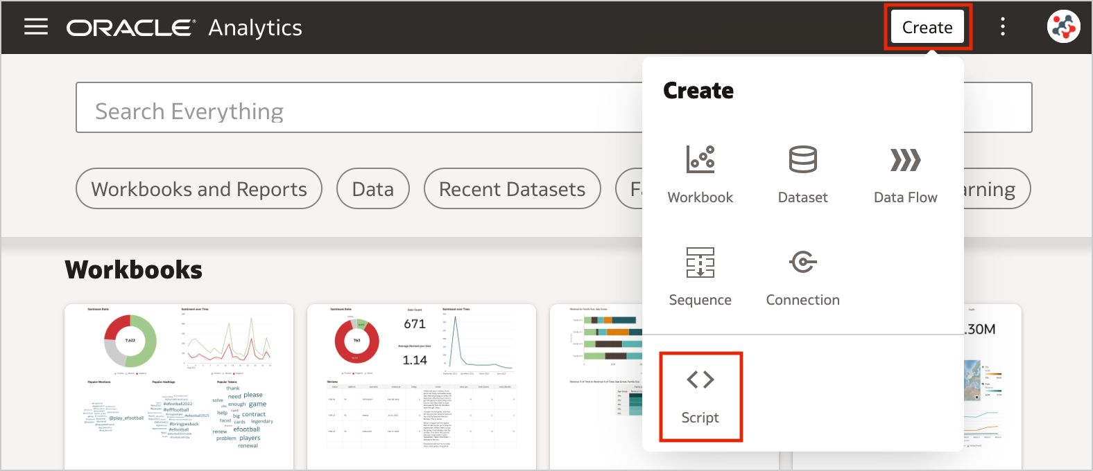 Figure 1. Uploading custom scripts into Oracle Analytics Server (step 1)
Drag and drop your custom script to the Add Script dialog, then click OK.
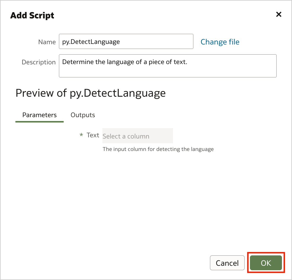 Figure 2. Uploading custom scripts into Oracle Analytics Server (step 2)
The uploaded custom script is now available for use and displayed in the Scripts tab on the Machine Learning page.
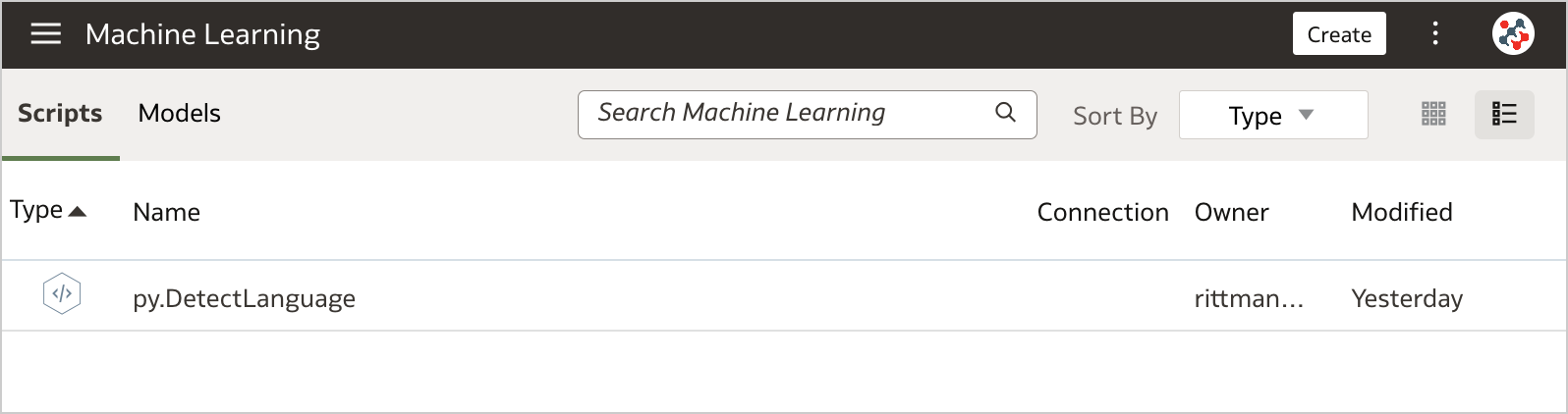 Figure 3. The Scripts tab on the Machine Learning page
To invoke the script from a data flow you have to include the Add Custom Script step.
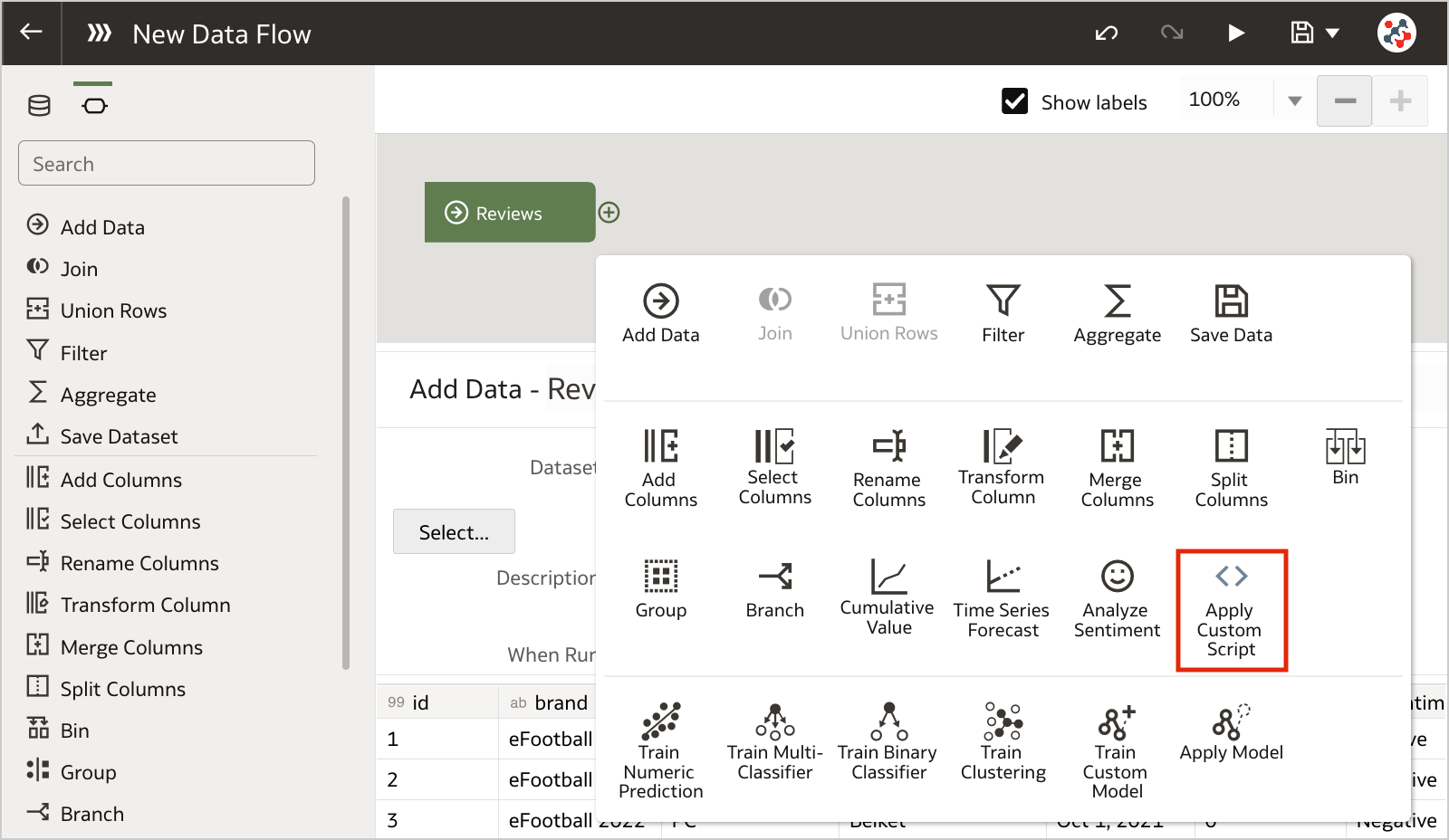 Figure 4. Invoking custom scripts in a data flow (step 1)
Select the script that you want to execute, and click OK.
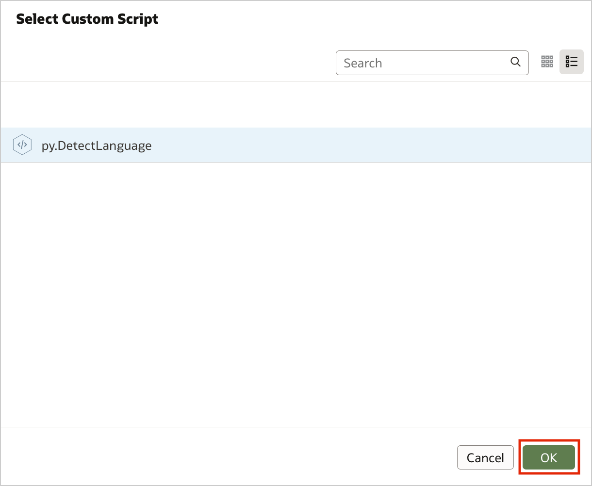 Figure 5. Invoking custom scripts in a data flow (step 2)
Configure the step by specifying any required input and the outputs that you want to include into the result set. In the example, I chose to detect the language for the review column.
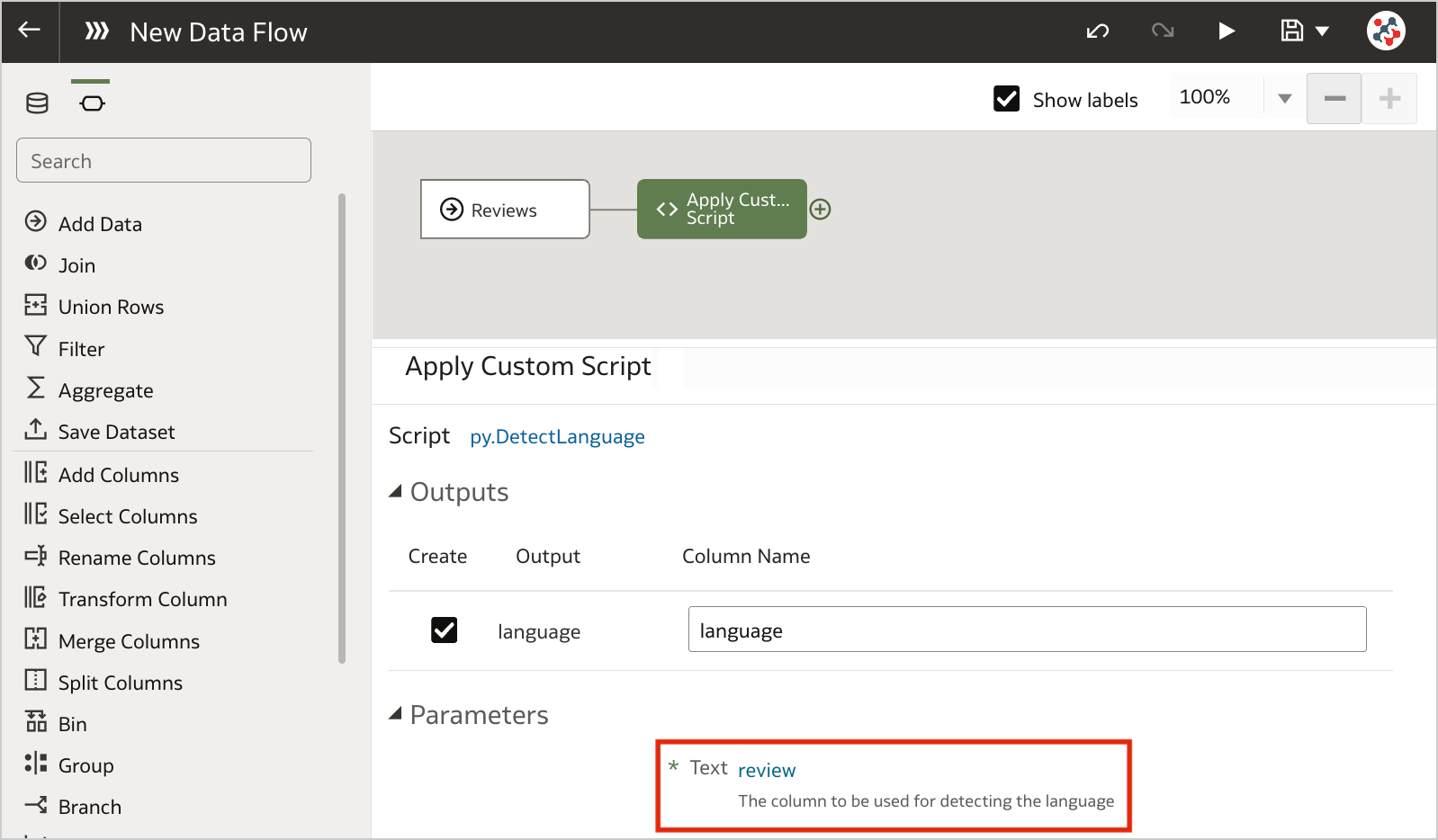 Figure 6. Invoking custom scripts in a data flow (step 3)
Save the output data by adding the Save Data step and run the data flow to execute the custom script.
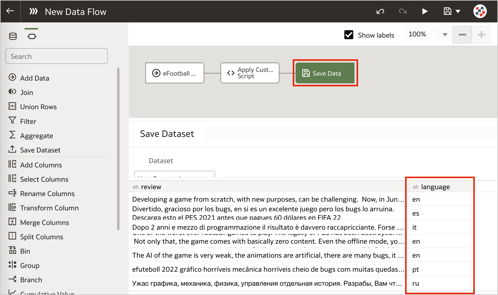 Figure 7. Invoking custom scripts in a data flow (step 4)Conclusion
Business analysts and end-users often want greater control when performing data preparation tasks. In this context, leveraging custom Python/R scripts into Oracle Analytics Server can give you full control and flexibility over specific data processing needs.
If you are looking into leveraging custom Python/R scripts into Oracle Analytics Server and want to find out more, please do get in touch or DM us on Twitter @rittmanmead. Rittman Mead can help you with a product demo, training and assist within the development process.
Rittman Mead - de Novo Partnership

26th October 2022
On behalf of Rittman Mead I am delighted to announce the market disrupting partnership of de Novo - Rittman Mead.
Oracle is a large investment for any organisation and as such it needs to be done correctly. By combining forces this new partnership gives clients access to on shore specialists across Finance, HR, Data & Analytics.
I’ve been in the Oracle market in one way or another for 16 years and one story has remained consistent throughout. When a client has a large transformation programme they usually engage with a massive SI that promise the world, but in most cases fail to deliver on that promise.
In fact in the mid naughties it was more common to find a project running at 50% over budget and six months past the deadline than one that actually went as planned.
There’s always been a hunger to get true experts working in collaboration and we see this as the start of that journey.
Meet the Team
Rittman Mead
We’ve been a leader in the Oracle BI, Data & Analytics world for 15 years and believe successful organisations see data as an opportunity, not an overhead. Over that time, we’ve helped companies do exactly that, by partnering with companies we enable them to produce understandable content from their data and drive meaningful business change.
de Novo
A real A team in the world of Oracle Finance and HR. With hundreds of hours of transformation work under their belts for clients from SMB to Enterprise. de Novo not only understand the practicalities of a great Oracle transformation they have the departmental knowledge to make sure your Finance and HR teams are listened to and included in the creation of world class solution.
With the uncertainties facing everyone over the next 12 to 18 months there has never been a more business critical time to do projects correctly from day one, Rittman Mead and de Novo not only offer a true best in breed team, built with the top 10% of consultants in their respective niches. They deliver a real client - consultancy partnership.
For additional information please feel free to contact;
Oliver Matthews - Business Development - Rittman Mead
oliver.matthews@rittmanmead.com
+44 (0) 7766060749
Michelle Clelland - Marketing Experience Lead - de Novo Solutions
michelle.celland@de-novo-solutions.com
+44 (0) 1633492042
Commute Vs Energy App

23% of UK workers are considering ditching WFH to save on heating bills!!! Was the title of a news article that appeared on my phone at the end of August.
Back then, and I say back then because the rate at which things are changing in the UK make a month feel more like a years worth of policy and financial worry. The fear was, energy prices could continue to rise every quarter until we’d all be selling a kidney every time we wanted a bath.
For a second it made me think this could actually have some legs.
Then it made me wonder. What about the cost of commuting?
For instance I used to live in Tunbridge Wells and I remember clearly the train season ticket being £6000 to get to London. So, would 10 back to the office hours including commuting actually save me anything or would it just cost me more?
The answer in that scenario was obviously a resounding no! Going to the office was the financially un responsible move.
But there must be some situations where going back to the office makes sense. 23% of UK workers can’t be completely mad. Can they? What home to work distance makes going to the office to get warm economically viable? How much of a difference does the way you get to work make? For instance walking is free, a 6.2 ltr V8 is not so free.
There were too many factors to fit onto a single A4 sheet of paper, so as is the case in many businesses, I released my Excel abilities (predominately the =sum() one). I produced a good data set, with the ability to recalculate based on the miles to office, chosen vehicle, lunch and parking if appropriate.
For me commuting failed to win the economically viable game even after I removed all vehicle related expenses other than fuel. But it was fun and I wanted to share it.
Luckily for me we have a Lucas at Rittman Mead.
For the uninitiated a Lucas is an APEX guru able to spin up even the most random of concepts into a well designed, functional APEX application. Over a few days of listening to Oliver the Sales / Amateur Product Owner explain how he wanted a slidey thing for this and a button for that. Lucas was able to produce my vision in a way others could enjoy.
So here it is the Commute vs Energy application brought to you by the APEX Team at Rittman Mead.
https://commute.ritt.md/ords/r/energy_tool/calc/home?session=404835286670167
Disclamer
The Commute vs Energy app is the brain child of a non technical Sales man who’d had a lot of coffee. So while it does give you a calculated answer based on your options it is in no way an exhausted analysis of every possible penny involved in your WFH or not decision. It’s a fun slightly informative tool for your pleasure.
How to Sense-Check Your Data Science Findings
One of the most common pitfalls in data science is investing too much time investigating a dead-end. It happens to the best of us; you're convinced that you've found something amazing and profound that will revolutionise the client's business intelligence...And then, in an awkward presentation to a senior stakeholder, somebody points out that your figures are impossible and somewhere along the way you've accidentally taken a sum instead of an average. Here are a few tricks you can and should use to make this kind of embarrassment less likely.
Visualise Early and OftenThe sooner you plot your data, the quicker you will notice anomalies. Plot as many variables as you have time for, just to familiarise yourself with the data and check that nothing is seriously wrong. Some useful questions to ask yourself are:
• Is anything about these data literally impossible? E.g., is there an 'age' column where someone is over 200 years old?
• Are there any outliers? Sometimes data that has not been adequately quality-checked will have outliers due to things like decimal-point errors.
• Are there duplicates? Sometimes this is to be expected, but you should keep it in mind in case you end up double-counting duplicate entries.
I once worked on a project that found that social deprivation scores negatively correlated with mental health outcomes, i.e., more deprived groups had better mental health scores. This was exactly the kind of surprising result that would have made for a great story, with the unfortunate caveat that it wasn't at all true.
It turned out that I had mis-coded a variable; all my zeroes were ones, and all my ones were zeroes. Fortunately I spotted this before the time came to present my findings, but this story illustrates an important lesson:
Findings that are interesting and findings that are erroneous share a common property: both are surprising.
'Ah, this is impossible- this number can never go above ten' is one of the most heart-breaking sentences I've ever heard in my career.
It's often the case that someone more familiar with the data will be able to spot an error that an analyst recently brought onto a project will miss. It is essential to consult subject-matter experts often to get their eyes on your findings.
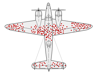
Check for Missing DataThere is a legendary story in data collection about Survivorship Bias. In WWII, a group called the Statistical Research Group was looking to minimise bombers lost to enemy gunfire. A statistician name Abraham Wald made the shrewd observation that reinforcements should be added to the sections of planes that returned from missions without bullet holes in them, rather than- as intuition might suggestion- the parts riddled with bullets. This was because those planes were the ones that returned safely, and so the parts that were hit were not essential to keeping the pilot alive.
 https://en.wikipedia.org/wiki/Survivorship_bias
Missing data can poison a project's findings. There are a lot of reasons data could be missing, some more pernicious than others. If data is missing not-at-random (MNAR) it may obscure a systematic issue with data collection. It's very important to keep this in mind with something like survey data, where you should expect people who abandon the survey to be qualitatively different to people who complete it.
Understand Where the Data Came From and WhyDid you assemble this dataset yourself? If so, how recently did you assemble it, and do you still remember all of the filters and transformations you applied to get it in its current form? If someone else assembled it, did they document what steps they took and are they still around to ask? Sometimes a dataset will be constructed with a certain use case in mind different from your use case, and without knowing the logic that went into making it you run the risk of building atop a foundation of errors.
Beware the Perils of Time TravelThis one isn't a risk for all kinds of data, but it's a big risk for data with a date component- especially time series data. In brief, there is a phenomenon called Data Leakage wherein a model will be built such that it unintentionally cheats by using future data to predict the past. This trick only works when looking retrospectively because in the real world, we cannot see the future. Data leakage is a big enough topic to deserve its own article, but just be aware that you should look it up before building any machine learning models.
ConclusionIt is impossible to come up with a fully-general guard against basic errors, and kidding yourself into thinking you have one will only leave you more vulnerable to them. Even if you do everything right, some things are going to slip you by. I encourage you to think of any additions you might have to this list.
A Few Words About OAC Embedding
Esc, then type :q! to just exit or :wq to save changes and exit and then press Enter.Some time ago and by that I mean almost exactly approximately about two years ago Mike Durran (https://insight2action.medium.com) wrote a few blogs describing how to embed Oracle Analytics Cloud (OAC) contents into public third-party sites.
For anyone who needs to embed OAC reports into their sites, these blogs are a must-read and a great source of valuable information. Just like his other blogs and the official documentation, of course.

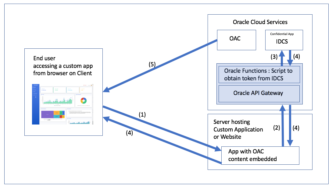
If you have ever tried it, you most likely noticed that the embedding process is not exactly easy or intuitive. Roughly it consists of the following steps:
- Create content for embedding.
- Setup infrastructure for authentication:
2.1. Create an Oracle Identity Cloud Service (IDCS) application.
2.2.Create an Oracle Functions function.
2.3. Set up Oracle API Gateway. - Embed JavaScript code to the third-party site.
Failing to implement any of the above leads to a fully non-functional thing.
And here is the problem: Mike knows this well. Too well. Some things that are entirely obvious to him aren't obvious to anyone trying to implement it for the first time. When you know something at a high level, you tend to skip bits and bobs here and there and various tasks look easier than they are.
 A small story
When I was studying at the university, our techer told us a story. Her husband was writing a math book for students and wrote the infamous phrase all students love: "... it is easy to prove that ...". She said to him that, if it was easy to prove, he should do it.
A small story
When I was studying at the university, our techer told us a story. Her husband was writing a math book for students and wrote the infamous phrase all students love: "... it is easy to prove that ...". She said to him that, if it was easy to prove, he should do it.He spent a week proving it.
That is why I think that I can write something useful on this topic. I'm not going to repeat everything Mike wrote, I'm not going to re-write his blog. I hope that I can fill in a few gaps and show some it is easy to do things.
Also, this blog is not intended to be a complete step-by-step guide. Or, at least, I have no intention of writing such a thing. Although, it frequently happens that I'm starting to write a simple one-paragraph hint and a few hours later I'm still proofreading something with three levels of headers and animated screen captures.
Disclaimer. This blog is not a critique of Mike's blog. What he did is hard to overestimate and my intention is just to fill some gaps.Not that I needed to make the previous paragraph a disclaimer, but all my blogs have at least one disclaimer and once you get locked into a serious disclaimers collection, the tendency is to push it as far as you can.
Testing out Token GenerationMy main problem with this section is the following. Or, more precisely, not a problem but a place that might require more clarification in my opinion.
You’ll see that the token expires in 100 seconds and I describe how to increase that in a separate blog. For now, you can test this token will authenticate your OAC embedded content by copying the actual token into the following example HTML and deploying on your test web server or localhost (don’t forget to add suitable entries into the OAC safe domains page in the OAC console)I mean why exactly 100 seconds is a bad value? What problem does increasing this value solve? Or, from the practical point of view, how do we understand that our problem is the token lifespan?
It is easy and confusing at the same time. The easy part is that after the token is expired, no interaction with the OAC is possible. It is not a problem if you embed non-interactive content. If the users can only watch but do not touch, the default value is fine. However, if the users can set filters or anyhow interact with reports, tokens must live longer than the expected interaction time.
Here is what it looks like when the token is OK:
And the same page a few minutes later:
Assuming that we don't know the right answer and need to find it, how do we do it? The browser developer console is your friend! The worst thing you can do to solve problems is to randomly change parameters and press buttons hoping that it will help (well, sometimes it does help, but don't quote me on that). To actually fix it we need to understand what is going on.
To be fair, at first sight, the most obvious and visible message is totally misleading. Normally, we go to the Console tab (Ctrl+Shift+J/Command+Option+J) and read what is written there. But if the token is expired, we get this:
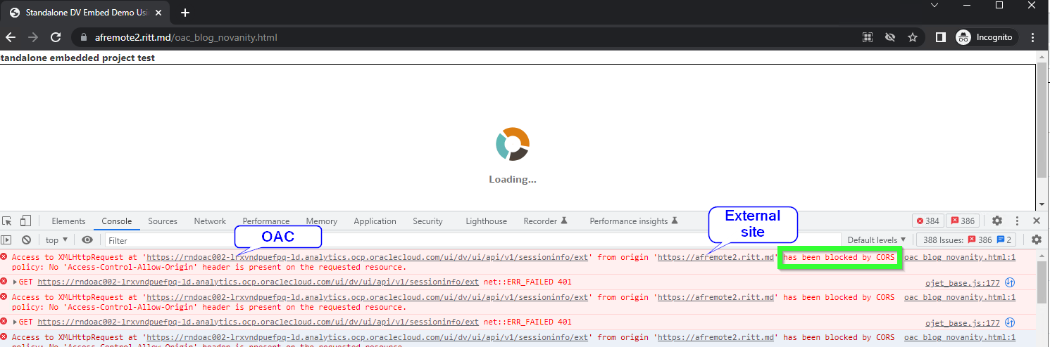
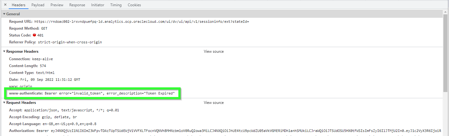
The console shows multiple CORS errors: Access to XMLHttpRequest at 'https://OAC-INSTANCE-NAME.analytics.ocp.oraclecloud.com/ui/dv/ui/api/v1/sessioninfo/ext' from origin 'https://THIRD-PARTY-SITE' has been blocked by CORS policy: No 'Access-Control-Allow-Origin' header is present on the requested resource. CORS stands for Cross-Origin Resource Sharing. In short, CORS is a security mechanism implemented in all modern browsers which allows for specifying if content from one server may be embedded into another server.
So looking at this we might assume that the solution would be either specify Safe domains in OAC or set CORS policy for our Web server, or both. In reality, this message is misleading. The real error we can get from the Network tab.
Let's take a look at the first failed request.
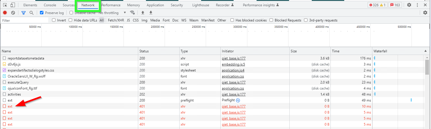
Simply click it once and check the Headers tab. Here we can clearly see that the problem is caused by the token, not by CORS. The token is expired.
The same approach shows when there is something wrong with the token. For example, once I selected a wrong OAC instance for the Secure app. Everything was there. All options were set. All privileges were obtained. The token generation was perfect. Except it didn't work. The console was telling me that the problem was CORS. But here I got the real answer.
Oracle Functions ServiceI feel like this is the part which can use more love. There are a few easy-to-miss things here.
And the most important thing is why do we need Oracle Functions at all? Can't we achieve our goal without Functions? And the answer is yes, we can. Both Oracle Functions and API Gateways are optional components.
In theory, we can use the Secure application directly. For example, we can set up a cron job that will get the token from the Secure application and then embed the token directly into static HTML pages using sed or Python or whatever we like. It (theoretically) will work. Note, that I didn't say it was a better idea. Or even a good one. What I'm trying to say is that Functions is not an essential part of this process. We use Oracle Functions to make the process more manageable, but it is only one of the possible good solutions, not the only one.
So what happens at this step is that we are creating a small self-containing environment with a Node.js application running in it. It all is based on Docker and Fn Project, but it is not important to us.
The function we are creating is a part required to simplify the result.
High-level steps are:
- Create an application.
- Open the application and either use Cloud Shell (the easy option) or set up a development machine.
- Init a boilerplate code for the function.
- Edit the boilerplate code and write your own function.
- Deploy the code.
- Run the deployed code.
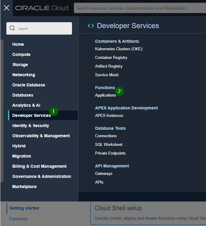
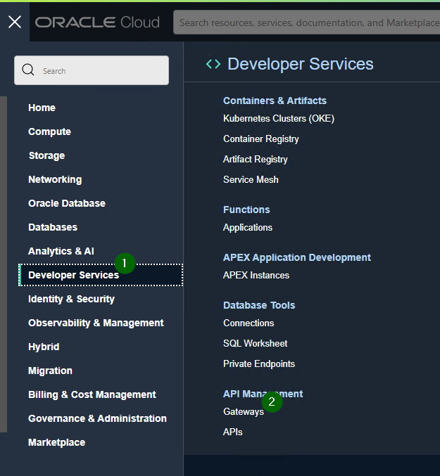
Creating a new function is easy. Go to Developer Services -> Applications
Create a new function and set networking for it. The main thing to keep in mind here is that the network should have access to Oracle Cloud Infrastructure Registry. If it doesn't have access, you'll get Fn: Error invoking function. status: 502 message: Failed to pull function image error message when trying to run the function: Issues invoking functions.
The first steps with Oracle functions are simple and hard at the same time. It is simple because when you go to Functions, you see commands which should be executed to get it up and running. It is hard because it is not obvious what is happening and why. And, also, diagnostics could've been better if you ask me.
After you create an application, open it, go to the Getting started, press Launch Cloud Shell and do what all programmers do: copy and paste commands trying to look smart and busy in the process. Literally. There are commands you can copy and paste and get a fully working Hello World example written in Java. Just one command has a placeholder to be changed.

Hint: to make your life easier first do step #5 (Generate an Auth Token) and then come back to the steps 1-4 and 6-11.
If everything is fine, you will see "Hello, world!" message. I wonder, does it make me a Java developer? At least a junior? I heard that is how this works.
OK, after the Java hello-world example works, we can add Node.js to the list of our skills. Leave the Java hello-world example and initialize a new node function:
cd
fn init --runtime node embed_func
This creates a new Node.js boilerplate function located in the embed_func directory (the actual name is not important you can choose whatever you like). Now go to this directory and edit the func.js file and put Mike's code there.
cd embed_func
vim func.js

- do some vim magic
- try to exit vim
I don't feel brave enough to give directions on using vim. If you don't know how to use vim but value your life or your reason, find someone who knows it.
But because I know that many wouldn't trust me anyways, I can say that to start editing the text you press i on the keyboard (note -- INSERT -- in the bottom of the screen) then to save your changes and exit press Esc (-- INSERT -- disappears) and type :wq and press Enter. To exit without saving type :q! and to save without exiting - :w . Read more about it here: 10 Ways to Exit Vim Editor
 Image source: https://www.linuxfordevices.com/tutorials/linux/exit-vim-editor
Most likely, after you created a new node function, pasted Mike's code and deployed it, it won't work and you'll get this message: Error invoking function. status: 504 message: Container failed to initialize, please ensure you are using the latest fdk and check the logs
I'm not a Node.js pro, but I found that installing NOT the latest version of the node-fetch package helps.
cd embed_func
npm install node-fetch@2.6.7
At the moment of writing this, the latest stable version of this package is 3.2.10: https://www.npmjs.com/package/node-fetch. I didn't test absolutely all versions, but the latest 2.x version seems to be fine and the latest 3.x version doesn't work.
If everything was done correctly and you managed to exit vim, you can run the function and get the token.
fn invoke <YOUR APP NAME> <YOUR FUNCTION NAME>
This should give you a token every time you run this. If it doesn't, fix the problem first before moving on.
Oracle API GatewayAPI Gateway allows for easier and safer use of the token.
Just like Functions, the API Gateways is not an essential part. I mean after (if) we decided to use Oracle Functions, it makes sense to also use Gateways. Setting up a gateway to call a function only takes a few minutes, no coding is required and things like CORS or HTTPS are handled automatically. With this said API Gateways is a no-brainer.
In nutshell, we create an URL and every time we call that URL we get a token. It is somewhat similar to where we started. If you remember, the first step was "creating" an URL that we could call and get a token. The main and significant difference is that now all details like login and password are safely hidden behind the API Gateway and Oracle Functions.
Before Functions and Gateway it was:
curl --request POST \
 --url https://<IDCS-domain>.identity.oraclecloud.com/oauth2/v1/token \
 --header 'authorization: Basic <base64 encoded clientID:ClientSecret>' \
 --header 'content-type: application/x-www-form-urlencoded;charset=UTF-8' \
 -d 'grant_type=password&username=<username>&password=<password>&scope=\
 <scope copied from resource section in IDCS confidential application>'
With API Gateways the same result can be achieved by:
curl --request https://<gateway>.oci.customer-oci.com/<prefix>/<path>
Note, that there are no longer details like login and password, clientID and ClientSecret for the Secure application, or internal IDs. Everything is safely hidden behind closed doors.
API Gateways can be accessed via the Developer Services -> [API Management] Gateways menu.
We click Create Gateway and fill in some very self-explanatory properties like name or network. Note, that this URL will be called from the Internet (assuming that you are doing this to embed OAC content into a public site) so you must select the network accordingly.
After a gateway is created, go to Deployments and create one or more, well, deployments. In our case deployment is a call of our previously created function.
There are a few things to mention here.
Name is simply a marker for you so you can distinguish one deployment from another. It can be virtually anything you like.
Path prefix is the actual part of the URL. This has to follow rather strict URL rules.
The other very important thing is CORS. At the beginning of this blog I already mentioned CORS but that time it was a fake CORS message. This time CORS is actually important.
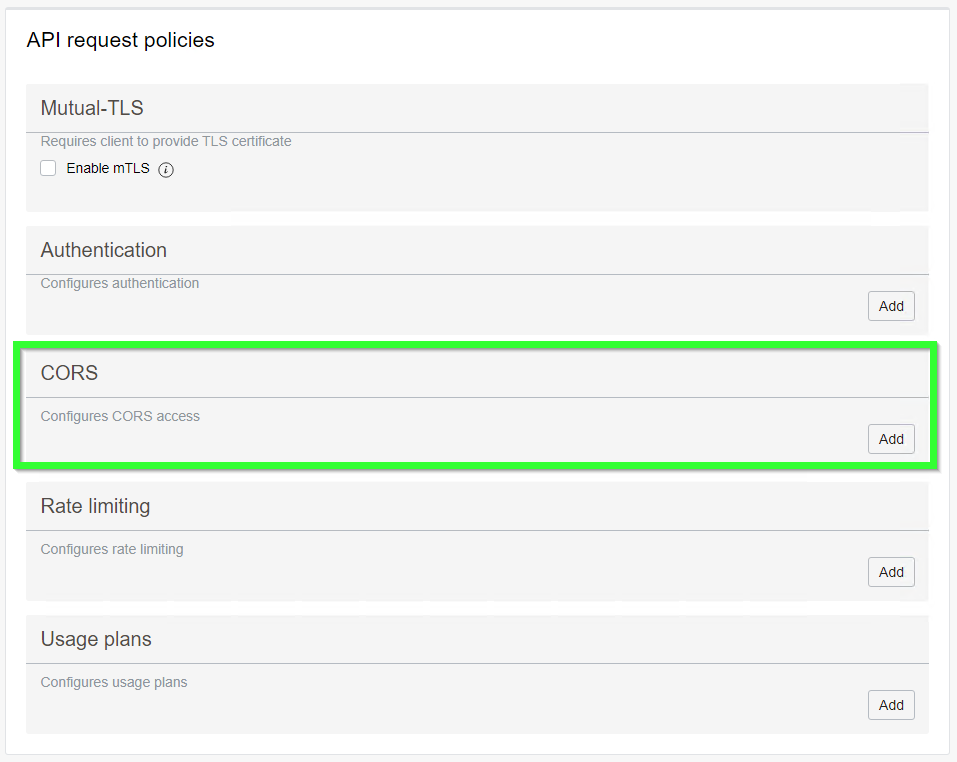
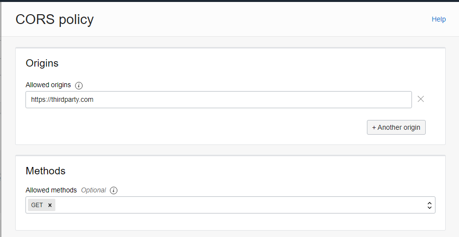
If we are embeddig OAC content into the site called https://thirdparty.com, we must add a CORS policy allowing us to do so.
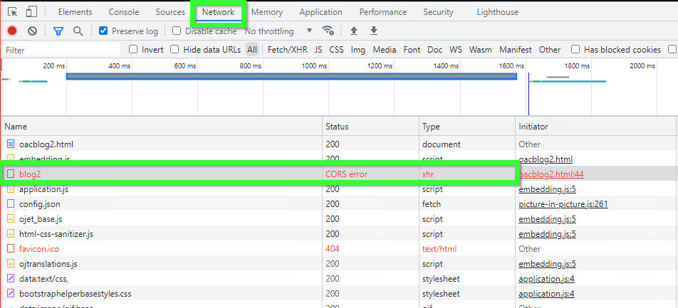
If we don't do it, we will get an actual true authentic CORS error (the Network tab of the browser console):
The other very likely problem is after you created a working function, exited vim, created a gateway and deployment, and defined a deployment, you are trying to test it and get an error message {"code":500,"message":"Internal Server Error"}:
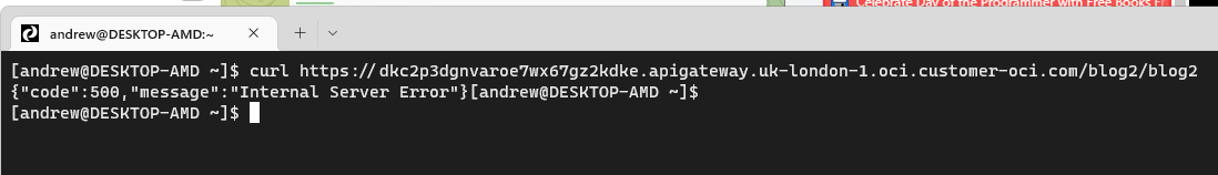
If you are getting this error, it is possible that the problem is caused by a missing policy:
Go to
And create policy like this:
ALLOW any-user to use functions-family in compartment <INSERT YOUR COMPARTMENT HERE> where ALL { request.principal.type= 'ApiGateway'}
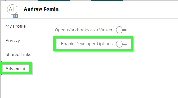
It is rather easy to copy pieces of embedding code from the Developer menu. However, by default this menu option is disabled.
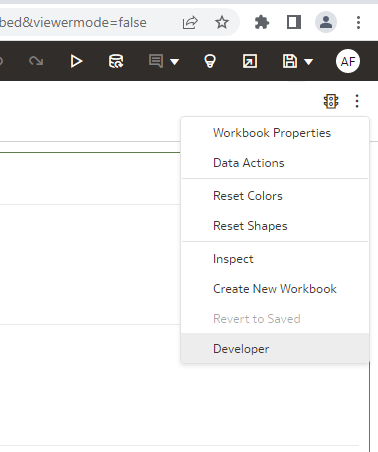
It can be enabled in the profile. Click your profile icon, open Profile then Advanced and Enable Developer Options. It is mentioned in the documentation but let's be real: nobody reads it.
If you simply take the embedding script, it won't work.
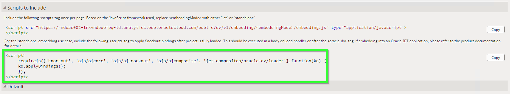
This code lacks two important modules: jquery and obitech-application/application. If either of them is missing you will get this error: Uncaught TypeError: application.setSecurityConfig is not a function. And by the way, the order of these modules is not exactly random. If you put them in an incorrect order, you will likely get the same error.
After walking this path with a million ways to die we get this beautifully looking page: Niðurstaða stafrænna húsnæðisáætlana 2022
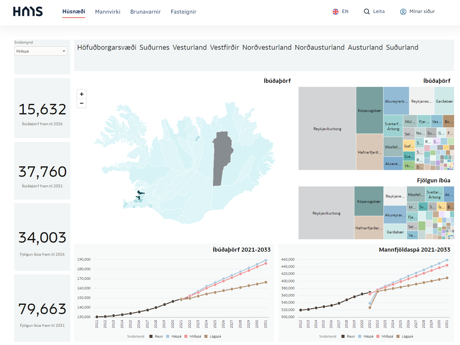 https://hms.is/husnaedi/husn%C3%A6%C3%B0isa%C3%A6tlanir/m%C3%A6labor%C3%B0-husn%C3%A6%C3%B0isa%C3%A6tlana/ni%C3%B0ursta%C3%B0a-stafr%C3%A6nna-husn%C3%A6%C3%B0isa%C3%A6tlana-2022
 OAC Semantic Modeler and Version Control with Git
This is my third blog post in the series of posts about OAC's Semantic Modeler. The first one was an overview of the new Semantic Modeler tool, the second was about the new SMML language that defines Semantic Modeller's objects. This post is about something that OBIEE developer teams have been waiting for years - version control. It looks like the wait is over - Semantic Modeler comes with native Git support.
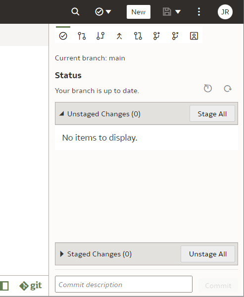
When you open Semantic Modeler from OAC, you will see two toggle buttons in the bottom right corner:

The right toggle is for Git Panel, where version control magic takes place.
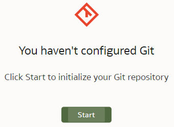
Enabling Git for a Semantic ModelVersion control with Git can be enabled for a particular Semantic Model, not the whole Modeller repository. When first opening the Git Panel, it will inform you it requires configuration.
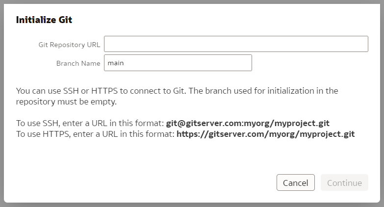
Click Start and you will be asked for a Git Repository URL and the name of the main branch. I created my test repository on Github but you may have your own company internal Git server. The easiest way to establish version control for a Model is to create an empty Git repository beforehand - that is what I did. In the "Initialize Git" prompt, I copied the full https URL of my newly created, empty (no README.md in it!) Github repository and clicked "Continue".
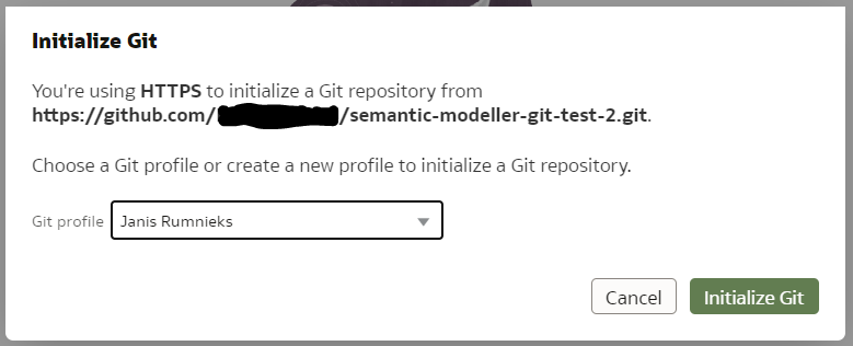
If the repository URL is recognised as valid, you will get the next prompt to choose a Git profile, which is your Git logic credentials. To create a new profile, add your git user name and password (or Personal Access Token if you are using Github) to it and name your profile.
Click "Initialize Git". After a short while, a small declaration of success should pop up...

... and the Git Panel will now have a typical set of Git controls and content.
Next, let us see it in action.
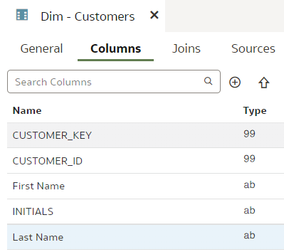
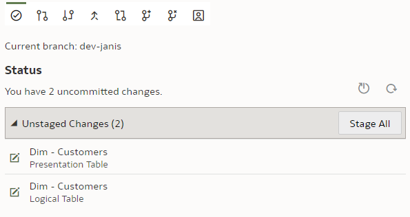
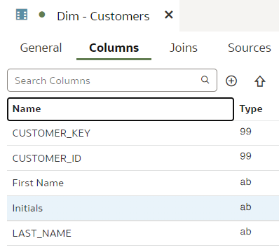
Git and Semantic Modeler - the BasicsThe basics of Semantic Modeler's version control are quite intuitive and user friendly. Let us start by implementing a simple change to our Customers dimension, let us rename a column.
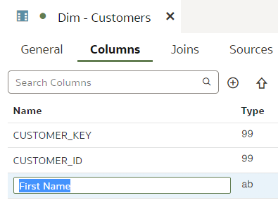
We type in the column name, press Enter. We see that the Unstaged Changes list in the Git Frame is still empty. We press Ctrl+S to save our changes and the Unstaged Changes list gets updated straight away.
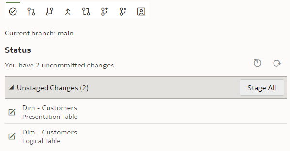
We click on "Stage All". At the bottom of the Git panel, "Commit description" input and "Commit" button appear.
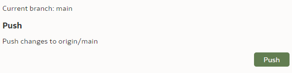
We enter a description, click "Commit" and get a message:
However, the changes have not yet been pushed to the Git server - we need to push them by clicking the "Push" button.
Now let us check the repository content in the Git server.
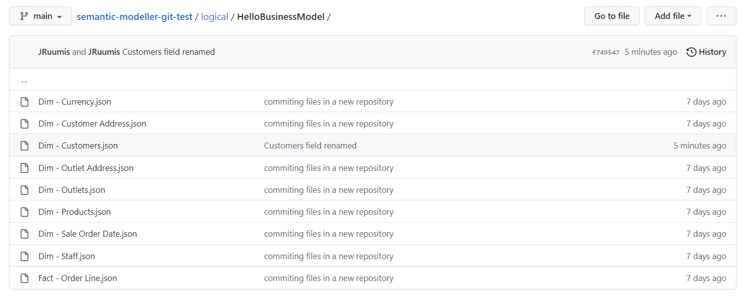
We can see the "Dim - Customers.json" SMML file has just been updated.
Git and Semantic Modeler - Working with BranchesAt Rittman Mead we are evangelists of Gitflow - it works well with multiple developers working independently on their own features and allow us to be selective about what features go into the next release. The version control approach we have developed for OBIEE RPD versioning as part of our BI Developer Toolkit relies on Gitflow. However, here it is not available to us. No worries though - where there is a will, there is a way. Each of our devs can still have their own branch.
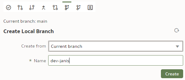
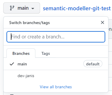
Before we start playing with branches, let us make sure our main branch is saved, checked in and pushed. To create a new branch, we click on the "Create Local Branch" button.
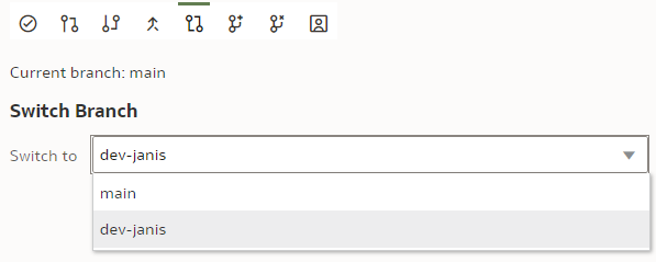
We base it on our current "main" branch. We name it "dev-janis" and click "Create".
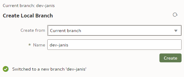
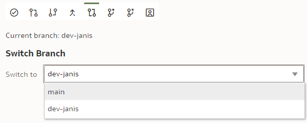
If successful, the Current branch caption will change from "main" to "dev-janis". (An important part of version control discipline is to make sure we are working with the correct branch.)
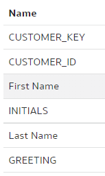
In our dev branch, let us rename the "LAST_NAME" column to "Last Name".
Save.
Stage. Commit. Push.
Once pushed, we can check on the Git server, whether the new branch has been created and can explore its content.
We can also switch back to the "main" branch to check that the "LAST_NAME" column name remains unchanged there.
Git and Semantic Modeler - Merge ChangesThe point of having multiple dev branches is to merge them at some point. How easy is that?
Let us start with changes that should merge without requiring conflict resolution.
In the previous chapter we have already implemented changes to the "dev-janis" branch. We could merge it to the "main" branch now but Git would recognise this to be a trivial fast-forward merge because the "main" branch has seen no changes since we created the "dev-janis" branch. In other words, Git does not need to look at the repository content to perform a 3-way merge - all it needs to do is repoint the "main" branch to the "dev-janis" branch. That is too easy.
Before merging, we will implement a change in the "main" branch.
We switch to the "main" branch.
We rename the "INITIALS" column to "Initials".
Save. Stage. Check in. Push.
Let us remind ourselves that in the "dev-janis" branch, the INITIALS column is not renamed and the LAST_NAME column is - there should be no merge conflicts.
To merge the "dev-janis" branch into the "main" branch, we switch to the "main" branch. We click the "Merge" button.
We select the Merge branch to be "dev-janis" and click "Merge".
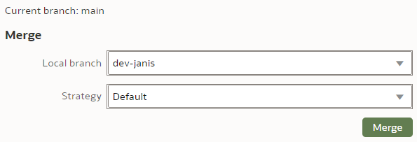
The Merge Strategy value applies to conflict resolution. In our simple case, there will be no merge conflicts so we leave the Strategy as Default.
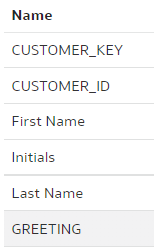
After the merge, I could see moth the "INITIALS" and the "LAST_NAME" columns renamed - the merge worked perfectly!
Save. Stage. Check In. Push.
Well, how easy was that!? Anybody who has managed an OBIEE RPD multidev environment will the new Semantic Modeler.
Git and Semantic Modeler - Merge Conflict ResolutionAt last we have come to merges that require conflict resolution - the worst nightmare of OBIEE RPD multidev projects. How does it work with OAC's Semantic Modeler?
Let us create a trivial change that will require conflict resolution - we will rename the same column differently in two branches and then will merge them. The default Git merge algorithm will not be able to perform an automatic 3-way merge.
We use our trusted Customers dimension, we select the "main" branch and change the column "DOB" name to "Date of Birth".
"main" branch:
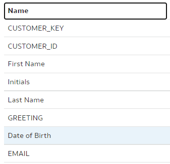
Save. Stage. Check in. Push.
In the "dev-janis" branch, we rename the same "DOB" column to "DoB".
"dev-janis" branch:
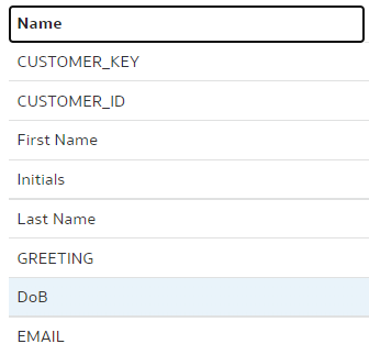
To merge, we switch back to the "main" branch. (Pull if necessary.) As the branch to be merged with, we choose "dev-janis".
As for Merge Strategy, we have 3 options here: Default, Ours and Theirs. (In our example, Ours would be the "main" branch whereas Theirs would be the "dev-janis".) We can use the Ours and Theirs strategies if we are 100% certain in case of a conflict we should always prefer the one or the other branch. In most cases however, we want to see what the conflicts are before deciding upon the resolution, therefore I expect the Default Strategy will almost always be used. You can read more about Merge Strategies in OAC's documentation here.
We call the Merge command.
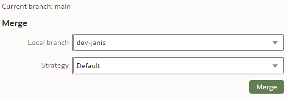
As expected, we get merge errors - two of them. (The reason there are two is because our Business Layer column names are automatically propagated to the Presentation Layer - hence we get two errors - one from Business Layer and the other from Presentation.)
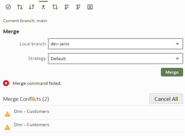
We click on the first conflict. Lo and behold - we get a proper A/B conflict merge window that does a decent job at showing us the merge conflict. However, I did find it to be a bit buggy - the "Resolve Item" and "Resolve All" buttons only work when you click on their edges. Also the A and B version toggle buttons did not work at all for me.
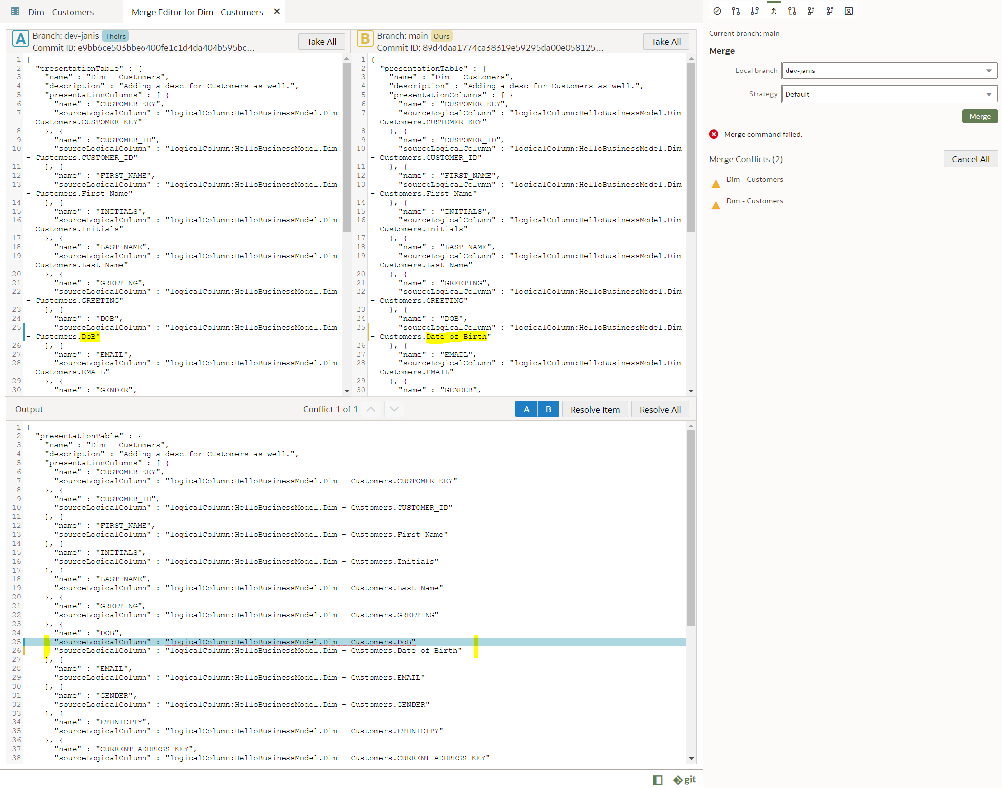
However, I got it working by using the Take All buttons, which worked fine for me, since there was only a single conflict to resolve. I wanted the B version so I clicked the Take All button in the B frame and then clicked the Resolve Item button and then pressed Ctrl+S. That did the trick and the error disappeared from the Merge Conflicts list. The same I did with the Presentation Layer conflict. After that, there were no more Merge conflicts in the Merge frame and I got a message there: "Merge successful".
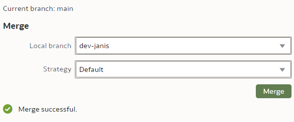
And successful it was. This is the end result - the Customer dimension in the "main" branch after a conflict-resolved merge.
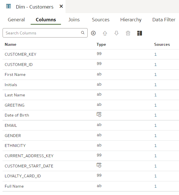
Version control merge conflict resolution can be challenging. I recommend you read the Understand and Resolve Merge Conflicts chapter from the OAC documentation.
ConclusionsAs of the time of this writing, version control features like change staging, checking in, push and pull, switching between branches, appear to be rock-solid. When it came to merging and in particular merge conflict resolution, the version control functionality appears a bit more capricious but it still worked for me.
Overall, Git support in Semantic Modeler looks well designed and will be a huge improvement over OBIEE RPD versioning.
If you want to run advanced queries against your repository content from Python, if you want to auto-generate Semantic Model content with scripts, version control with Git will enable that. And it will be easier than with OBIEE RPD.
OAC Semantic Modeler and the SMML Language
There are a few reasons to like the Oracle Analytics Cloud (OAC) paired with the new Semantic Modeler:
- It works in the cloud. I mean, it actually works. (Check my blog post for an overview of Semantic Modeler.)
- It has a native, built in git integration. (A blog post about that is coming shortly.)
- The SMML language.
The SMML, which is short for Semantic Modeler Markup Language, is my personal favourite feature coming with the new Semantic Modeler.
The old UDML and the new SMMLIn the old days the only way to manipulate the OBIEE RPD content automatically was to export the RPD in UDML format, tweak it and then import it back. UDML was proprietary, undocumented and an utter nightmare to parse - content analysis was usually done with sophisticated regex and it did not work very well. The use of UDML was mostly "local" when you copy an RPD object into Notepad, tweak it and then copy it back into the RPD. That all changed with the XML export feature - parsing of the whole repository became feasible, almost easy. At Rittman Mead we have parsed the entire RPD content and inserted it into a relational database to make it available for further analysis like lineage or data dictionary. The XML export capability was a game changer. However, for individual RPD object manipulation we were still stuck with UDML.
In OAC and with the new Semantic Modeler, UDML is replaced with SMML. It is documented. It is JSON-based, which I usually prefer to XML. Instead of modifying UDML at our own risk, Semantic Modeler objects are available in SMML format from the Modeler itself - the Modeler features a SMML editor.
Editing SMML in Semantic ModelerTo easiest access to Semantic Modeler objects in SMML format is from the Modeler itself. You right-click a Modeller object, choose Open in SMML Editor from the pop-up menu and a new tab will open with the script.
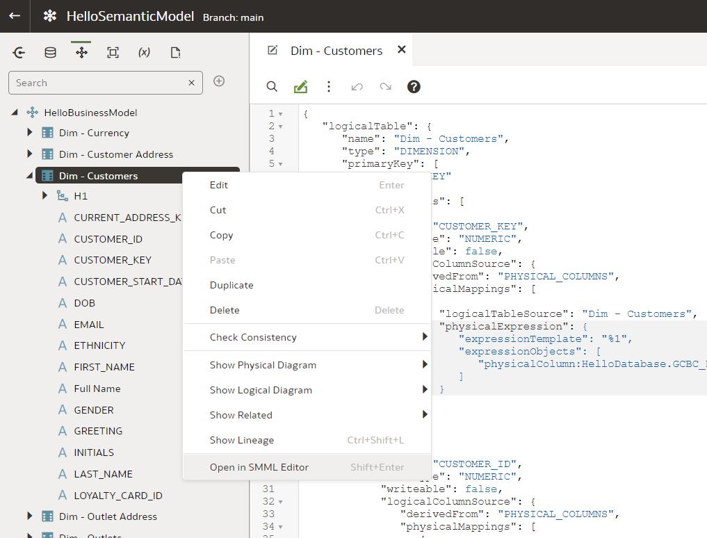
However, this way you are accessing only one object at a time. (You cannot multi-select objects to have them in a single SMML editor view.) Moreover, when opening a high-level object like a Business Model, you will not get full SMMLs of its Logical Tables - you will have to open the SMML Editor for each Logical Table separately. Also, some low-level objects like Columns do not have their own SMML - when opening SMML Editor for a particular Column, you will get the SMML code for the whole Table.
Let us give it a try. We go to the Logical Layer, double-click the "Dim - Customers" Logical Table to open it in designer.
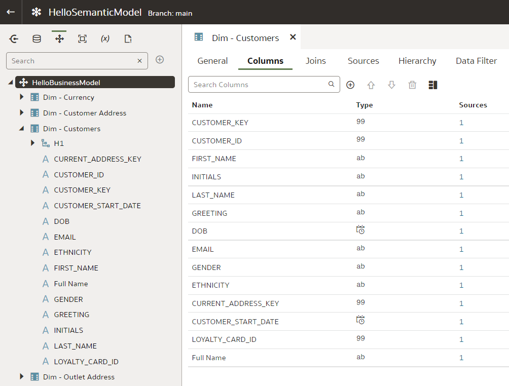
Now, right-click the same "Dim - Customers" table and open the SMML Editor from the menu. The two tabs will sit next to each other.
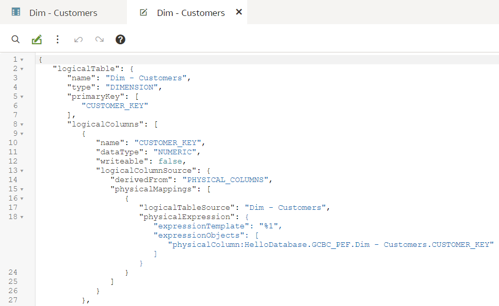
Let us change a dataType value from NUMERIC to VARCHAR:
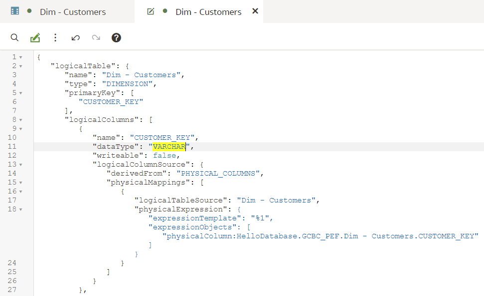
To save the changes, we either press Ctrl+S or click the save icon in the top right corner. Now let us go back to the designer tab. We see that the data type in the designer has changed from '99' to 'ab' - without refreshing the designer we can see the change there. (Note that the same change cannot be done from the designer - data types are normally derived from the Physical sources, instead of specified explicitly.)
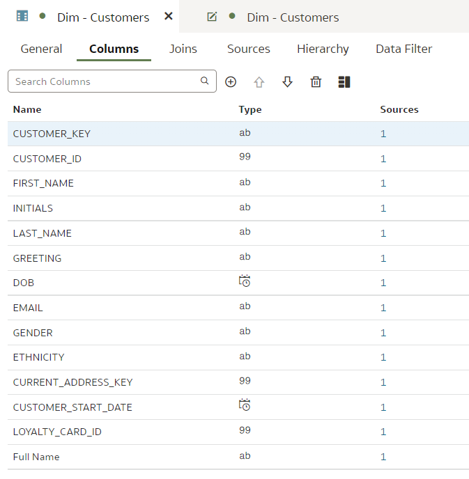
Can repository content be broken in SMML Editor? Let us try that by renaming a JSON key:
When trying to save it, I get this error:
No explanation, no line number. In this case, the save did not take place. I can either revert the change in the SMML Editor itself or I can close the Editor tab and choose to discard changes.
However, the way errors come up is inconsistent. For some errors, I would get this message:
When I choose to proceed (common sense says No but I'm doing this for you!), the Dim - Customers dimension disappears from the Business Model...
But it is not all lost. It is now found in the Invalid Files section.
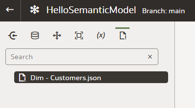
Here I can open it and this time the row with the error is actually highlighted. I remove the unneeded commas that make the JSON invalid and save it.
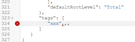
However, the file is still in the Invalid Files section and still missing from the Business Model - I don't think that is how it is supposed to work. Perhaps I am missing a simple trick here but I could not find an easy way of moving the Customer dimension back to the Business Model. The best solution for me was to use the git reset command.
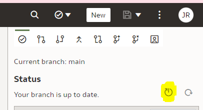
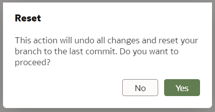
I will describe git integration in my next blog post.
The SMML editing works well but when you get it wrong, it does not do a good job at telling what and where the issue is. However, it does tell you there is an issue and when that happens, do not save it!
We have seen that SMML editing works well for individual objects. But how about a whole repository export and import?
Whole Repository SMML Export and ImportThe documentation does not go into much detail on whole repository exports and imports. I found two ways of exporting the whole repository in SMML format and one for importing it.
The easiest way to export the whole Semantic Model is to open it in Modeler and then open the triple-dot menu from the top right corner.
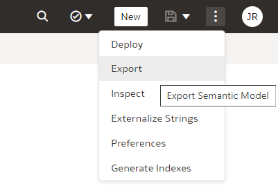
There you can choose to Export and then specify the name of the Zip file.
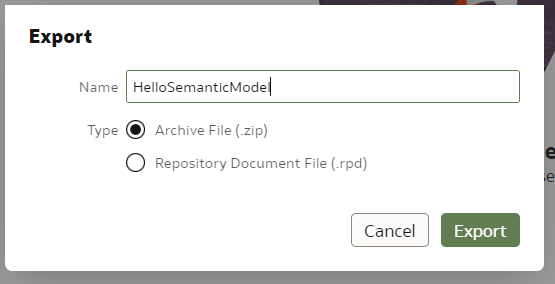
Upon pressing Export, the zip file gets generated and your browser will download it. When unpacking the archive, this is what you see - (at least) three folders...
...with lots of JSON files in them - those are SMML scripts.
An alternative way of exporting the whole repository in SMML format is to upload it to a git repository. In git, the repository is stored in exactly the same format as the export zip file.
When the repository is in git, you can clone the repository locally and edit it with a text editor - it will be the same as with a zip export. However, when done, you can commit and push your changes back to the git repository and then pull the repository changes from Semantic Modeler - this is the only way I found to import the whole repository into Semantic Modeler.
Querying OAC Repository SMML Content with PythonWhy do I love the SMML so much? Because it presents a great opportunity for repository content analysis and development acceleration.
Now that we have the entire OAC Repository exported in JSON format, we can use Python to query it or even modify its content. Python is very good at handling data in JSON format - it is much easier than XML.
Let us start with something simple - in Python we open the Customers dimension JSON to count columns in it:
import json

with open("D:\OAC-Semantic-Modeller\Repo\logical\HelloBusinessModel\Dim - Customers.json") as f:
    customerJson = json.load(f)

    print(f"Logical Table Name is {customerJson['logicalTable']['name']} and its type is {customerJson['logicalTable']['type']}.")

    logicalColumnNames = [lc['name'] for lc in customerJson['logicalTable']['logicalColumns']]
    print(f"The table has {len(logicalColumnNames)} columns:\n\t{', '.join(logicalColumnNames)}")
These are just a few lines of code and the output looks like this:
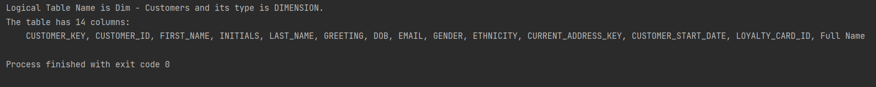
Note above that in the SMML JSON, the name attribute is a single attribute whereas logicalColumns is a list. In Python they become a single attribute and a list accordingly.
It would be easy to modify the above script to do the same for more than one table, to run the script regularly to keep track of table column changes...
However, it would be more useful to do queries across multiple repository objects. With a bit more effort, we can do that.
Let us set a task to get a list of all Logical Table Columns in the format <Logical Table name>.<Logical Column name> (<Logical Column data type>) but without opening each JSON individually like we did in the first script. Instead we want to load the whole repository in memory and then run our queries.
import json
import os
from functools import reduce

def getFileContent(filePath):
    with open(filePath) as f:
        return json.load(f)


def getFolderContent(folderPath):
    folderPaths = [{'name': f, 'path': os.path.join(folderPath, f)} for f in os.listdir(folderPath) if not os.path.isfile(os.path.join(folderPath, f))]
    filePaths   = [{'name': f, 'path': os.path.join(folderPath, f)} for f in os.listdir(folderPath) if os.path.isfile(os.path.join(folderPath, f))]

    folderContent = [{f['name']: getFolderContent(f['path'])} for f in folderPaths]
    fileContent = [{f['name']: getFileContent(f['path'])} for f in filePaths]

    return reduce(lambda a, b: {**a, **b}, folderContent + fileContent)


smmlRootPath = "D:\OAC-Semantic-Modeller\Repo"  # this is the root path to where I unzipped the SMML export
allRepositoryJson = getFolderContent(smmlRootPath)

# get all Logical Tables in the Repository
logicalTableNames = [lt['logicalTable']['name'] for lt in allRepositoryJson['logical']['HelloBusinessModel'].values()]
print(f"There are {len(logicalTableNames)} Logical Tables in the repository: {', '.join(logicalTableNames)}\n")

# get all Logical Table Columns
ltColumns = []
for ltName in logicalTableNames:
    ltColumns.extend([
        f"{ltName}.{lc['name']} ({lc['dataType']})"
         for lc in allRepositoryJson['logical']['HelloBusinessModel'][ltName + '.json']['logicalTable']['logicalColumns']
    ])

div = "\n\t * "
print(f"There are {len(ltColumns)} Columns found across {len(logicalTableNames)} Logical Tables:{div}{div.join(ltColumns)}")
The script is still quite simple and now allows us to run pretty much any query we can think of against the repository. The (top of the) output looks like this:
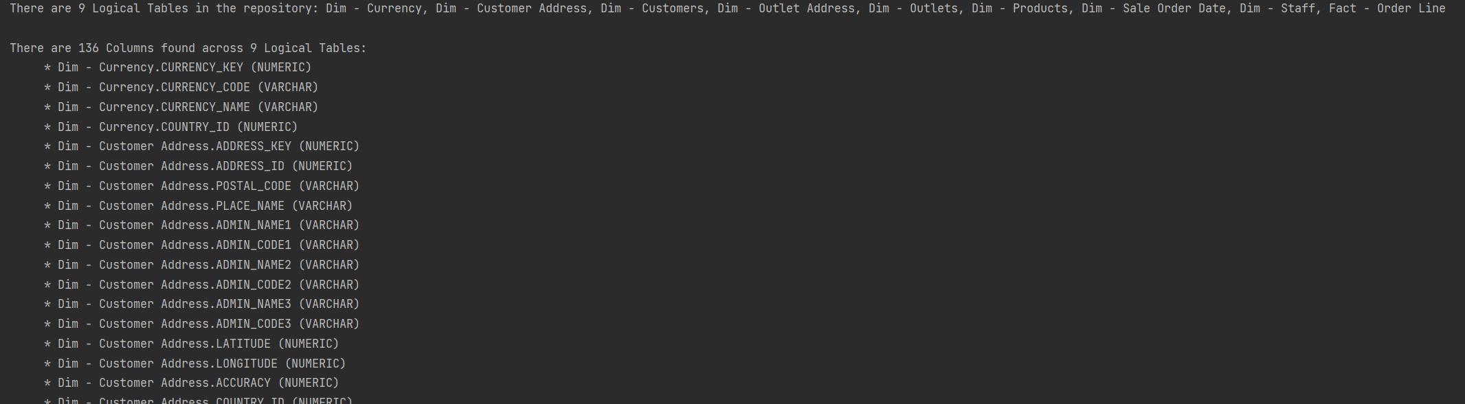
The new SMML language allows for a much easier repository content analysis and manipulation with Python - I expect that no big OAC project in the future will go without a Python developer. Development standards checks, change monitoring, development speed measurement, lineage tracing, repetitive repository content generation - these are just a few scripting opportunities that come to mind.
Conclusions- The SMML language is a major improvement over the OBIEE's UDML language;
- It is a good way of quickly editing a repository object in a text editor;
- Editing SMML is more dangerous than using the standard object designer. The SMML editor will give you warnings if you try to save something dodgy but you can break things;
- Use Python to run repository-wide queries and updates. It is easier than it was with OBIEE's XML extracts;
- If planning to use SMML editing extensively, enable git and follow best version control practices - if you do break something, make sure it is your own dev branch.
Giving OAC Semantic Modeller a Try
Kids just love it when old folk go on about good old days. The particular good old days I have in mind is when Oracle CRM On Demand was released. Competition in the Cloud CRM space was tough but the Oracle product had one trick up its sleeve: its data analytics capability that set it apart from the competition. It was almost scary how well CRM worked in the cloud, and Cloud BI surely was just round the corner. A few years later (time seems to pass quicker as you get older), Oracle Analytics Cloud (OAC) gets released and we can safely say that Cloud BI works. The Semantic Modeller that has been made available for evaluation on May 2022 as part of OAC, is a big step towards Cloud BI not just working but working well.
At the time of this writing, Semantic Modeller is available for evaluation only, hence needs to be enabled from the Navigator menu > Console > System Settings > Preview Semantic Modeller.
Once enabled, we are ready to try it out, to see how it compares to the old ways.
From the Create menu we select Semantic Model and choose to start with an empty Model.

Let us call our Model 'HelloSemanticModel'. Once it is created, its high-level building blocks are available as icons just under the Model name:
- Connections,
- Physical Layer,
- Logical Layer,
- Presentation Layer,
- Variables,
- Invalid Files.
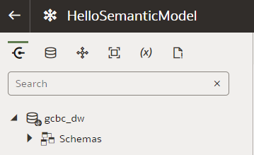
The names of items 2., 3. and 4. look familiar - indeed they are borrowed from the three Layers of the OBIEE's RPD.
Semantic Model's Physical LayerHere we manage Databases that consist of Physical Schemas, Tables, Table Aliases and Joins between them - much like in the RPD's Physical Layer. Let us create a new Database - from the New menu we select Database.

Interestingly, the Physical Layer is not where physical database connections are defined - they are defined outside the Semantic Model. But Connections are visible in the Semantic Modeller's Connections view - this is where we select a FACT table and drag and drop it into our newly created Database's Tables view. Helpfully, it offers to import the DIMs that are joined to it in the physical database and even creates joins.

However, the joins created are of little use to us - our FACT_ORDER_LINE fact joins to the DIM_ADDRESS dimension in 3 ways: as Customer, Outlet and Staff Address. Just like in the RPD, we fix that by using Table Aliases.

After creating Aliases for all Physical Tables, I was about to create Joins between them and then I saw this:
Columns in all my Physical Tables had been duplicated. Why? Because most of my Aliases were named the same as their base Physical Tables, the only difference being UPPER_CASE replaced with Camel_Case. It turns out, Semantic Modeller's name uniqueness checker is case sensitive whereas further down the line the case is ignored. The best way I found to fix this was to scrap and re-create the Semantic Model, while reminding myself this is just a preview.
After re-creating the Model and using proper naming for Aliases, the issue was fixed.

Before moving on to the next Layer, let us have a look at the Connection Pool tab. Instead of defining a connection from start to finish like in the RPD, here you select it from a drop-down and provide a bit of additional info like Timeout and DB Writeback.
 Semantic Model's Logical Layer
Semantic Model's Logical Layer does the same job as the RPD's BMM Layer. Here, as expected, we turn Physical Database Tables into Facts and Dimensions and define Logical Joins between them. Lookup Tables don't get to hang out with the cool guys - they are separated from Facts and Dimensions in a different tab.

Do you notice something missing? That's right - no dimension hierarchies! That is because they are now part of the Dimension tables, which makes sense.
First we import the Fact table. Then the Dimensions. Helpfully, the dimensions that the Fact table can physically be joined with, are already pre-selected.

After importing the Dimensions, we want to define their Hierarchies. To do that, we have to right-click on each and choose Edit from the menu.
Then we go straight to the Hierarchy tab and define a Dimensional Hierarchy in a manner very similar to RPD.
Grand total:

Detail:
It looks very similar to RPD so we feel right at home here. (To build an entire Model in a single blog post, we rush forward without exploring the detail.)
Now that dimensional hierarchies are defined, we want to set dimensional levels for our Fact Source. We right-click our Fact table and choose Edit from menu.

We scroll down the Sources tab and, unsurprisingly, we find Data Granularity section. Setting dimensional levels here is nicer than in the RPD's Admin Tool - kids have it so easy these days!
Before we move on to the next Layer, let us have a look at Attribute expressions. We create a Full Name attribute for the Dim - Customers dimension as a concatenation of First and Last Names.

Notice the Aggregation Rule option here, relevant for facts.
Semantic Model's Presentation LayerNot much going on here - we create a Subject Area...

... and add tables to it.
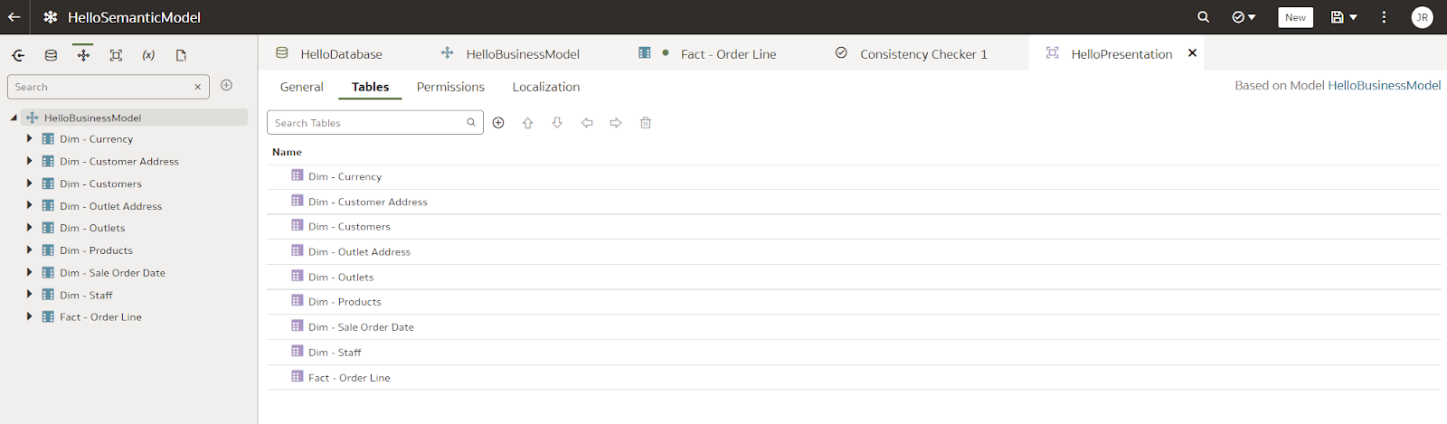
All done! Well, almost. Just like in the Admin Tool, we want to check consistency.
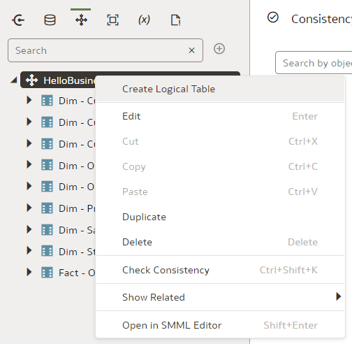
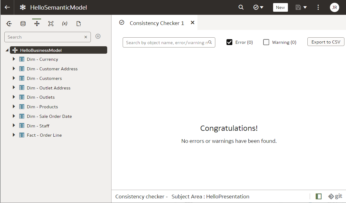 Is Cloud BI the Future?
It has been a long wait but now it looks like it! Whilst not perfectly stable and production-ready, using the Semantic Modeller is a good experience. In this blog post we went through the creation of a very simple dimensional model. I did not mention the very promising lineage visualisation capability that the Semantic Modeller now offers, the new and much nicer SMML language instead of the old UDML language of the OBIEE's RPD, Git support. But those are so exciting they deserve their own blog posts. The future looks bright for Cloud BI. Back in the day when we worked with Siebel Analytics, we could only dream of...
Oracle APEX - Basic Business Questions

It could be the case that you have heard of Oracle APEX lately. Maybe not just once, but a couple of times and maybe more often than ever before. We I will try to answer a couple of basic questions in this blog, that might help you understand why Oracle APEX is great and is becoming very popular.
What is Oracle APEX? What is Oracle APEX used for? What is Oracle ORDS? is Oracle APEX free? How popular is Oracle APEX? Is Oracle APEX low-code or no-code? How can I learn Oracle APEX?
If you are still doubting Application Express super powers, this blog might help you clarify.
What is Oracle APEX?Oracle Application Express (APEX) is a low-cost, easy-to-use development environment that enables you to create sophisticated, database-driven applications. With APEX, you can quickly develop applications that run on the Oracle Database.
APEX enables you to develop and deploy web-based applications on the Oracle Database. It includes an IDE with a set of tools to accelerate the development process. APEX is fully supported and comes with a set of sample applications.
What is Oracle APEX used for?APEX is the perfect tool for creating small, departmental applications, prototyping new ideas or even creating large enterprise applications. Given that it follows the latest web standards, it makes it simple to create any type of application that can be handled by your browser.
Some common use cases for Oracle Apex include:
- Opportunistic Apps
- Spreadsheet Replacement
- Oracle Forms Modernization
- External Data Sharing
- Datamart Reporting
- Enterprise-scale Apps
- SaaS and EBS Extensions
I would like to say NO to this question, as the price seems to be one of the key factors in APEX's unpopularity a couple of years ago. Free things are not very welcomed in enterprises. But... YES, Oracle Application Express (APEX) is free. It is a fully supported no-cost feature of the Oracle Database. It can run as well in the free version of the database (XE).
How popular is Oracle APEX?There is no definitive answer to this question as popularity is subjective. However, a quick Google search shows that there are many articles and blog posts discussing the popularity of Oracle APEX. For some real examples, you can check this site or contact us for a demo :). Maybe checking this post from Oracle is worth it.
Is Oracle APEX low-code or no-code?Oracle APEX can be considered low-code as it allows users to develop applications without writing extensive amounts of code. As Oracle said:
Build enterprise apps 20x faster with 100x less code.but I believe the good thing is, that you can execute any PL/SQL logic or reuse any views that you have already in your database.
How can I learn Oracle APEX?Generally speaking, if you know SQL and PL/SQL, you might be halfway there. Add some Web technologies knowledge (HTTP, HTML, CSS, JS, etc.) and you will be able to deploy your first app in no time.
There are a few ways that you can learn Oracle APEX:
- Take an Oracle APEX training course. Contact our training department if need help with that.
- Read the Oracle APEX documentation.
- Download the Oracle APEX development environment from the Oracle website and build some sample applications.
- Attend some of the many Oracle APEX community events.
Oracle ORDS (Oracle Rest Data Services) is a tool that allows developers to quickly create RESTful API endpoints for data stored in an Oracle database.
ORDS can be used with any Oracle database and makes it easy to build RESTful services that expose the data in the database.
In the APEX case, is the middle-tier platform that allows a client (browsers) to reach APEX scripts to receive data back from the database (an HTML document to be rendered for example).
Oracle Analytics Summit 2022
Last week I attended the second Oracle Analytics Summit at Skywalker Ranch.
The last Summit was in 2019 and attended by Jon Mead and he summarised the experience here.
The purpose of the event is unchanged, and the idea is to showcase the current analytics products and services and more importantly, get feedback from analytics customers and partners on future developments and strategy.
It was clear during the event lots had changed since 2019 and the initiative has really started to pay off, Oracle was named as visionary in the 2022 Gartner magic quadrant for analytics and Business Intelligence Platforms for the third year in a row. Rittman Mead has certainly seen an uptake of OAC/OAS and positive customer feedback.
The event started well with a recorded opening keynote and two customer success stories. MTN being one of them. We have been working with MTN for the last five years.
The core workshops over the two days focused on three main areas:
1. Analytics (OAC/OAS)
2. Oracle Applications and Fusion Analytics Workspace (FAW)
3. Data
One of the highlights for me was a couple of talks around storytelling by James Richardson. James used to work for Gartner and is now at Oracle. He continues to look at data storytelling and how this is expected to dominate business intelligence in the future, specifically now with Oracle.
The biggest change to OAC is the introduction of web-based semantic modelling tool. This will absolutely revolutionise the way we build semantic models in OAC. I’m sure most of the readers know or have come across the OBIEE Admin tool and RPD.
“The Oracle BI Repository (RPD file) stores BI Server metadata. The metadata defines logical schemas, physical schemas, physical-to-logical mappings, aggregate table navigation, and other constructs. You can edit Oracle BI repositories using the Oracle BI Administration Tool.”
The challenge with the RPD has always been how to do multiuser development (MUD). The RPD is a single binary object and unless you edit in online mode (not advisable) it’s hard to version changes (Enabling OBIEE Concurrent development). The new semantic layer has been completely re-engineered to the latest software engineering practices thanks to the leadership of Bret Grinslade and team. The User Interface (UI) looks modern, and you can use the UI or code directly in Semantic Model Markup Language (SMML). The lineage tool presents well. Keep an eye out for upcoming blogs from our team on the subject as we start testing its current capabilities.
“The current version supports relations objects modelling. Essbase and OLAP are not available, and the tool is only for OAC. The traditional Admin tool will be here for a while.”
In addition there are continued improvements to OAC, focusing on AI/ML and natural language processing.
There is a continued drive to enhance Fusion Analytics Warehouse (FAW) for Fusion application users. Additional external pipelines include SalesForce and EBS as examples.
Summary
There is a continued commitment to supporting customers and building a strong analytics community. The event was certainly filled with thought leaders in the area and hearing about customer experiences gave useful insight and feedback to Oracle product teams and partners.
Look out for our blogs on the new semantic layer and our experiences with FAW.
Customers I spoke to during the event were struggling to increase their users’ adoption of new analytics capabilities. Same reports, different platform. If you are struggling with user adoption, let us know.We have an excellent team of consultants and we have a user engagement service that helps to identify why users aren’t engaged with the reporting tools.
Tracing Data Lineage from Source Column to End User
A while ago I blogged about our Lineage Tool, which back then was limited to diving into the ODI Work Repository and emerging from it with source-to-target data flow diagrams. The task at hand was simple and the design straightforward: show Source and Target database entities and connect them with arrows representing the ELT logic in ODI Mappings. The hierarchy to use to drill down from summary to detail was quite natural: ODI Environment > ODI Model > Datastore (Table) > Attribute (Column).
This 4-level hierarchy works very well with ODI. Here is a view at the Table level:(Similarly we can have views at the Model or the Environment level.)
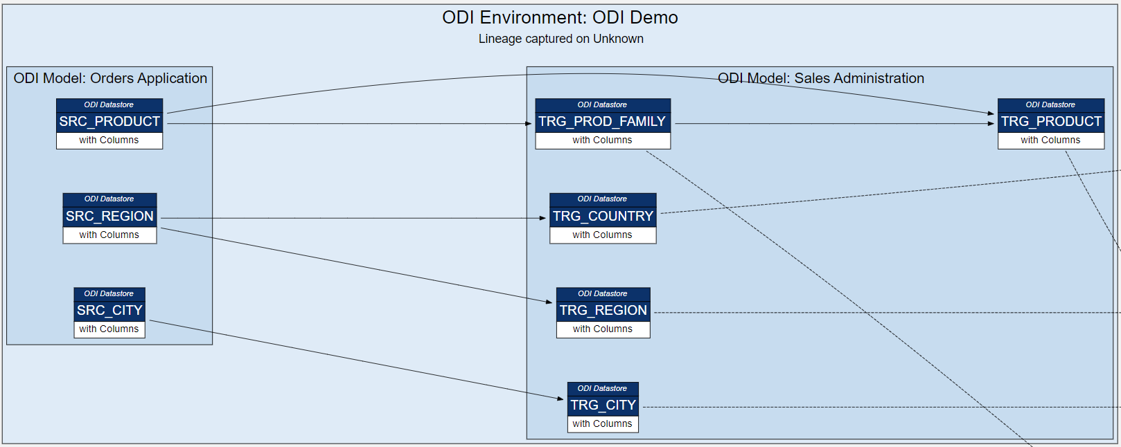
However, there was a temptation to add more to the lineage: OBIEE (OAS/OAC) RPD and Web Catalog lend themselves nicely to lineage analysis. In fact, in the case of these two, Oracle allows us to generate lineage reports from the Model Administration Tool and Catalog Manager respectively.
Starting with RPD's Physical Model, we have very similar entities there: Physical Tables and their Aliases have Columns. Tables are grouped into Physical Schemas, which in turn are part of Databases. It looks like we have one more hierarchy level here: OBIEE Environment > Database > Physical Schema > Physical Table / Alias > Column. We could acknowledge that different lineage analysis sources will have different hierarchies with their own number of hierarchy levels. However, we also want to see the entire lineage across ODI and OBIEE at a certain hierarchy level - showing ODI lineage at a Column level and OBIEE lineage at a Table level will not work very well. Therefore we had to force all hierarchies to conform to 4 hierarchy levels. Here is the OBIEE RPD Physical Layer:
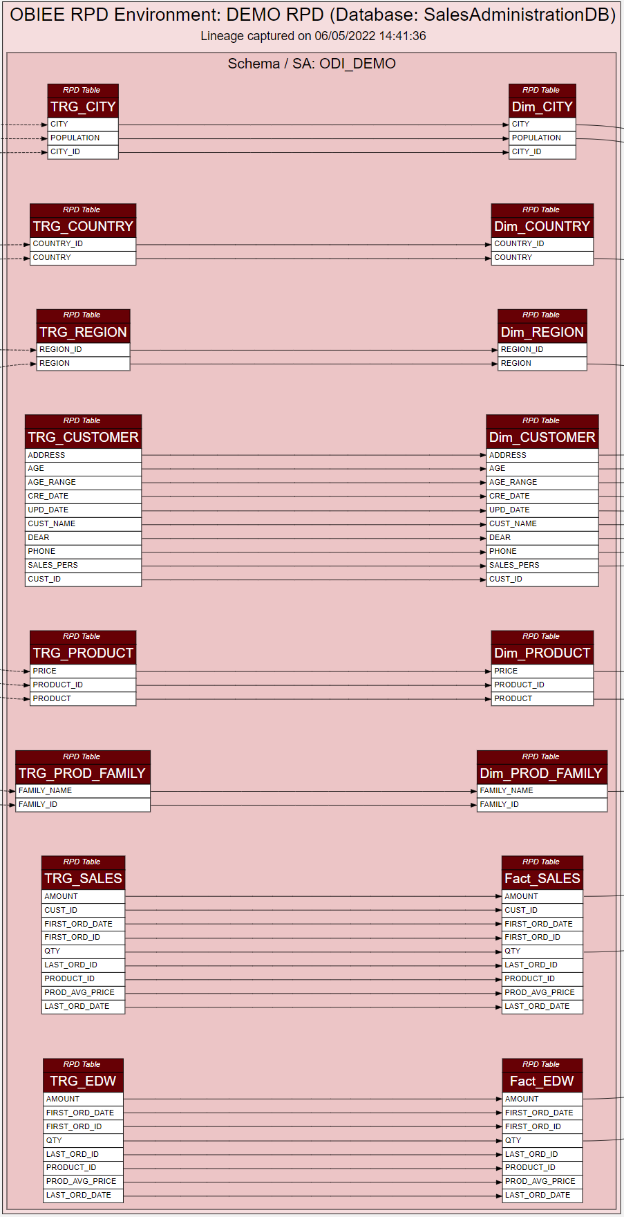
We have 4 hierarchy levels instead of 5 - Environment and Database are squeezed into a single level.
Notice Physical Tables on the left and their Aliases on the right - table and view aliasing naturally becomes part of the lineage flow.
Further down the lineage line, we have the OBIEE Presentation Layer - we can keep the Lineage more compact by hiding the BMM Layer by going from Physical straight to Presentation. Controversial? Yes, we do not always want as much detail in a diagram as possible. Just like our ODI lineage diagram that shows only Source and Target tables, hiding the inner workings of the ODI Mapping.
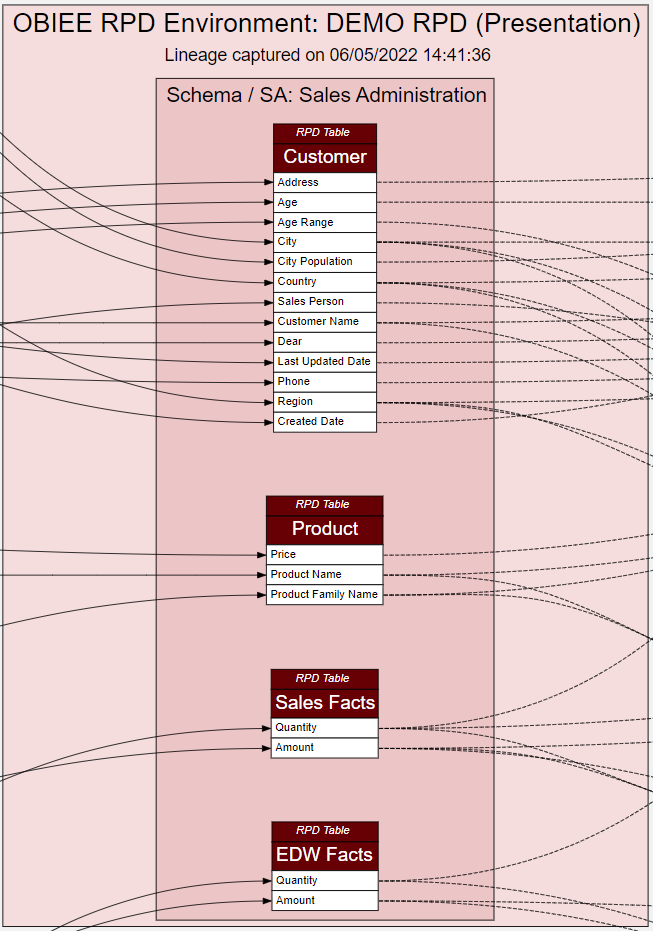
Here we have Presentation Tables and their Columns, Subject Area (SA) instead of a Schema, OBIEE RPD Environment at the top. This time there is no need to an extra hierarchy level, but we add (Presentation) after the Environment name to better distinguish it from the Physical Layer.
Adding OBIEE Web Catalog to our Lineage is no harder than adding the RPD.
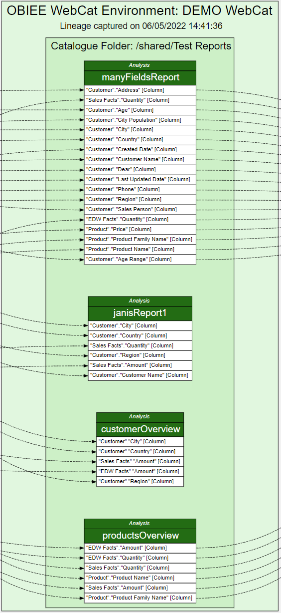
This time it seems we only really need 3 hierarchy levels: OBIEE Environment > Analysis (Report) > Report Column. However, we can introduce Catalog Folders to the hierarchy to stand at the Schema level.
As we can see, conforming to the 4-level hierarchy can be artificial in some cases, but overall the lineage makes sense and, importantly, we can easily switch between the 4 hierarchy levels to get summary or detailed views, drill down Schemas, Tables and Columns to get a filtered view of those entities.
But does the Lineage end at the BI Report? It depends on what we want to call Lineage. We can argue that the end point of our lineage is not the Report but the BI User. Getting Usage Adoption data from OBIEE is easy, assuming that Usage Adoption data gathering is enabled. But can we fit UA data into our lineage, and make it conform to the 4-level hierarchy?
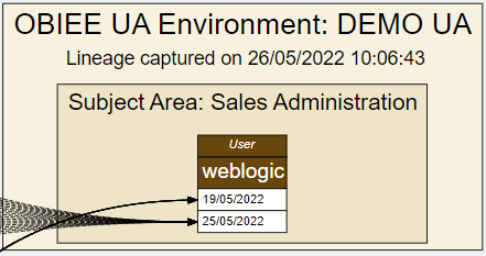
It is a stretch but yes, we can. Let us note that Usage Adoption is the first lineage source that does not have the concept of a Column and a collection of Columns (e.g. table or report). I chose to assign the user name to the table hierarchy level - because the table and the column hierarchy levels are probably going to be the two most frequently used and I do not want the user to be available at the finest level only. In the example above, the finest detail is Report Access Date. In a Production system that has been used for a few years, it would be substituted with Month or Quarter.
The end result is one large diagram that goes from the source table and column all the way to the BI User accessing that data in a report.
In the diagram, we can select a source column, say, SRC_PRODUCT.PRICE and see which users have accessed reports with Product Price in it. If the column data is deemed sensitive, we can do security audits by using this Lineage diagram. We can see if a certain source Table or Column is currently being used in BI reports and also if those reports are actually being used. We can start our analysis from the other end as well, by selecting a user and seeing what source table and column data that user is or is not accessing.
As of now, the Rittman Mead's Lineage Tool is capable of tracing and visualising data lineage starting with the ODI Mapping's Source Datastore Column and ending with the OBIEE User. The Lineage Tool is constantly evolving and there is still much we want to add to it. The journey so far has been interesting and I am sure we will revisit the compromises we have made to make the many lineage data sources fit together in a coherent hierarchy in a single end-to-end lineage.
Interested in finding out more about the Lineage Tool, contact us.
OAS / DV & HR Reporting (A Learning Experience Part 2)
Until recently as a relative newbie to Oracle Analytics Server (OAS) and Oracle Data Visualisation (DV) myself, I was keen to share with you this learning experience.
If you are a HR professional, or you work supporting HR with data and reports, this blog is aimed at you. My intention was, that you could use these two blogs (part 1 and part 2) as a guide to get your own local working OAS copy. You could also load in your own HR data into the system to make the experience more relatable. You could start working with HR data and quickly create some HR data visualisation reports. You could begin to build a business case for moving any current OBIEE system to OAS based on your findings. Even if you don't use OBIEE, OAS may well be worth a look.
This is not a sales pitch for OAS, more to show how you can get OAS up and running with some HR data and make up your own mind about it. You can also to use the system to engage with others who may be interested. In addition the content should freely available to you if you have My Oracle Support.
Firstly as a recap, in Part 1 of this blog, I created a stand alone Oracle database and OAS system using Docker. I connected my local OAS instance to an Oracle database which contained an Oracle HR sample schema. Using the HR schema, I created an OAS HR dataset. I then used the HR dataset (the actual data!) to create some Basic HR visualisations (reports!). In Part 1 of the blog I focused on the newer business intelligence Data visualisation tools and data self-serve facility OAS (akin to Microsoft Power BI Desktop).
Hopefully if all that makes sense, so far so good!
Is this blog (Part 2) I am going old school. What if I want to leverage my existing HR OBIEE developments and recreate / migrate my existing BI subject areas to OAS and write the BI reports in OAS with the same interface OBIEE uses. What if i want to move my current HR BI Publisher reports into OAS? In addition what if i want to mix and match all the visualisations and BI reports in OAS. DV/Classic BI/BI Publisher etc on a BI Dashboard.
Can I do all of this?
Answer: Yes
In this blog are the the steps I took to prove it.
 A mix of OAS Classic Views (OBIEE) and OAS Data Visualisation views on the HR Dataset. Rendered in OAS classic dashboard.
Firstly, how can I re-use an existing OBIEE schema and data in OAS?
The HR professionals my be less interested in the BI technical side might glaze over in this part of the blog! however, they will be interested in knowing if they have existing BI reports, these are going to transition and work fine in OAS with the minimum of fuss. Assuming I already use OBIEE, and have already have my HR subject areas set up. How do I get these into OAS so I can report on it?
Maybe I want to create new OAS visuals using this HR subject area to get some additional functionality thrown in for the effort involved.
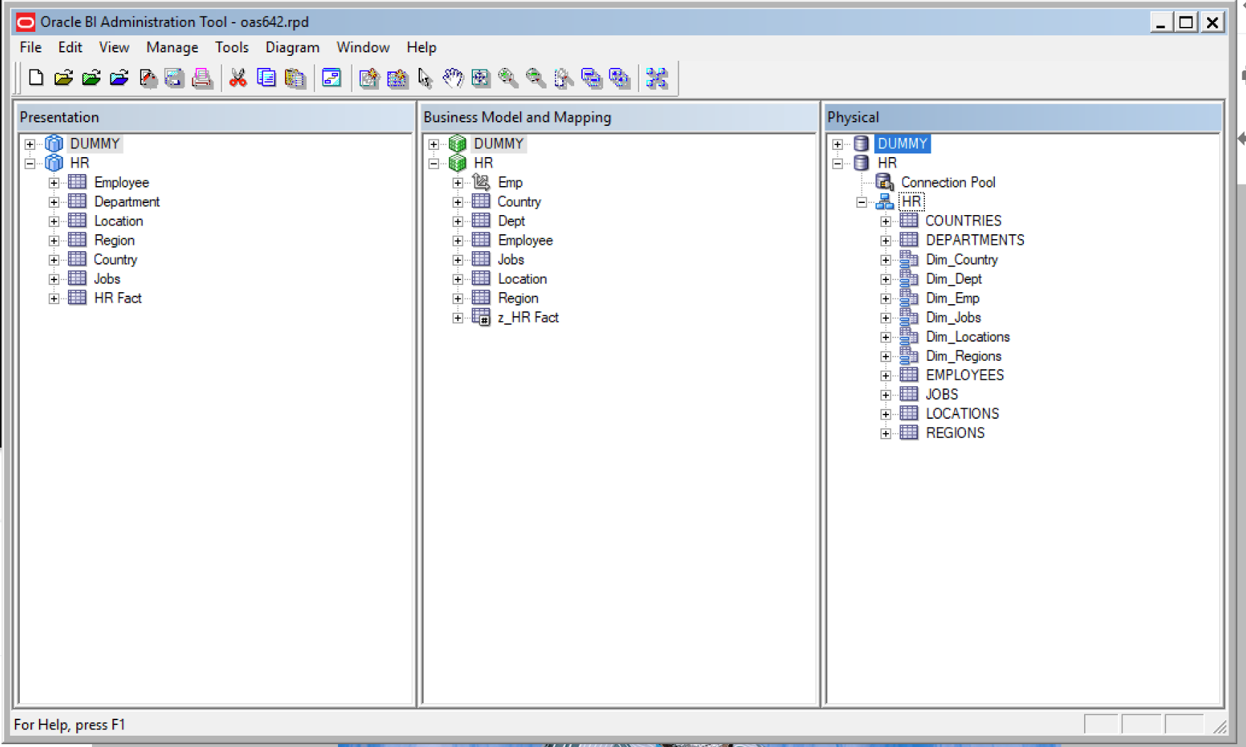 HR subject area in OAS Repository
1) My existing OBIEE repository is currently working against a local OBIEE 12c install and local Oracle database instance I created a while ago. We have already used this same HR Oracle sample schema in Part 1 of the blog to create visualisations in OAS. It would be interesting to see once I get the HR subject area working in OAS and write the reports that they reconcile back to the OAS reports that i created in Part 1 of the blog! after all I don't want to remodel the data again thats the point of doing this exercise and the same may be the case for you if you are thinking of a move from OBIEE to OAS.
Firstly I needed to get hold of the OAS repository from the OAS server copied locally. Then I can edit it with the BI Administration tool and add in the HR schema from my existing OBIEE repository.
To get access to the OAS642 container in docker
Docker exec -it oas642 bash
Then cd /opt/oracle/config/domains/bi/bitools/bin
Run the datamodel download script to get hold of the OAS repository.
./datamodel.sh downloadrpd -O /home/oracle/oas642.rpd -W Admin123 -SI ssi -U weblogic -P Admin123
Now I can locate oas642.rpd in home/oracle.
I renamed the original OAS repository before I made any changes to it just so I retained an original copy locally.
mv oas642.rpd oas642orig.rpd
2) Next I edited the oas642 repository in the BI Administration tool to add in the HR physical/logical and presentation layer of the HR Subject Area. OK so here I had a slight issue in that my local BI Admin tool could not open the OAS repository as it complained it was a newer version than the local client BI Admin tool. I installed a newer BI client version using setup_bi_client-12.2.1.3.0-win64.exe and I installed this in windows 8 in compatibility mode. I am using windows 10 and if I didn't do this, the BI admin tool would not work!
I cut and pasted the physical/logical and presentation layer between one session of the BI Admin tool (one OBIEE repository the other the OAS repository). There are other ways to get the the HR Subject Area into the OAS repository (repository merge etc) but, for now, I wanted to keep things simple. Once the elements were copied over I ran a consistency check on the OAS repository and made sure there were no errors with the copied HR subject area.
I changed the HR database connection pool to point to my docker container oracle database rather than my local database instance (the HR sample schema and data is identical in both databases). Note the Data source name IP in image below is the docker container IP for OAS (as identified in part 1 of this blog) not my local machine IP.
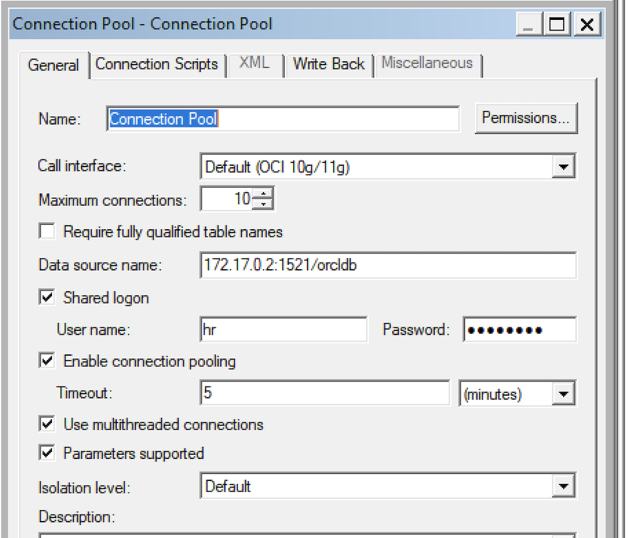 OAS Repository Data source name re-pointed to docker database container IP.
3) Next step was to upload the updated OAS repository with the HR subject area to the Docker OAS server container.
To upload the OAS repository from the directory /opt/oracle/config/domains/bi/bitools/bin
./datamodel.sh uploadrpd -i /home/oracle/oas642.rpd -si ssi -u weblogic -p Admin123
Message returned on command line was 'RPD upload completed successfully'.
4) In OAS I navigated to the Datasets menu, and saw a new Dataset 'HR'. The purple box icon (below) denotes this is a OAS subject area.
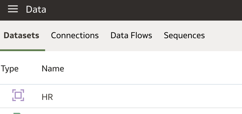 HR Dataset which is the HR Subject Area.
I clicked on the icon and I can begin to build OAS visualisations using the HR Subject area. I could see the dimension folders and the HR Fact folder which all looked familiar.
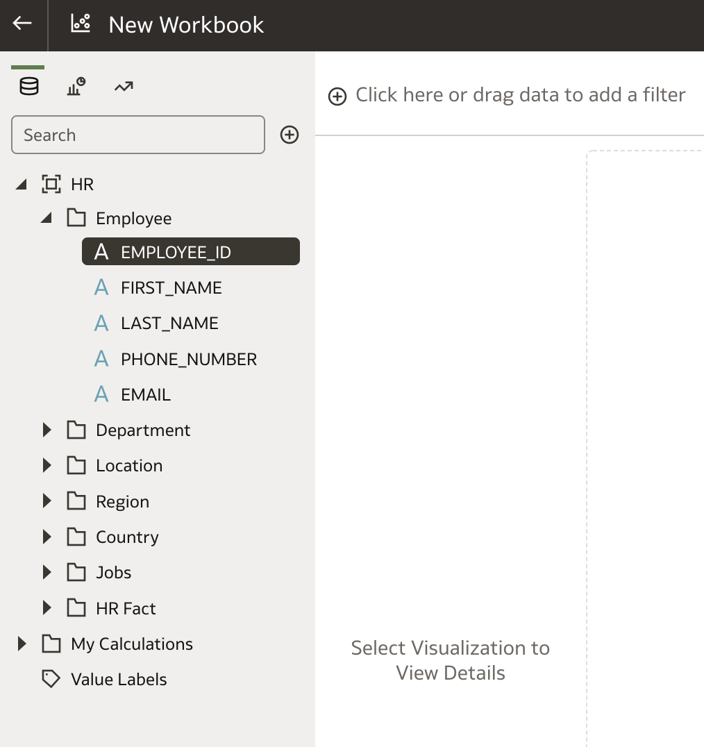 HR Subject Area now in OAS. Select columns to start building.
In addition to the complete HR subject area, I also created another Dataset called 'HR Local Subject Area' based on a subset of the complete HR subject area. Why do this? I wanted to see if i could cherry pick elements of the HR subject area just to include the columns I needed to replicate the OAS visualisations that I created in Part 1 of the blog (which were written directly against the database). This process helps simply the report writing. Not so much required for this small HR subject area used in the examples, but, in the real world often very large subject areas get confusing to users who don't know which dimensions to use and they only need certain elements of the data. Also they may not be permitted to see all the data elements. You can tailor the dataset to a specific set of requirements and add other calculated columns if required at this stage.
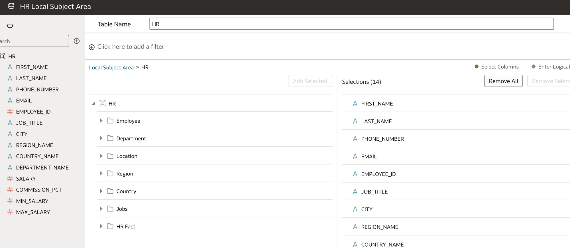 Creating a Dataset subset of the HR Subject Area for a specific requirement
5) OK so now to create the visualisations in OAS against the HR local Subject Area Dataset!
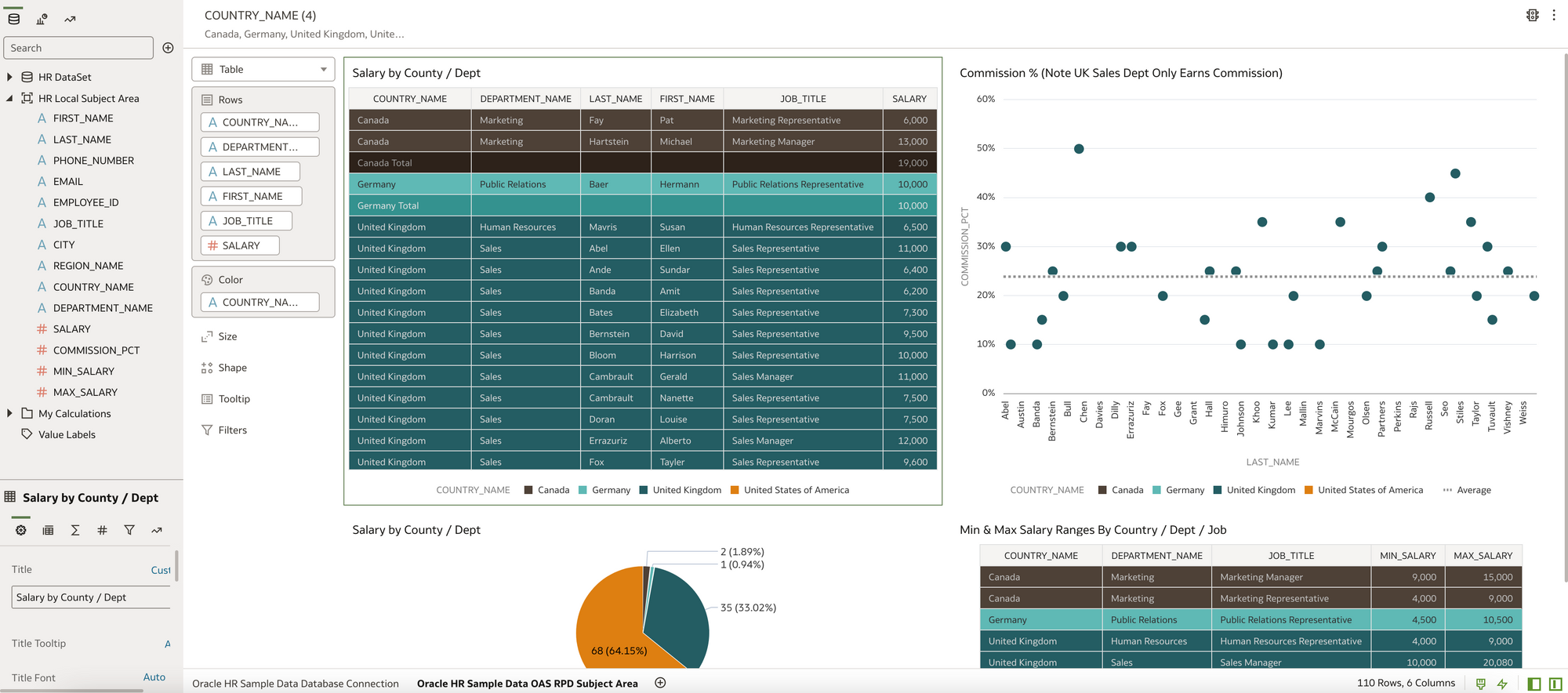 Note:Two Datasets (top left) and The active tab writing against the HR Local SA Dataset
This was pretty straight forward to do, there were a couple of issues with data types but nothing that didn't take more that a couple of minutes to fix. The main thing was the data reconciled exactly to the visualisations written against the database connection which gave confidence that the move from the OBIEE repository to the OAS repository was successful.
6) What if I want to present the OAS data visuals on a BI Dashboard and also write some additional reports the old fashioned OBIEE way. Then combine these on a Dashboard.
I click on Open Classic home
I go to My Dashboard and Edit. I drag my DV workbook into the dashboard and as I have two OAS canvas, I choose display canvas1 (show view) this was the Oracle database connection visuals. Note Canvas2 was the HR Subject Area visuals I just created.
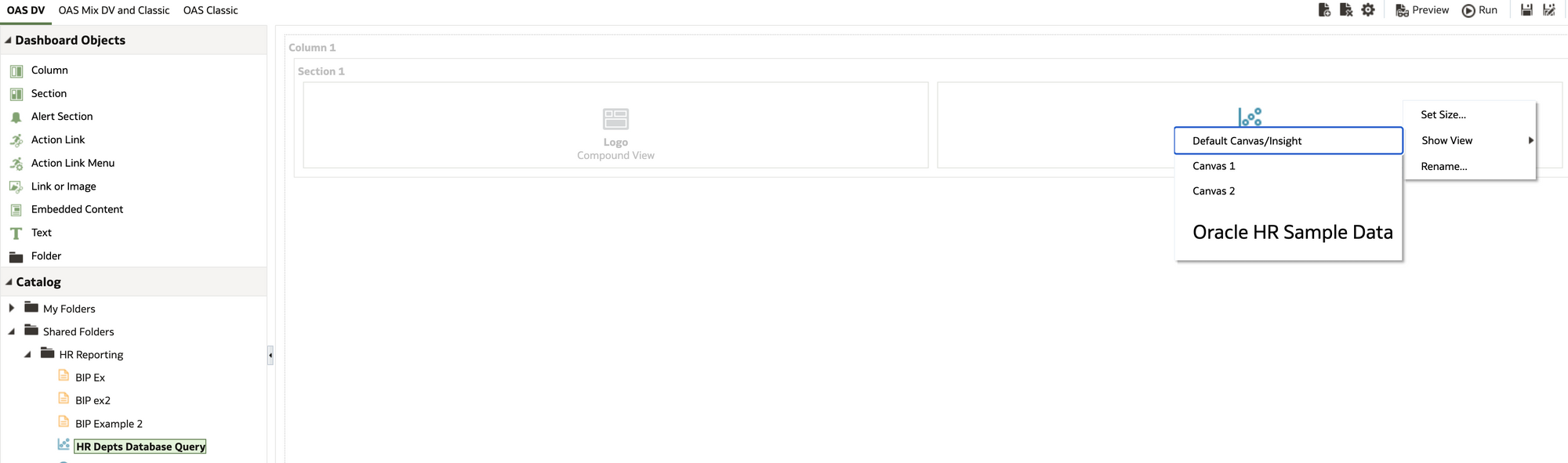 Presenting the Data Visualisations on a Dashboard
I also added in a logo. I saved My Dashboard and had a look at it.
Quite happy with that view!
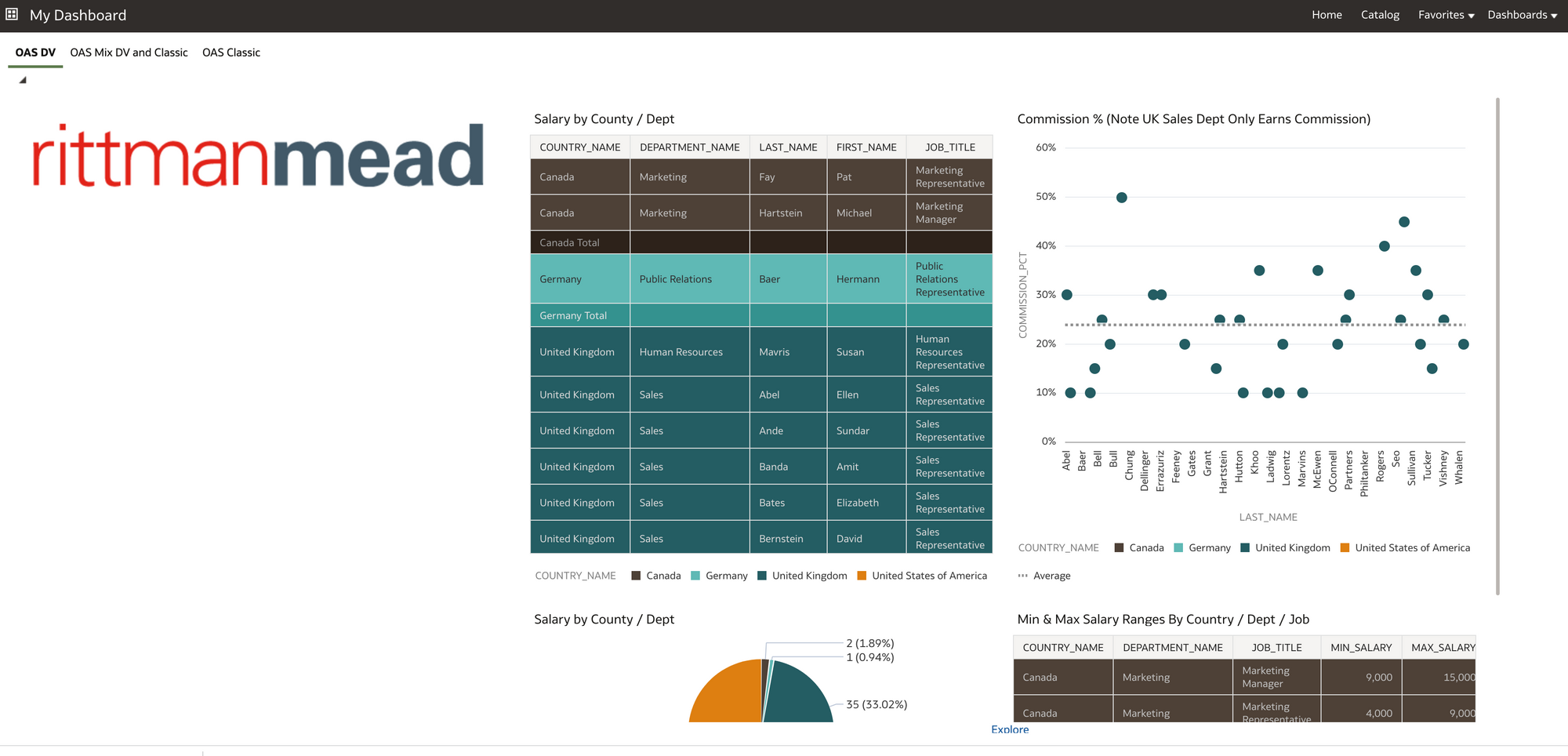 OAS Data visualisations on a BI classic Dashboard.
For the new BI Classic content, I clicked on create and choose Analysis.
With the Criteria tab I could now create my OBIEE reports with the familiar interface using the HR Subject Area.
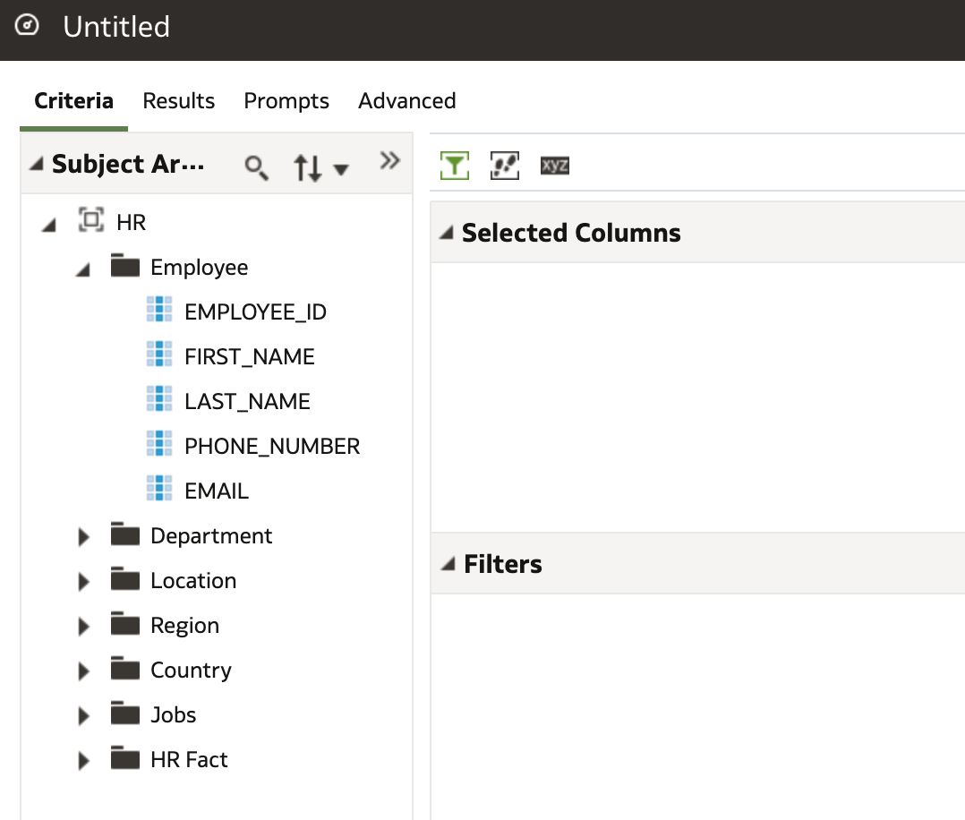 This all looks very familiar!
I knocked together a quick report. Note I could have also used the HR Local Subject Area Dataset I created to write the analysis.
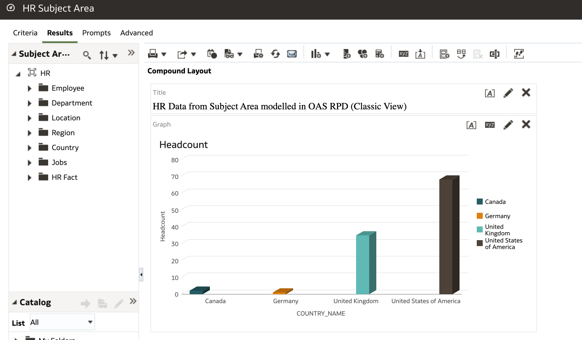
I added the new Analysis to my dashboard and combined with the OAS Data visualisations to get this view (below).
Again I was pretty happy with that view.
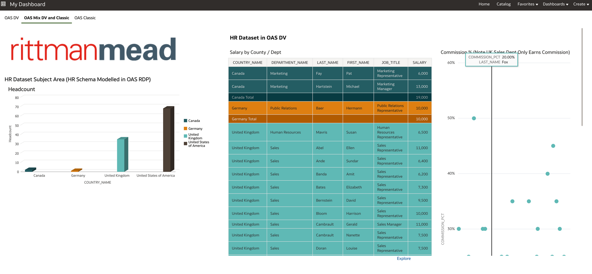
7) Finally, I wanted to create a couple of basic BI Publisher reports in OAS as a way of proving I could migrate HR BI Publisher content to OAS should I wish.
In OAS I created a BIP Data Source connection to the HR schema database so I could get to the data.
For this I needed to go into Administration page of BI Publisher in OAS and create a new JDBC connection.
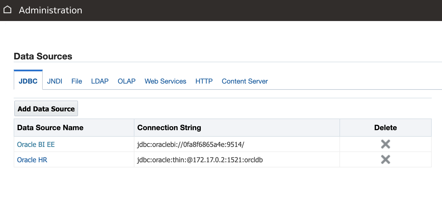 Oracle HR JDBC Connection created (second in list above).
 Then I created my data model, in this case with a bit of SQL (below). I also used the HR subject area to create another BI publisher HR salary report as its useful to be able to demonstrate both methods .
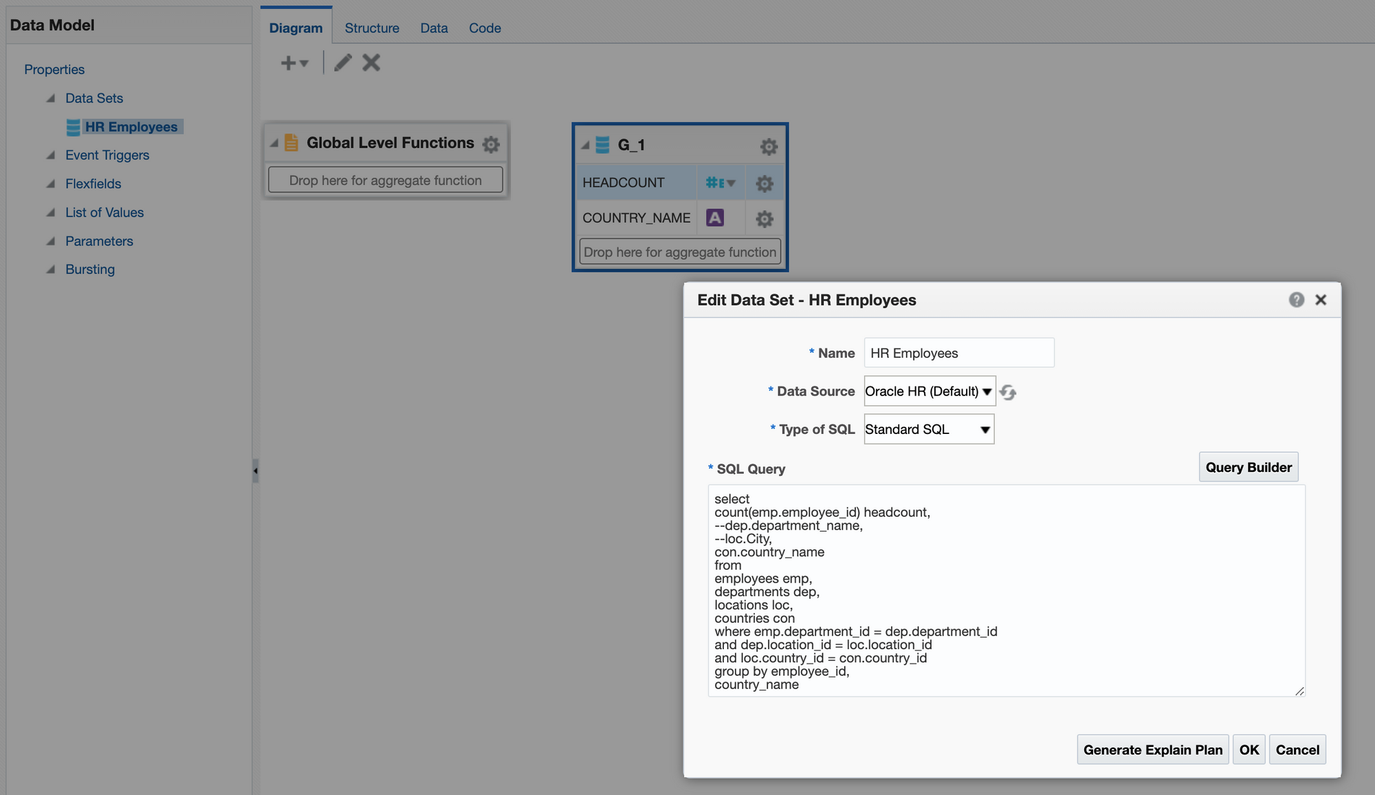 Basic BIP Data Model on HR Schema in Oracle Database
 Once I wrote my reports using the BI Publisher report interface, I presented them with my other Classic views on a BI dashboard.
Job done!
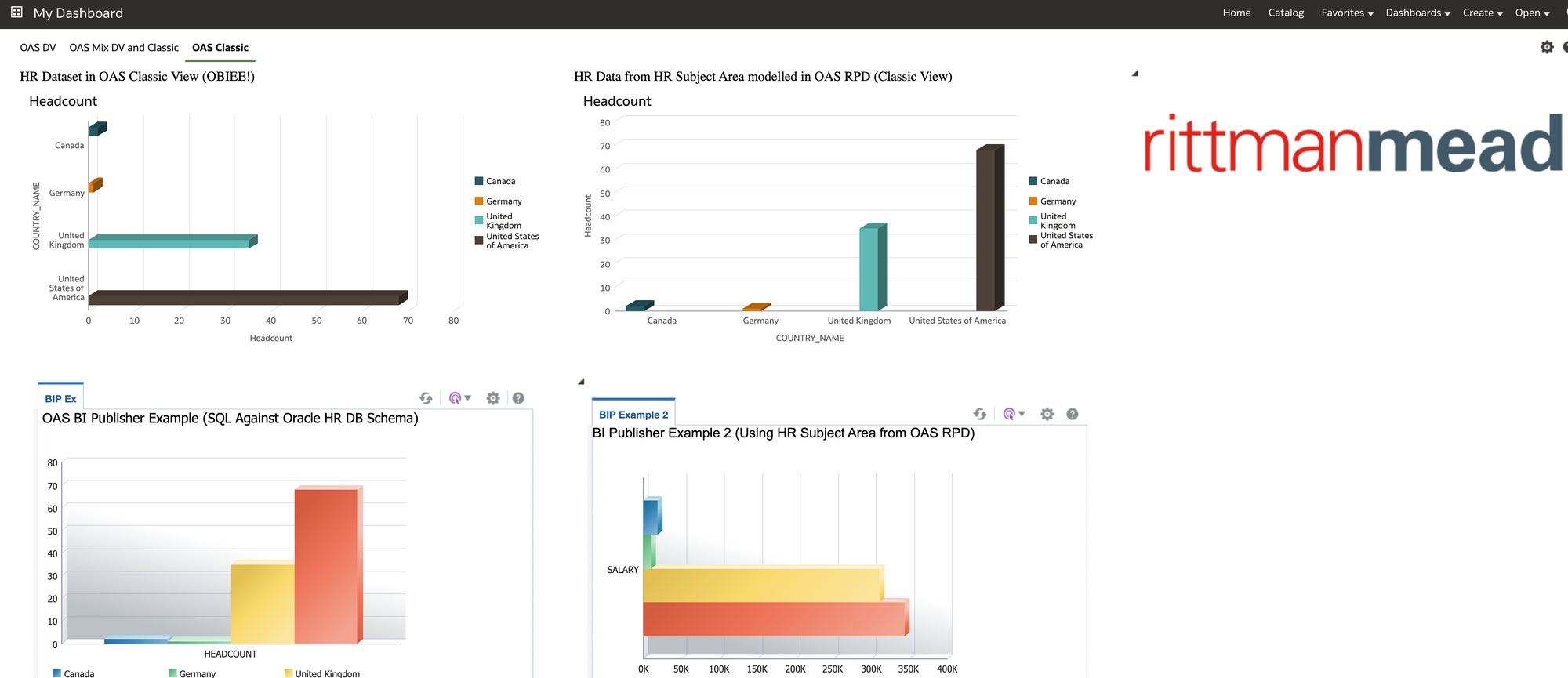 Example of OBIEE and BI Publisher views in OAS Classic
 Conclusion
During this exercise the penny dropped regarding OAS.
I have worked in organisations where certain departments felt trapped into the traditional approach taken to BI. Basically that BI is a technical product that should be administered directly from IT (obviously this may be less relevant to you if you have already moved away from this model).
Essentially OAS moves you to a platform where you can start to involve users from the business and get them fully engaged in preparing and curating data through to writing visuals and reports. Once connections to data sources are set up a certain level of ownership of data and reporting can be passed over to the business from IT OAS also gives the business users the chance to create their own datasets based on data they may have in 3rd party systems or spreadsheets. Working alongside other departments in the business, all which have similar aspirations and requirements for data, then OAS has an enterprise ready feel to it.
As well as the OAS Data visuals and interface it was reassuring to see that you could continue with the older BI technology and re-use content and Subject Areas/reports from OBIEE, also BI Publisher data models/reports should you have these.
In the real world with OAS, I can see HR departments sticking to having certain more complex HR reporting datasets written for them by more technical people in the OAS stack, but, certainly the flexibility is there to have one or two people within the HR department creating OAS datasets and visuals with complete autonomy. These individuals could also have SQL skills and work with the OAS Administrator to fast track content into the system. The OAS Administrator for HR content could also sit within the HR department. A blended approach is always the best in my opinion.
As a real world example, it's worth mentioning, I am currently working for a Rittman Mead client who are moving a number of on premise OBIEE repositories to OAS in the cloud (migrating to one consolidated OAS repository). Phase 1 of the project involves replicating and enhancing current OBIEE dashboard and analytics in OAS classic. This phase of the project is being handled by a team specifically set up for this purpose. Phase 2 of the project is to push out the OAS Data Visualisation tool for adoption by business users, who will be trained to create and design datasets and workbooks. In addition the business unit users will receive training to maintain and develop further OAS analytics and dashboards in OAS classic. This is to help facilitate a move to a user reporting self serve model out in the business from the old central IT report writing model.
With Microsoft Power BI Desktop and similar products increasingly being requested by business users that have got tired of waiting for an overstretched IT to address reporting issues, It certainly might be worth looking at OAS as a candidate solution into the mix.
Overall, personally I found this a useful practical learning experience. I hope you may have gained something too, and, if you stuck with it this far then thanks for reading.
A quick way of generating Informatica PowerCenter Mappings from a template
In our blogs we have discussed the options for Oracle Data Integrator (ODI) content generation here and here. Our go-to method is to use the ODI Java SDK, which allows querying, manipulating and generating new ODI content.
Can we do the same with Informatica PowerCenter? In the older PC versions there was the Design API that enabled browsing the repository and creating new content. However, I have never used it. My impression is that Oracle APIs are more accessible than Informatica APIs in terms of documentation, help available online and availability for download and tryout.
If we want to browse the PowerCenter repository content, there is an easy way - query the repository database. But what about content generation? Who will be brave or foolish enough to insert records directly into a repository database!? Fortunately, there is a way, and a fairly easy one, if you don't mind doing a bit of Python scripting.
Selective Informatica PC repository migrations are done via XML export and import - it is easy and mostly fool-proof. If we can generate XMLs for import, then we have found a way of auto-generating PowerCenter content. Informatica seems to support this approach by giving us nice, descriptive error messages if something is wrong with import XMLs. Only completely valid XMLs will import successfully. I have never managed to corrupt my Informatica repository with a dodgy XML import.
Let us look at an example - we need to extract a large number of OLTP tables to a Staging schema. The source and staging tables have very similar structures, except the staging tables have MD5 codes based on all non-key source fields to simplify change data capture (CDC) and also have the extract datetime.
- We start by creating a single mapping in Designer, test it, make sure we are 100% happy with it before proceeding further;
- We export the mapping in XML format and in the XML file we replace anything unique to the source and target table and their fields with placeholder tags:
[[EXAMPLE_TAG]]. (See the XML template example further down.) - Before we generate XMLs for all needed mappings, we need to import Source and Target table definitions from the databases. (We could, if we wanted, generate Source and Target XMLs ourselves but PC Designer allows us to import tables in bulk, which is quicker and easer than generating the XMLs.)
- We export all Sources into a single XML file, e.g.
sources.xml. Same with all the Targets - they go intotargets.xml. (You can select multiple objects and export in a single XML in Repository Manager.) The Source XML file will serve as a driver for our Mapping generation - all Source tables in thesources.xmlfile will have a Mapping generated for them. - We run a script that iterates through all source tables in the source XML, looks up its target in the targets XML and generates a mapping XML. (See the Python script example further down.) Note that both the Source and Target XML become part of the Mapping XML.
- We import the mapping XMLs. If we import manually via the Designer, we still save time in comparison to implementing the mappings in Designer one by one. But we can script the imports, thus getting both the generation and import done in minutes, by creating an XML Control File as described here.
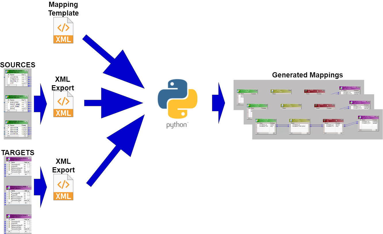 Scripting Informatica PowerCenter Mapping generation
A further improvement to the above would be reusable Session generation. We can generate Sessions in the very same manner as we generate Mappings.
The ImplementationAn example XML template for a simple Source-to-Staging mapping that includes Source, Source Qualifier, Expression and Target:
<?xml version="1.0" encoding="UTF-8"?>
<!DOCTYPE POWERMART SYSTEM "powrmart.dtd">
<POWERMART CREATION_DATE="05/26/2021 11:55:12" REPOSITORY_VERSION="188.97">
<REPOSITORY NAME="DemoETL" VERSION="188" CODEPAGE="UTF-8" DATABASETYPE="Oracle">
<FOLDER NAME="Extract" GROUP="" OWNER="Developer" SHARED="NOTSHARED" DESCRIPTION="" PERMISSIONS="rwx---r--" UUID="55321111-2222-4929-9fdc-bd0dfw245cd3">
[[SOURCE]]
[[TARGET]]
<MAPPING DESCRIPTION ="[[MAPPING_DESCRIPTION]]" ISVALID ="YES" NAME ="[[MAPPING_NAME]]" OBJECTVERSION ="1" VERSIONNUMBER ="2">
<TRANSFORMATION DESCRIPTION ="" NAME ="SQ_EXTRACT" OBJECTVERSION ="1" REUSABLE ="NO" TYPE ="Source Qualifier" VERSIONNUMBER ="1">
[[SQ_TRANSFORMFIELDS]]
<TABLEATTRIBUTE NAME ="Sql Query" VALUE =""/>
<TABLEATTRIBUTE NAME ="User Defined Join" VALUE =""/>
<TABLEATTRIBUTE NAME ="Source Filter" VALUE =""/>
<TABLEATTRIBUTE NAME ="Number Of Sorted Ports" VALUE ="0"/>
<TABLEATTRIBUTE NAME ="Tracing Level" VALUE ="Normal"/>
<TABLEATTRIBUTE NAME ="Select Distinct" VALUE ="NO"/>
<TABLEATTRIBUTE NAME ="Is Partitionable" VALUE ="NO"/>
<TABLEATTRIBUTE NAME ="Pre SQL" VALUE =""/>
<TABLEATTRIBUTE NAME ="Post SQL" VALUE =""/>
<TABLEATTRIBUTE NAME ="Output is deterministic" VALUE ="NO"/>
<TABLEATTRIBUTE NAME ="Output is repeatable" VALUE ="Never"/>
</TRANSFORMATION>
<TRANSFORMATION DESCRIPTION ="" NAME ="EXPTRANS" OBJECTVERSION ="1" REUSABLE ="NO" TYPE ="Expression" VERSIONNUMBER ="2">
[[EXP_TRANSFORMFIELDS]]
<TRANSFORMFIELD DATATYPE ="nstring" DEFAULTVALUE ="ERROR('transformation error')" DESCRIPTION ="" EXPRESSION ="[[MD5_EXPRESSION]]" EXPRESSIONTYPE ="GENERAL" NAME ="CDC_MD5" PICTURETEXT ="" PORTTYPE ="OUTPUT" PRECISION ="32" SCALE ="0"/>
<TRANSFORMFIELD DATATYPE ="date/time" DEFAULTVALUE ="ERROR('transformation error')" DESCRIPTION ="" EXPRESSION ="SYSTIMESTAMP()" EXPRESSIONTYPE ="GENERAL" NAME ="EXTRACT_DATE" PICTURETEXT ="" PORTTYPE ="OUTPUT" PRECISION ="29" SCALE ="9"/>
<TABLEATTRIBUTE NAME ="Tracing Level" VALUE ="Normal"/>
</TRANSFORMATION>
[[SOURCE_INSTANCE]]
<INSTANCE DESCRIPTION ="" NAME ="SQ_EXTRACT" REUSABLE ="NO" TRANSFORMATION_NAME ="SQ_EXTRACT" TRANSFORMATION_TYPE ="Source Qualifier" TYPE ="TRANSFORMATION">
<ASSOCIATED_SOURCE_INSTANCE NAME ="[[SOURCE_INSTANCE_NAME]]"/>
</INSTANCE>
<INSTANCE DESCRIPTION ="" NAME ="EXPTRANS" REUSABLE ="NO" TRANSFORMATION_NAME ="EXPTRANS" TRANSFORMATION_TYPE ="Expression" TYPE ="TRANSFORMATION"/>
[[TARGET_INSTANCE]]
[[SRC_2_SQ_CONNECTORS]]
[[SQ_2_EXP_CONNECTORS]]
[[EXP_2_TGT_CONNECTORS]]
<CONNECTOR FROMFIELD ="CDC_MD5" FROMINSTANCE ="EXPTRANS" FROMINSTANCETYPE ="Expression" TOFIELD ="CDC_MD5" TOINSTANCE ="[[TARGET_INSTANCE_NAME]]" TOINSTANCETYPE ="Target Definition"/>
<CONNECTOR FROMFIELD ="EXTRACT_DATE" FROMINSTANCE ="EXPTRANS" FROMINSTANCETYPE ="Expression" TOFIELD ="EXTRACT_DATE" TOINSTANCE ="[[TARGET_INSTANCE_NAME]]" TOINSTANCETYPE ="Target Definition"/>
<TARGETLOADORDER ORDER ="1" TARGETINSTANCE ="[[TARGET_INSTANCE_NAME]]"/>
<ERPINFO/>
<METADATAEXTENSION COMPONENTVERSION ="1000000" DATATYPE ="STRING" DESCRIPTION ="" DOMAINNAME ="User Defined Metadata Domain" ISCLIENTEDITABLE ="YES" ISCLIENTVISIBLE ="YES" ISREUSABLE ="YES" ISSHAREREAD ="NO" ISSHAREWRITE ="NO" MAXLENGTH ="256" NAME ="Extension" VALUE ="" VENDORNAME ="INFORMATICA"/>
</MAPPING>
</FOLDER>
</REPOSITORY>
</POWERMART>Python script snippets for generating Mapping XMLs based on the above template:
- To translate database types to Informatica data types:
mapDataTypeDict = {
	"nvarchar": "nstring",
	"date": "date/time",
	"timestamp": "date/time",
	"number": "decimal",
	"bit": "nstring"
}
2. Set up a dictionary of tags:
xmlReplacer = {
	"[[SOURCE]]": "",
	"[[TARGET]]": "",
	"[[MAPPING_DESCRIPTION]]": "",
	"[[MAPPING_NAME]]": "",
	"[[SQ_TRANSFORMFIELDS]]": "",
	"[[EXP_TRANSFORMFIELDS]]": "",
	"[[MD5_EXPRESSION]]": "",
	"[[SOURCE_INSTANCE]]": "",
	"[[SOURCE_INSTANCE_NAME]]": "",
	"[[TARGET_INSTANCE]]": "",
	"[[TARGET_INSTANCE_NAME]]": "",
	"[[SRC_2_SQ_CONNECTORS]]": "",
	"[[SQ_2_EXP_CONNECTORS]]": "",
	"[[EXP_2_TGT_CONNECTORS]]": ""
}
3. We use the Source tables we extracted in a single XML file as our driver for Mapping creation:
sourceXmlFilePath = '.\\sources.xml'

# go down the XML tree to individual Sources
sourceTree = ET.parse(sourceXmlFilePath)
sourcePowerMart = sourceTree.getroot()
sourceRepository = list(sourcePowerMart)[0]
sourceFolder = list(sourceRepository)[0]

for xmlSource in sourceFolder:
	# generate a Mapping for each Source

    # We also need to go down the Field level:
    for sourceField in xmlSource:
    	# field level operations
4. Generate tag values. This particular example is of a Column-level tag, a column connector between Source Qualifier and Expression:
sqToExpConnectorTag = f'<CONNECTOR FROMFIELD ="{columnName}" FROMINSTANCE ="SQ_EXTRACT" FROMINSTANCETYPE ="Source Qualifier" TOFIELD ="{columnName}" TOINSTANCE ="EXPTRANS" TOINSTANCETYPE ="Expression"/>'5. We assign our tag values to the tag dictionary entries:
xmlReplacer["[[SQ_2_EXP_CONNECTORS]]"] = '\n'.join(sqToExpConnectors)6. We replace the tags in the XML Template with the values from the dictionary:
for replaceTag in xmlReplacer.keys():
	mappingXml = mappingXml.replace(replaceTag, xmlReplacer[replaceTag])
Interested in finding out more about our approach to generating Informatica content, contact us.
Analyzing Brand Reputation with Oracle Analytics
When Italy used to qualify for the FIFA World Cup, I was a big fan of Oracle Endeca Information Discovery and implemented several innovative projects with it. Endeca allowed users to upload and combine diverse data for agile discovery on structured and unstructured information, transform and enrich data with a powerful visual data integration environment, mine text in multiple languages, and identify sentiment through natural language processing within the same framework. Unfortunately, it was too ahead of its time and didn't achieve the success it deserved.
Two World Cup qualifying failures and one Euro Cup triumph later, the time is ripe and several features seen in Endeca have been included in Oracle Analytics. In this post, I'm going to illustrate how to use Oracle Analytics to easily perform brand reputation analysis without machine learning or marketing experience.
Let's begin!
Identifying the Brand to AnalyzeAccording to Marketing91:
Brand Reputation is the perception of the brand and how the particular brand of the company is viewed by customers, stakeholders, and the market as a whole. It is the culmination of ideas and emotions that a customer associated with the brand with the customer service experienced during the purchase of goods and services, whilst using them, and after-sales services provided by the company.Since Italy can have a chance to win the 2022 FIFA World Cup only in videogames, I'm going to pick eFootball 2022 - a free-to-play football game - to conduct my brand reputation analysis.
At launch, the game was panned by critics and players, who criticized the atrocious graphics, lack of content, laggy engine and finicky controls. With 92% negative reviews, it became the worst-rated game on Steam a day after launch, and the lowest-rate game of 2021 on the review aggregator Metacritic.
Konami - the publisher - apologised for the game's many issues and said they would work on improving it. A major update was released on the 14th of April 2022 on PC and consoles: would it be sufficient to raise the reputation of the game?
Gathering the DataPeople love to share their thoughts and opinions online. Due to this fact and the rise of social media, consumers have the greatest say in how a brand is perceived nowadays. Online discussions, reviews, posts, and articles about a brand can make it or break it.
I'm going to focus on a single social network - Twitter - to start my analysis and understand what people think about eFootball 2022. Unfortunately, Oracle Analytics does not (yet) allow users to gather data directly from social networks, so I decide to use the Twitter API v2 and search-tweets - a Python library for the v2 search endpoints - because I'm familiar with them. I don't cover the details here, but you can trust me when I say that the most difficult thing is to get the developer account application approved by Twitter!
In order to have a set of data suitable for analysis, I'm going to consider only tweets in English, and ignore retweets and quotes. I'm also going to exclude tweets with links because I noticed that most of them were actually spam. I can then retrieve all tweets posted over the last week related to eFootball 2022, and its official Twitter account @play_eFootball, with the following query:
(to:play_eFootball OR @play_eFootball OR #eFootball OR #eFootball2022 OR eFootball OR eFootball2022) -from:play_eFootball -is:retweet -is:quote -has:links lang:en
The response is in JSON format, which is not directly supported by Oracle Analytics, and contains a mix of tweets and users information, so I'm going to convert it in a couple of Excel files - Tweets.xlsx and Users.xlsx - using a simple custom Python script.
Tweets.xlsx contains the following fields:
id- The unique identifier of the requested tweettext- The Actual UTF-8 text of the tweetauthor_id- The unique identifier of the user who posted the tweetcreated_at- Creation time of the tweet- Public engagement metrics for the tweet at the time of the request, such as
retweet_count,reply_count,like_countandquote_count
Users.xlsx contains the following fields:
id- The unique identifier of the username- The name of the user, as they've defined it on their profile (subject to change)username- The Twitter screen name, handle, or alias that the user identifies themselves withlocation- The location specified in the user's profile (freeform value)- Public metrics about activity for the user, such as
followers_count,following_count,tweet_countandlisted_count
With the gathered data in Excel format, I'm finally able to upload it to Oracle Analytics and use the data preparation features to enrich the datasets before visualizing the data.
Focusing solely on the numbers is a big mistake in brand reputation analysis. The high number of mentions does not automatically mean the brand is doing great, in particular when the vast majority of those mentions are terrible reviews. Understanding the general attitude towards the brand it's a crucial activity, but it could be really tedious if you have to do it manually.
Luckily, the Analyze Sentiment step comes in handy: in Oracle Analytics, it can be added to a data flow to automatically detect the sentiment (Positive, Neutral or Negative) for a given text column. Figure 1 shows how easy is to configure this step. All I have to do is to select the column to analyze (text ) and provide a name for the new column that will contain the calculated sentiment (the default is emotion).
 Figure 1. The Analyze Sentiment step allows to automatically detect the sentiment for a given textual column in a data flow.
The next step requires to save the data in an Oracle Database or Oracle Autonomous Data Warehouse, for instance by adding a Save Data step to the data flow and setting the Save data to property to an existing database connection (Figure 2).
 Figure 2. The Save Data step can be used to save data in a database table and access additional database functions.
Having the data in the database allows to display the Database Analytics step in the data flow editor and perform advanced analysis and data mining analysis. In particular, I'm going to use it to break tweets text down into distinct words, count their occurrences and save the results in a new database table. Once again it's very easy to configure this step. All I have to do is to select the Text Tokenization analytics operation (Figure 3), specify the column to be tokenized (text), the reference column(s) to be included in the output dataset (id), the number of top tokens to return and wheter to use a special language lexer (Figure 4).
 Figure 3. The Database Analytics step allows to use several database analytics functions in a data flow.
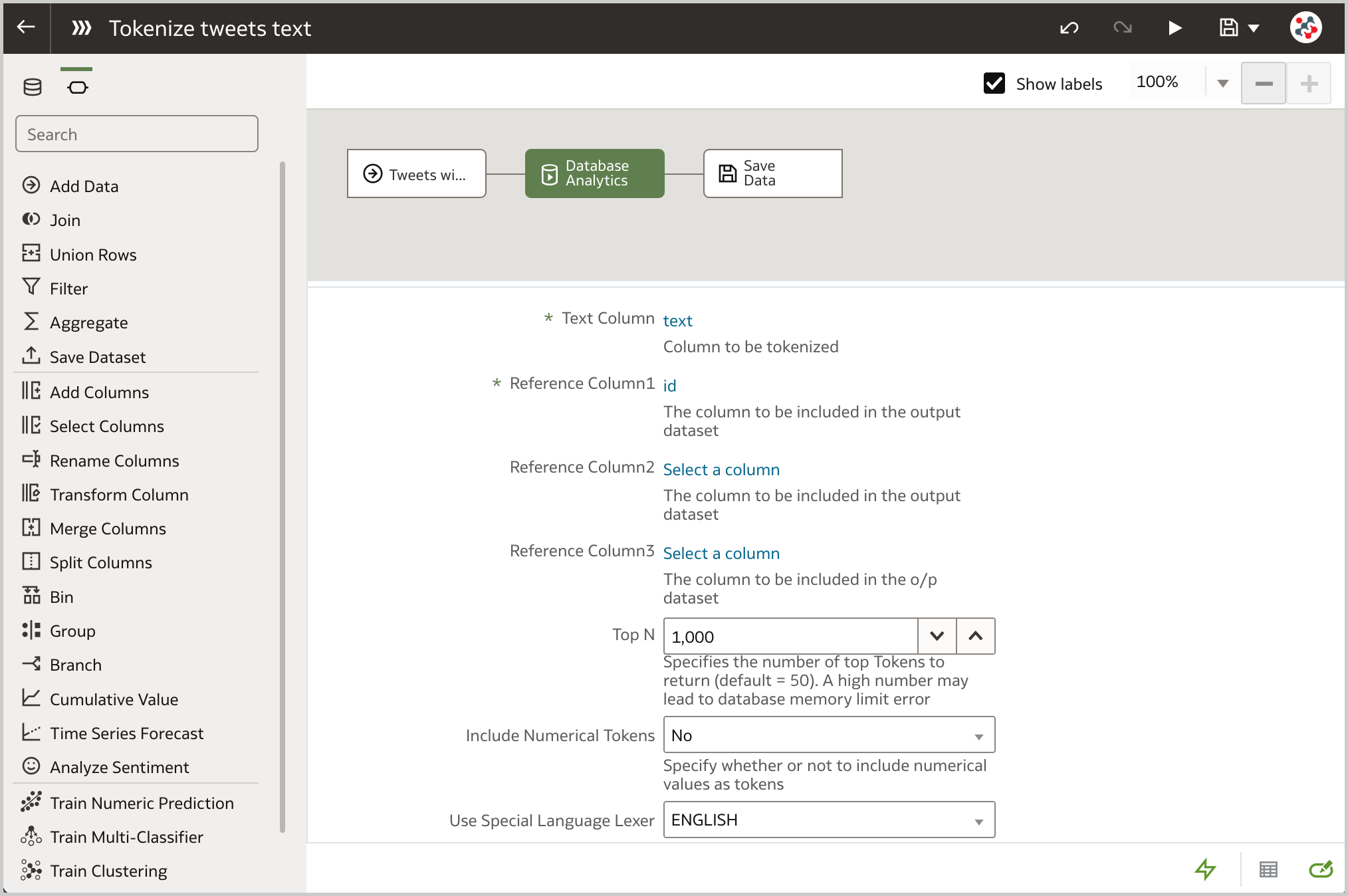 Figure 4. The Text Tokenization analytics function can be used to break a textual column down into distinct words and count their occurrences.
Tokens and occurrences will be fundamental when I analyze the data to display Tag Cloud visualizations. It is a great visualization of the things people usually associate with the brand, and it can be an indicator of the brand reputation in general.
Since all tweets, users and tokens data is in the database, it's a good idea to create a dataset with multiple tables to analyze the data (Figure 5). This solution allows me to achieve better performance because all the joins will be executed at the database level and only the tables needed to satisfy a visualization are used in the query.
 Figure 5. A dataset with multiple tables (Tweets, Tokens and Users) is the ideal solution for analyzing brand reputation in Oracle Analytics.Analyzing the Data
Now that data is set up, it's time to conduct a brand reputation analysis to identify what works and what does not, and optimize the brand strategy accordingly.
The Line visualization is the ideal way to display brand mentions (i.e., the number of tweets) over time (Figure 6). The number of mentions fluctuate with the higher peaks on the 21st of April, when eFootball 2022 Season 1 started, and on the 25th of April, when Konami made important announcements related to the game. The decreasing trend of mentions should not be cause for concern: most of the tweets are created in the afternoon/evenining while I gathered the data on the 28th of April during my lunch break (Figure 7).
 Figure 6. The Line visualization can be used to display the number of mentions over time in Oracle Analytics.
 Figure 7. The Grid Heat Map visualization can be used to understand when the majority of tweets has been created in Oracle Analytics.
As stated previously, the sentiment analysis is crucial for a successfull brand reputation analysis. I like to analyze it either at aggregated level with a Donut visualization (Figure 8) and over time with a Line visualization (Figure 9). According to the Analyze Sentiment step 47.66% are positive and only 21.64% are negative, a big step forward compared to when the game was originally published in 2021!
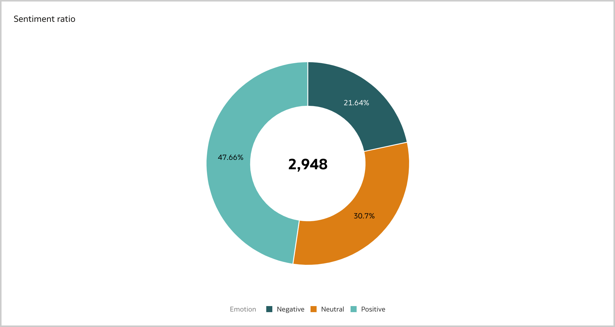 Figure 8. The Donut visualization can be used to display the total number of mentions and the sentiment ratio in Oracle Analytics.
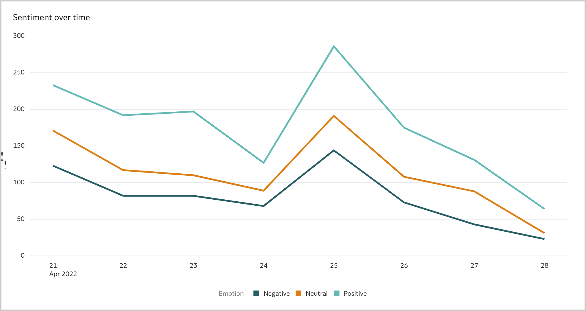 Figure 9. The Line visualization can be used to display the sentiment over time in Oracle Analytics.
Users have a major impact on brand reputation and a good brand reputation analysis should take into account what the most relevant influencers are posting. I usually display a Table visualization of the top 10 users by mentions, by followers count and by engagement (i.e., the sum of mentions' retweets, replies, likes and quotes), and create a data action to a detailed canvas for inspecting the user's content (Figure 10).
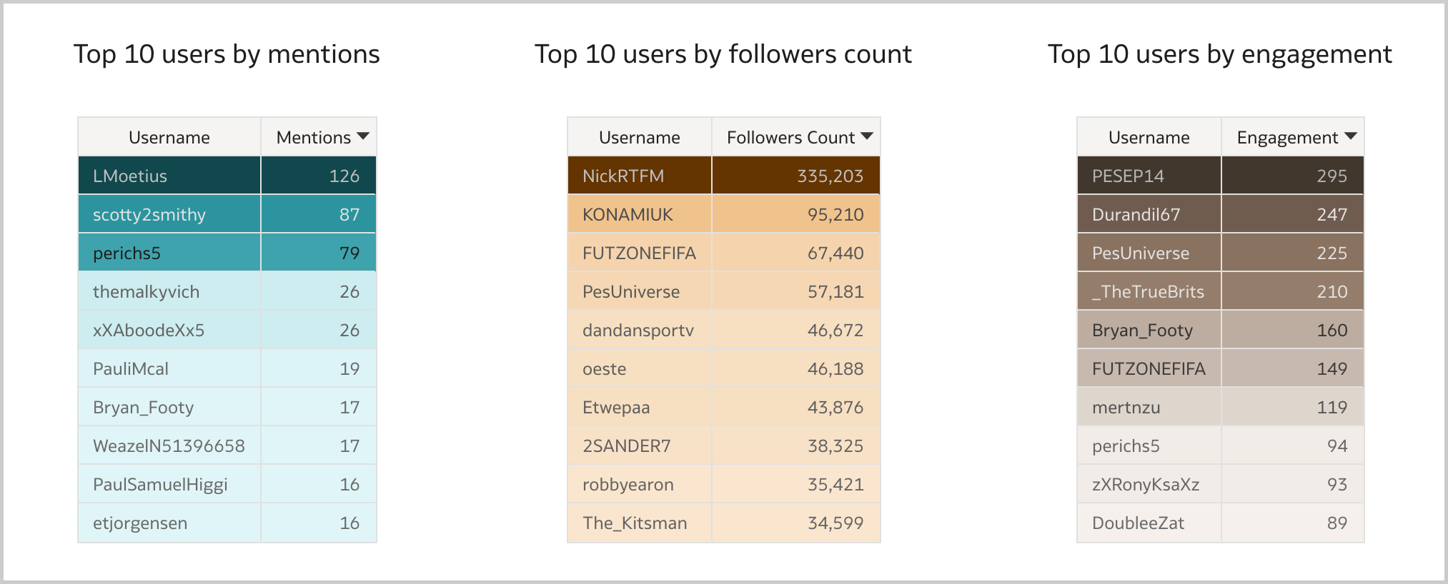 Figure 10. The Table visualization can be used to display the most relevant influencers by mentions, followers count and engagement in Oracle Analytics.
Finally, there is the Tag Cloud visualization which clearly shows what people are looking for when mentioning the brand (Figure 11).
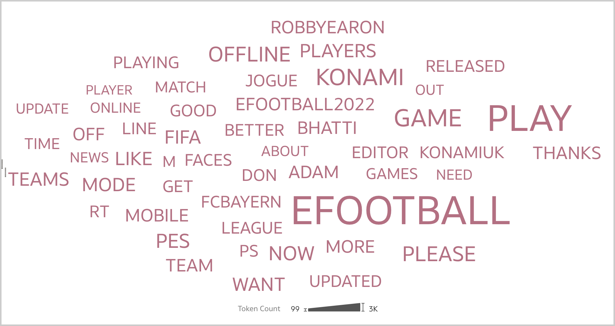 Figure 11. The Tag Cloud visualization can be used to display what people are looking for when mentioning the brand in Oracle Analytics.
With the fundamental visualizations clear in mind, the brand reputation workbook can take shape. In the Overview canvas (Figure 12), I like to present aggregated data such as the total number of mentions, the sentiment ratio, the sentiment over time, the number of mentions over time, and the top 50 words by occurence. I can restrict the analysis to a specific emotion, a date range, a peak or a word, and see how the selection affects the other visualizations.
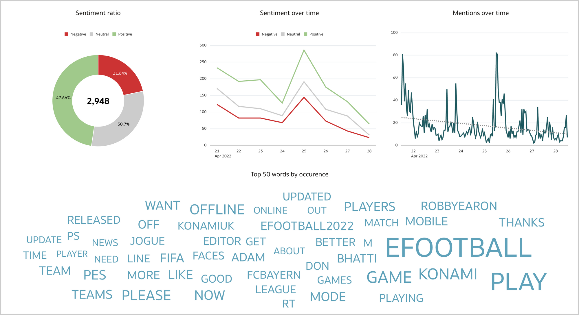 Figure 12. The Overview canvas displays aggregated data about the brand.
The Influencers canvas (Figure 13) lists the most relevant influencers alongside with the sentiment ratio and the most used words by mention, followers count and engagement. Again, I can restrict my analysis to a specific user, an emotion or a word, and see how the selection affects other visualizations.
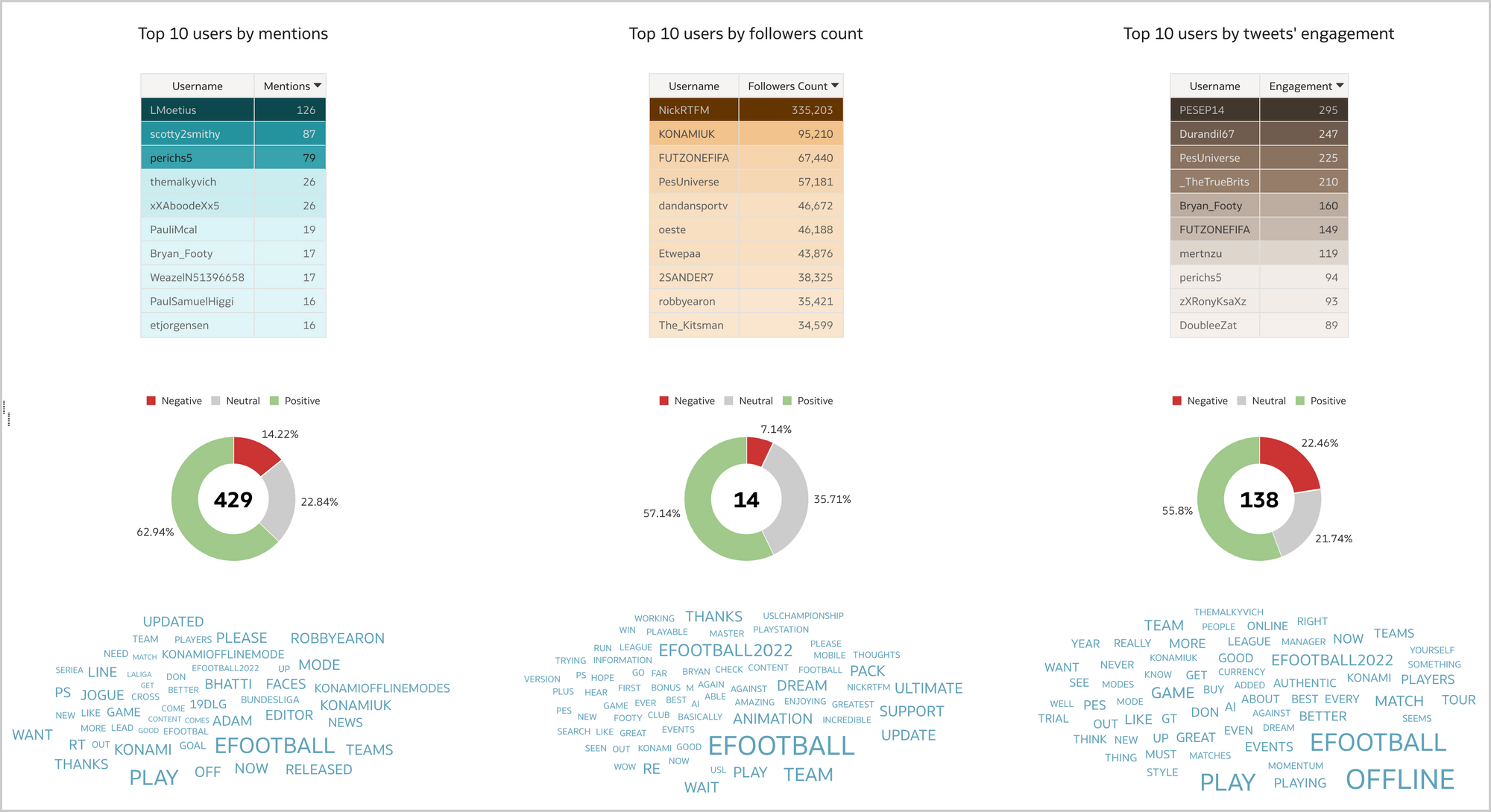 Figure 13. The Influencers canvas displays aggregated data about the most relevant influencers.
The last canvas, Tweets (Figure 14), allows to fully inspect the content of the gathered tweets and related public metrics. Since the data in this canvas is at a very granular level, I prefer to reach it through data actions from the Overview or Influencers canvases. This allows to preserve any selection previously made (i.e., the search context) and display the details only for the tweets that I'm really interested in.
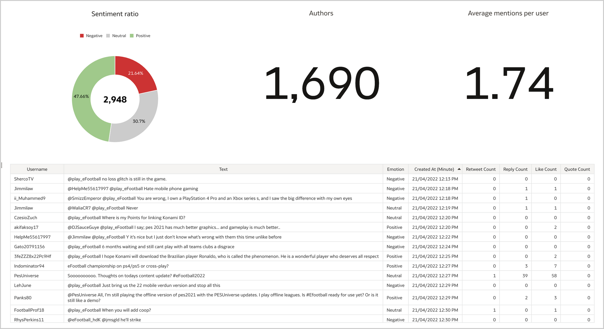 Figure 14. The Tweets canvas displays the content of the gathered tweets and related public metrics.What's next?
Once the data is available in a format supported by Oracle Analytics, it takes less than an hour to build a workbook like the one described in previous sections. It's worth saying that while it represents a solid starting point for a brand reputation analysis, there is also large room for improvement:
- Manual data gathering is not the way to go in a production scenario, and the process must be automated.
- I gathered data from Twitter, but there is a wide variety of platforms people use to mention brands and all relevant sources should be monitored.
- Competitors' data should be collected to evaluate the strenghts and weaknesses of brands that are deemed to be a potential threat to your business.
Brand reputation nowadays is a must have intangible asset for any organization since even the small error in service can be visible to the entire world by a single tweet by that unhappy customer, and impact the business.
If you are looking into brand reputation analysis with Oracle Analytics and want to find out more, please do get in touch or DM us on Twitter @rittmanmead. Rittman Mead can help you with a product demo, training and assist within the development process.